|
|
| Author |
Message |
cyborg
Joined: 12 Oct 2004
Posts: 1102
Location: canada
|
|
|
|
|
 |
cyborg
Joined: 12 Oct 2004
Posts: 1102
Location: canada
|
 Posted: Tue Oct 17, 2006 11:43 am Post subject: Posted: Tue Oct 17, 2006 11:43 am Post subject: |
 |
|
bump
|
|
|
|
|
|
murch
Joined: 13 Sep 2006
Posts: 47
Location: michigan
|
| Posted: Tue Oct 17, 2006 12:11 pm Post subject: |
|
|
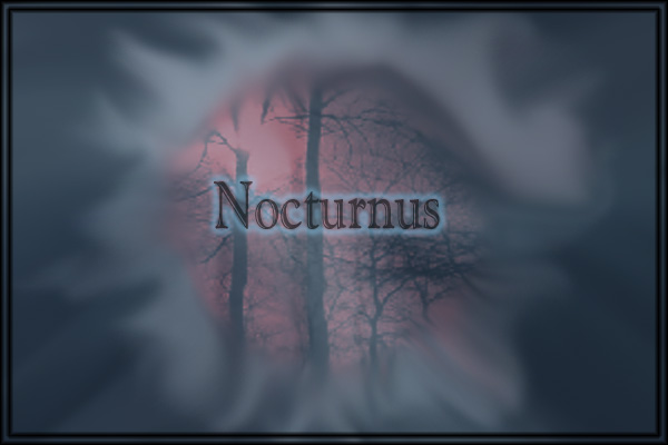
looks good cyborg, but i think it would look better with a smaller border on the outside.
|
|
|
|
|
|
cyborg
Joined: 12 Oct 2004
Posts: 1102
Location: canada
|
| Posted: Tue Oct 17, 2006 7:53 pm Post subject: |
|
|
thnx alot, but believe it or not thats 2 borders 4px apart, it looked good at the time when i made it, but thnx XD
|
|
|
|
|
|
malcon
Joined: 23 Feb 2005
Posts: 391
Location: miami florida
|
| Posted: Wed Oct 18, 2006 8:48 am Post subject: |
|
|
hey whats up man. this is a cool background. i think that there is to much emphasis not being put on the band name. it seems like you would want the band name to play the major part in the wallpaper. also the text is very plane and not that intresting. the outer glow is pretty cool but it doesnt cary the text far enough. on your be3vel and emboss, try changing the lighlight color to that red color behind the text that will make it blend more with the rest of the picture. but yes. you need a text that if it were standing by itself next to a list of other bands, it would stand out. check out movie titles. after a few weeks there are just listed in the news paper, if they didnt have that col text nobody would notice it. anyway think about that.
i like the smudging, it almost looks like smoke, but its just to much, it takes away from the band name.
keep it up and keep us posted on changes.
-malcon
_________________
http://malconpierce.deviantart.com/
http://malcon.cgsociety.org/gallery/
FOR HIRE! malconpierce@gmail.com |
|
|
|
|
|
cyborg
Joined: 12 Oct 2004
Posts: 1102
Location: canada
|
| Posted: Wed Oct 18, 2006 11:12 am Post subject: |
|
|
hey thnx...id just like to point out that i made the image on a school computer on ps elements, there arnt any decent fonts in the program unless you get more(which i cant at school  ) and there are no real options with the layer styles i.e. color. And yea the smudging does look like smoke buts its intended to look i guess like a portal with a forest on the other side. ) and there are no real options with the layer styles i.e. color. And yea the smudging does look like smoke buts its intended to look i guess like a portal with a forest on the other side.
thnx alot for the criticism 
|
|
|
|
|
|
murch
Joined: 13 Sep 2006
Posts: 47
Location: michigan
|
| Posted: Wed Oct 18, 2006 12:03 pm Post subject: |
|
|
| cyborg wrote: | | thnx alot, but believe it or not thats 2 borders 4px apart, it looked good at the time when i made it, but thnx XD |
haha sorry i thought you just bevel and embossed it, i feel dumb.
|
|
|
|
|
|
cyborg
Joined: 12 Oct 2004
Posts: 1102
Location: canada
|
| Posted: Thu Oct 19, 2006 8:18 am Post subject: |
|
|
haha no problem
|
|
|
|
|
|
|