|
|
| Author |
Message |
murch
Joined: 13 Sep 2006
Posts: 47
Location: michigan
|
 Posted: Wed Sep 13, 2006 7:51 am Post subject: logo Posted: Wed Sep 13, 2006 7:51 am Post subject: logo |
 |
|
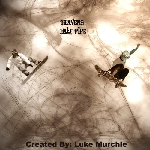
heres a logo i made for a company that is just a test. i would like to know what i can improve on. i just started with photoshop and this is my first large pic so constructive criticism would be appreciated.
 |
|
|
|
|
 |
malcon
Joined: 23 Feb 2005
Posts: 391
Location: miami florida
|
 Posted: Sun Sep 17, 2006 1:20 pm Post subject: Posted: Sun Sep 17, 2006 1:20 pm Post subject: |
 |
|
hey whats up man. first off, welcome to the forum. i hope you find the comments and reviews helpfull. the people here are great.
anyway first of all. this is for a company?
here are some things to keep in mind. buisness cards, letter head, shirts, envalopes etc etc. the logo will probably need to be done in vector because it will need to be scaled small or large and it needs to still carry the same message either way.
also it will need to be able to read the same in black and white aswell as in color. the more detail that is in the logo, the harder it will be to read when shrunk down to maybe a buisness card size.
the peice above is pretty cool. although there really isnt to much to it as far as logo design.
is the logo "heaven's half pipe? or all of this in a whole.
here are some things i suggest.
bring all the elements of this design together, it is much to spaced out. it will look better tighter.
it is a very symetrical compasition. symatry these days tends to be boring.
Try not to rely on text that anybody could use. make it somthing intresting. plus the text should be much muich larger.
try not to use very detailed pictures because the detail will be lost once itis shrunk.
anyway i could go on.
i think your in the right direction as far as maybe making a poster or somthing but not for a logo that will be functional.
check out these books, it maybe be of some intrest.
-
The New Big Book of Logos by David E. Carter
-
American Corporate Identity 2001 by David Carter
-the design of advertising by nelson
_________________
http://malconpierce.deviantart.com/
http://malcon.cgsociety.org/gallery/
FOR HIRE! malconpierce@gmail.com |
|
|
|
|
 |
murch
Joined: 13 Sep 2006
Posts: 47
Location: michigan
|
 Posted: Mon Sep 18, 2006 6:44 am Post subject: Posted: Mon Sep 18, 2006 6:44 am Post subject: |
 |
|
hmm i was actually going toward poster instead of logo actually, they already have a logo they wouldnt use his anyways. but thabkyou for the tips i will work on it and put the finished product on here when im done, how would i go about getting a font that nobody could use? should i make my own? ill have to learn how to first but i i could do it. thanks for the tis once again i appreciate it  |
|
|
|
|
 |
malcon
Joined: 23 Feb 2005
Posts: 391
Location: miami florida
|
 Posted: Mon Sep 18, 2006 9:12 pm Post subject: Posted: Mon Sep 18, 2006 9:12 pm Post subject: |
 |
|
oh ok yeah for a poster, i think that you would need much bigger text. there isnt enough going on.. but yeah man just check out books. keep it up man and keep us posted |
|
|
|
|
 |
|


