|
|
| Author |
Message |
Adam P.
VIP

Joined: 14 Feb 2003
Posts: 75
Location: USA
|
 Posted: Sun Mar 02, 2003 10:45 pm Post subject: Texture: 1 Part Grunge, 1 Part Tech Posted: Sun Mar 02, 2003 10:45 pm Post subject: Texture: 1 Part Grunge, 1 Part Tech |
 |
|
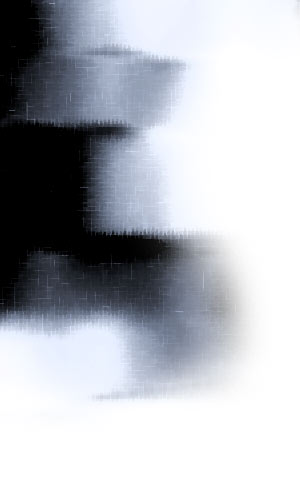
Here's a tutorial on how to create a cool texture that is kind of grungy, kind of techy and works great for collages and backgrounds. 
Step 1. Create a new document, 300x500, with a white background. Set your colors to the default by hitting the D key on your keyboard. You want black as your foreground and white as your background.
Next, go to filter/render/clouds.

Step 2. Go to filter/blue/motion blur and use these settings:
Angle: 0.
Distance: 55 pixels.
Click OK. You should now have something that looks about like this:

Step 3. Next, go to filter/liquify. Select the "shift pixels tool" from the left hand toolbar and keep the default settings. Brush size: 64 and brush pressure: 50. Now, using quick and sweeping strokes, begin at the top of your image and sweep back and forth across your image with slightly overlapping strokes. This should take about 8-10 overlapping strokes. If you mess up, don't panic! Simply click the "revert" button on the right side of the window.

If done correctly, you should get something similar to the following. Don't try and be exact this is an experimental step that you can have fun with.

Step 4. Now we need a little more contrast. Go to image/adjustments/brightness/contrast and use the following settings:
Brightness: 15.
Contrast: 55.
Click OK.

Step 5. Now let's add a little color. Not too much, because we're trying to keep a sort of metal/steel look, but enough to add some interest. Go to image/adjustments/hue/saturation (CTRL+U) and select the "colorize" checkbox. I used the following settings to give it a cold steel look, but feel free to experiment.
Hue: 218.
Saturation: 13.
Lightness: 0.
Click OK.

Step 6 (optional). I used it to accentuate the highlights and shadows. Simply go to image/adjustments/replace color. With the eyedropper tool, go to your image and select a pure black. Then, in the "replace color" window, change the "lightness" to -40. Leave hue and saturation alone. Click OK.

Step 7. Go to filter/sketch/water paper. Keep the default settings and click OK. There you have it! A cool, simple and fun texture that you can use almost anywhere. Be sure to experiment with your own settings I guarantee you'll find something even cooler along the way. If you'd like to use this as a corner background image on a webpage, continue to the next step:

Step 8 (optional). If you'd like to use it as a corner background on a webpage, simply select the eraser tool, grab a big 200 pixel feathered brush and erase around the bottom and left or right side. You should get a nice image that you can place in the corner of a webpage.

_________________
www.adampolselli.com The Adam Polselli Network
My Design Portfolio Check it out!
Get the Look Design Templates Series Article by Me
DesignOutpost.com Design Contests |
|
|
|
|
 |
Patrick
Administrator

Joined: 14 Feb 2003
Posts: 11945
Location: Harbinger, NC, U.S.A.
|
 Posted: Sun Mar 02, 2003 11:20 pm Post subject: Posted: Sun Mar 02, 2003 11:20 pm Post subject: |
 |
|
|
|
|
|
|
 |
beley

Joined: 19 Feb 2003
Posts: 109
Location: Georgia, USA
|
 Posted: Mon Mar 03, 2003 6:43 am Post subject: Posted: Mon Mar 03, 2003 6:43 am Post subject: |
 |
|
Sweet - I like that... 
_________________
Brandon Eley - I actually used Photoshop 2.0!
RackData Managed Business Hosting
Proud host of PhotoshopForums.com
2BigFeet.com - Large Size Shoes for Men and Women |
|
|
|
|
 |
BKJ1216
Joined: 04 Mar 2003
Posts: 8
Location: Yakima, Washington
|
 Posted: Tue Mar 04, 2003 1:25 pm Post subject: Posted: Tue Mar 04, 2003 1:25 pm Post subject: |
 |
|
Wow neat effect. I might use that in some of my stuff sometime. |
|
|
|
|
 |
Adam P.
VIP

Joined: 14 Feb 2003
Posts: 75
Location: USA
|
 Posted: Tue Mar 04, 2003 2:39 pm Post subject: Posted: Tue Mar 04, 2003 2:39 pm Post subject: |
 |
|
|
|
|
|
|
 |
JMulder

Joined: 04 Mar 2003
Posts: 48
Location: Netherlands
|
 Posted: Wed Mar 05, 2003 2:17 pm Post subject: Posted: Wed Mar 05, 2003 2:17 pm Post subject: |
 |
|
|
|
|
|
|
 |
Influence
Joined: 22 Jun 2003
Posts: 4
|
 Posted: Mon Jun 23, 2003 6:52 am Post subject: Posted: Mon Jun 23, 2003 6:52 am Post subject: |
 |
|
This look pretty good. |
|
|
|
|
 |
FB-ke
Joined: 26 May 2003
Posts: 10
Location: -= Out there =-
|
 Posted: Thu Jun 26, 2003 5:27 am Post subject: Posted: Thu Jun 26, 2003 5:27 am Post subject: |
 |
|
I like it as well...
I never got anything out of the Liquify tool before... |
|
|
|
|
 |
|


