|
|
| Author |
Message |
expinch
Joined: 23 Mar 2004
Posts: 8
Location: Diamondhead, MS
|
 Posted: Tue Jul 04, 2006 11:03 am Post subject: Website Layout Review Posted: Tue Jul 04, 2006 11:03 am Post subject: Website Layout Review |
 |
|
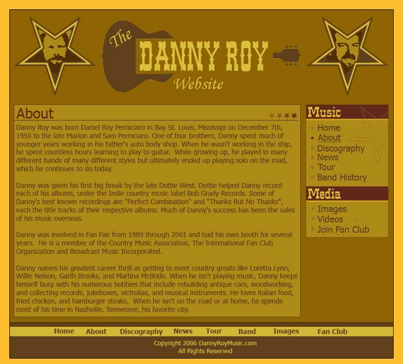
As William Hung would say......I have no formal training. I'm a decent developer but am trying to learn the ins and outs of design so any tips would be appreciated. The layout attached is a site I'm designing for my uncle who is a country music singer. I'm doing the site mainly to get some design practice as I've never taken any formal courses and am admittedly very weak.
Anyways, please feel free to rip the design apart. I like the elements in the banner, but am not particularly fond of their position. The image in the left start is from one of his old, old band pictures and the one of the right is a recent shot. The site is basically a chronology of his entire music career. I like the guitar logo, but I think its missing something, just not sure what it is.
I gave my best shot in regards to colors but may need some help there as well. I'd like to get some tips before I start coding the html, so please critique at will.
| Description: |
|
| Filesize: |
70.57 KB |
| Viewed: |
1318 Time(s) |
|
_________________
-brad |
|
|
|
|
 |
Haunus

Joined: 24 Nov 2004
Posts: 740
|
| Posted: Tue Jul 04, 2006 1:21 pm Post subject: |
|
|
its alright, the content could use a little more padding. I dont like the colors, but you probaly do so I wont suggest anything there. 
|
|
|
|
|
|
expinch
Joined: 23 Mar 2004
Posts: 8
Location: Diamondhead, MS
|
| Posted: Tue Jul 04, 2006 1:34 pm Post subject: |
|
|
Its not that I'm partial to the colors, I just thought brown would be a good base for a country site.......cowboy boots, guitars, cow patties & what not. I decided to use #906305 as a base color, then chose a complimentary color #f8b935. This ended up being the brown and orange color. From there I just used shades and tints of each. What approach would you take?
In regards to the padding, are you talking about the padding between the text and the content container?
_________________
-brad |
|
|
|
|
|
Haunus
Joined: 24 Nov 2004
Posts: 740
|
| Posted: Wed Jul 05, 2006 9:02 am Post subject: |
|
|
I think a different brown base might work well.
For padding, the space between your content and the edge of its container.
|
|
|
|
|
|
swanseamale47
Joined: 23 Nov 2004
Posts: 1478
Location: Swansea UK
|
| Posted: Wed Jul 05, 2006 10:55 am Post subject: |
|
|
Well the first thing I notice is the text hides the guitar, try it with just the letters over the guitar, put them on a clear background.
I have to say I'm not that fussed with the colour either, although it has got a bit of the old western wanted posters look to it.
Like the others I would argree it needs padding out. Wayne
|
|
|
|
|
|
Haunus
Joined: 24 Nov 2004
Posts: 740
|
| Posted: Thu Jul 06, 2006 6:46 am Post subject: |
|
|
try these colors, if you're willing to change them:

|
|
|
|
|
|
malcon
Joined: 23 Feb 2005
Posts: 391
Location: miami florida
|
| Posted: Thu Jul 06, 2006 8:59 am Post subject: |
|
|
|
|
|
|
|
|
Haunus
Joined: 24 Nov 2004
Posts: 740
|
| Posted: Thu Jul 06, 2006 11:02 am Post subject: |
|
|
the colors add to what malcon said...your colors are so similar that they blend in....in the pallete I just posted, there are onyl two blending colors, the rest contrast somewhat, which is important to a page that needs to stand out.
|
|
|
|
|
|
expinch
Joined: 23 Mar 2004
Posts: 8
Location: Diamondhead, MS
|
| Posted: Thu Jul 06, 2006 11:40 am Post subject: |
|
|
Thanks guys, I'm going to give those colors a whirl and post the outcome.
malcon, what would you suggest to add depth?
_________________
-brad |
|
|
|
|
|
malcon
Joined: 23 Feb 2005
Posts: 391
Location: miami florida
|
| Posted: Thu Jul 06, 2006 12:57 pm Post subject: |
|
|
well i think adding a bevel and maybe even some sort of drop shadow to the main area boxes and what-not. just make sure if you do the bevel emboss, that you change the highlight color from white to a lighter shade of the color that is on the box. the white highlight on the bevel tends to make things look cheep and plasticy..
but yeah man, so far so good
_________________
http://malconpierce.deviantart.com/
http://malcon.cgsociety.org/gallery/
FOR HIRE! malconpierce@gmail.com |
|
|
|
|
|
|


