|
|
| Author |
Message |
photomoto
Joined: 21 Jan 2006
Posts: 5
|
 Posted: Sat Mar 11, 2006 8:07 am Post subject: t-shirt design Posted: Sat Mar 11, 2006 8:07 am Post subject: t-shirt design |
 |
|
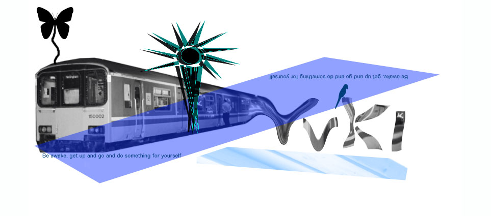
hi i've done this design and even though in many ways its really poor i think it would look good on a t-shirt. Would you wear it?
| Description: |
|
| Filesize: |
81.13 KB |
| Viewed: |
892 Time(s) |
|
|
|
|
|
|
 |
helcyon
Joined: 02 Oct 2005
Posts: 191
PS Version: CS3
OS: OSX 10
|
| Posted: Sat Mar 11, 2006 12:50 pm Post subject: |
|
|
|
|
|
|
|
|
Gallo_Pinto

Joined: 15 Jul 2005
Posts: 785
Location: BC, Canada
|
| Posted: Mon Mar 20, 2006 5:42 pm Post subject: |
|
|
standardly text on t-shirts is a little bigger, because you have to put your face really close to someone's chest to read text that small!
i have a suggestion. Where it says Vuki, make text a little more readable. i don't know how you made that exactly, but it doesn't look like a real font. Once you've got the text made with a readable font, you can select it and inverse the selection. then fill that and the image of the train will show through where the text is. basically you'll still have the end of the train visible in the text, but a little different. it's a good concept, though. Good motto and life lesson too. I'm too lazy to wear something like that. All my friends would call me a hypocrite.
_________________
brush your hair and comb your teeth |
|
|
|
|
|
|


