|
|
| Author |
Message |
jdrumstik

Joined: 13 Jan 2005
Posts: 114
Location: Orange County
|
 Posted: Sun Feb 12, 2006 4:39 am Post subject: Posted: Sun Feb 12, 2006 4:39 am Post subject: |
 |
|
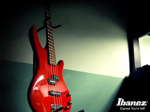
heres wheare I considered comercialism. i took the shot, added some text, thwo in some shading, aside from the natural ligh, and highlighted components, like made all the metal shiner, ect, something that a company might place in a magazine.

And then their are signatures, and then stuff that you think is fun. But I always try to thin, Fun, Comercial, or Art? and I plan it from the beginning. My work isn't outrageous or anything, but its simple. Im not a pro and im not very creative. But I like to have a goal in mind when i make something. Whats my purpose? |
|
|
|
|
 |
2bad
Joined: 26 Jan 2006
Posts: 16
|
 Posted: Sun Feb 12, 2006 2:47 pm Post subject: Posted: Sun Feb 12, 2006 2:47 pm Post subject: |
 |
|
drumstick i love how you do the reflections, is there a chance you could show me/ link me to a tut for them? |
|
|
|
|
 |
jdrumstik

Joined: 13 Jan 2005
Posts: 114
Location: Orange County
|
 Posted: Sun Feb 12, 2006 5:25 pm Post subject: Posted: Sun Feb 12, 2006 5:25 pm Post subject: |
 |
|
I don't know what a "tut" is. But thank you for the compliment.
Which photo are you refering too? Im more of an amatuer photographer than an amatuer PSer. But I'd be more than happy to share what i know. |
|
|
|
|
 |
helcyon
Joined: 02 Oct 2005
Posts: 191
PS Version: CS3
OS: OSX 10
|
 Posted: Sun Feb 12, 2006 5:31 pm Post subject: Posted: Sun Feb 12, 2006 5:31 pm Post subject: |
 |
|
|
|
|
|
|
 |
jdrumstik

Joined: 13 Jan 2005
Posts: 114
Location: Orange County
|
 Posted: Mon Feb 13, 2006 2:36 pm Post subject: Posted: Mon Feb 13, 2006 2:36 pm Post subject: |
 |
|
The reflections are actually pretty natural. I use a lot of Curves and Levels, both on the individual colro spectrum and on the RGB scale to get the colroing right. I also like to oversaturate white values kind of a lot, and I like to color different Items differently.
But mainly the reflections are natural. I ussually spend about 1/2 hour to an hour on the "PhotoShoot" Especially with the guitar it was hard to get the instrument to reflect the lights the way I wanted, the room was actually very very dark when I took that shot. with a single 24" Florencent tube sitting on top of an aqurium over to the left. I just took about 60 shots before it came out right.
If you want I can send you the PSDs and you can see. But I couldn't add this stuff in, its all about the photography here. I feel bad that I totally hijacked this thread though. |
|
|
|
|
 |
helcyon
Joined: 02 Oct 2005
Posts: 191
PS Version: CS3
OS: OSX 10
|
 Posted: Mon Feb 13, 2006 4:33 pm Post subject: Posted: Mon Feb 13, 2006 4:33 pm Post subject: |
 |
|
so did you do all that for fun? or a class? or get paid? With the ibanez that is... bc it sounds like you spent a lot of time on it.
_________________
www.kg-studios.com |
|
|
|
|
 |
jdrumstik

Joined: 13 Jan 2005
Posts: 114
Location: Orange County
|
 Posted: Mon Feb 13, 2006 4:50 pm Post subject: Posted: Mon Feb 13, 2006 4:50 pm Post subject: |
 |
|
No, i took a PS Class at my communty College in Orange County, CA. And we had to do 3 projects, one was advertizing, one was combining three images and the other was a webpage.
Anyways Im actually a business Major at BYU-Idaho. So , yeah, im not a professional and I have a really crapy camera so its hard to get shots that arn't grainy.
But I have fun with PS. I like to do projects for fun. I'd post all my stuff up but like I said im a photographer first, and this forum is mostly Graphic designers. |
|
|
|
|
 |
malcon
Joined: 23 Feb 2005
Posts: 391
Location: miami florida
|
 Posted: Mon Feb 13, 2006 4:59 pm Post subject: Posted: Mon Feb 13, 2006 4:59 pm Post subject: |
 |
|
I would these woul dbe better for maybe some sort of graphic design. where its mostly for advertise ment. but i think one thing maybe you should look at is all the diferent kinds of symmetry. alot of the pieces are very unconfordable. keep up the good work though
maybe try not making them so confusing and or unballenced.
i think you would like a-symmetry |
|
|
|
|
 |
|


