|
|
| Author |
Message |
Galadyn
Joined: 22 Jan 2006
Posts: 3
|
 Posted: Sun Jan 22, 2006 1:05 pm Post subject: Lost, on sig creation Posted: Sun Jan 22, 2006 1:05 pm Post subject: Lost, on sig creation |
 |
|
Hi there;
I sat down and decided my first project after getting Photoshop would be to create a signature; well, using Googled tutorials I've got what I think is pretty far. However, I'm not finding anything that takes my sig the final steps in the direction I want it to go.
This sig is for an online game called World of Warcraft, for the curious. 
Top Layer:

Evil BG Layer:

Fire BG Layer:

What I was trying to do, is have the "evil bg" around the character on the left, have the "fire bg" around the character on the right, and have the two backgrounds somewhat blend together as they reach the middle, and lay my text in there.
I'm probably missing something easy, and would really appreciate a few tips. Also, if you know of a tutorial that can show me how to make this even better than I'd planned, I'd appreciate that too 
I was pleasantly surprised with the awesome "evil bg" tutorial I found; I've seen some GREAT sigs on this site and can only dream of one day being that good 
Thanks in advance...
[/img]
|
|
|
|
|
 |
aoisenshi05
Joined: 08 Oct 2005
Posts: 47
Location: Southern CA
|
|
|
|
|
 |
Galadyn
Joined: 22 Jan 2006
Posts: 3
|
 Posted: Sun Jan 22, 2006 2:13 pm Post subject: Posted: Sun Jan 22, 2006 2:13 pm Post subject: |
 |
|
That doesn't look too bad at all, nice 
And the rogue is in Nightslayer and the mage in Netherwind; tier 1 and 2 epic sets respectively. Definitely 60 
|
|
|
|
|
 |
swanseamale47
Joined: 23 Nov 2004
Posts: 1478
Location: Swansea UK
|
 Posted: Sun Jan 22, 2006 4:31 pm Post subject: Posted: Sun Jan 22, 2006 4:31 pm Post subject: |
 |
|
What I would do is use layer masks instead, add a layer mask with a black/white gradient and you can soften the edge of the join as you want to. Wayne
|
|
|
|
|
 |
aoisenshi05
Joined: 08 Oct 2005
Posts: 47
Location: Southern CA
|
 Posted: Sun Jan 22, 2006 6:54 pm Post subject: Posted: Sun Jan 22, 2006 6:54 pm Post subject: |
 |
|
Yeah, I was going to try layer masks, but am still kinda new with them... Go with what Wayne said, he's a moderator!
|
|
|
|
|
 |
Galadyn
Joined: 22 Jan 2006
Posts: 3
|
 Posted: Sun Jan 22, 2006 7:14 pm Post subject: Posted: Sun Jan 22, 2006 7:14 pm Post subject: |
 |
|
| swanseamale47 wrote: | | What I would do is use layer masks instead, add a layer mask with a black/white gradient and you can soften the edge of the join as you want to. Wayne |
That's mainly what I'm having problems with. I've tried two tutorials on the subject so far, and seem to be missing the point :\
|
|
|
|
|
 |
swanseamale47
Joined: 23 Nov 2004
Posts: 1478
Location: Swansea UK
|
 Posted: Mon Jan 23, 2006 12:23 pm Post subject: Posted: Mon Jan 23, 2006 12:23 pm Post subject: |
 |
|
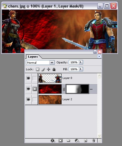
Ok layer masks. first off open your people layer and delete the white background, then I'd open the red layer, drag the pic onto the people pic, then with the move tool drag the small pic on the layers palette below the people layer (now you should have the people with the red layer behind them)
Now open the flame layer and drag it on top of the people,then drag the little pic below the red and people layers (you should now have 3 layers with the people at the top, then the red and flame at the bottom)
Now you click the red layer (to make it active) now click the add layer mask icon on the bottom of the layers palette.
Now click the white layer mask white square on the layers palette, and here the fun starts, get a soft brush and paint on the main image, where you paint in black it hides the red layer and shows the flame layer beneath, if you go wrong, just switch colours to white and you can paint the red layer back in, to soften the join just lower brush opacity and add as little or as much as you want (you could also use a B+W gradient on the mask if you wish)
You can see the mask here in the pic and you can see where the black is on it the flames show through.
Hope that helps a bit. Wayne
| Description: |
|
| Filesize: |
42.38 KB |
| Viewed: |
662 Time(s) |

|
|
|
|
|
|
 |
aoisenshi05
Joined: 08 Oct 2005
Posts: 47
Location: Southern CA
|
 Posted: Mon Jan 23, 2006 2:20 pm Post subject: Posted: Mon Jan 23, 2006 2:20 pm Post subject: |
 |
|
Thanks Wayne! That helps me too!
|
|
|
|
|
 |
|


