|
|
| Author |
Message |
flash gordon
Joined: 14 Jun 2005
Posts: 32
|
 Posted: Fri Jan 06, 2006 1:50 am Post subject: Clear Transparent Gif's Posted: Fri Jan 06, 2006 1:50 am Post subject: Clear Transparent Gif's |
 |
|
Hey Guys,
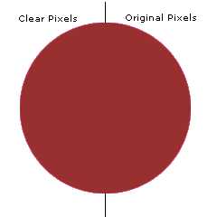
I have followed several tutorials, but I can NEVER get my GIF's to be clear. Would someone take my sample psd, and edit the left side of the red circle to make it appear crisp but leave the right side alone so that I can compare?
Also, are they any "special" settings that I need to make gifs?
ThankS!
FG
using: Photoshop CS
_________________
I love Photshop! |
|
|
|
|
 |
Gallo_Pinto

Joined: 15 Jul 2005
Posts: 785
Location: BC, Canada
|
 Posted: Fri Jan 06, 2006 2:04 am Post subject: Posted: Fri Jan 06, 2006 2:04 am Post subject: |
 |
|
by "clear" do you mean simply "have transparency"?
As far as I know, the only thing you need to do is, when you save as a gif, it'll give you a litlle dialog box, and you need to check the littlle box that says "transparency". If this isn't what you meant, please clarify.
_________________
brush your hair and comb your teeth |
|
|
|
|
 |
flash gordon
Joined: 14 Jun 2005
Posts: 32
|
 Posted: Fri Jan 06, 2006 2:09 am Post subject: Posted: Fri Jan 06, 2006 2:09 am Post subject: |
 |
|
By clear I also mean crisp.
My images come out very jagged and not crisp.
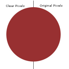
Notice how the border of the ball of the gif is not crisp compared to the jpg.
Hopefully that is clearer.
| Description: |
|
| Filesize: |
25.33 KB |
| Viewed: |
954 Time(s) |

|
| Description: |
|
| Filesize: |
1.1 KB |
| Viewed: |
954 Time(s) |

|
_________________
I love Photshop! |
|
|
|
|
 |
Gallo_Pinto

Joined: 15 Jul 2005
Posts: 785
Location: BC, Canada
|
 Posted: Fri Jan 06, 2006 2:19 am Post subject: Posted: Fri Jan 06, 2006 2:19 am Post subject: |
 |
|
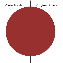
is this better?
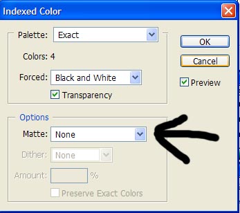
upon inspection, it looks great. the trick is simple. in that save option dialog, there's a thing that says "matte colour". the basic idea with this is that you set your foreground colour to the colour of the background against which your image is going to sit. IN this case I knew it would be that add blue-ish stuff, so I set that as my FG colour and then selected "foreground colour" from that dropdown. As you can see it looks really nice.
| Description: |
|
| Filesize: |
2.34 KB |
| Viewed: |
948 Time(s) |

|
_________________
brush your hair and comb your teeth |
|
|
|
|
 |
Gallo_Pinto

Joined: 15 Jul 2005
Posts: 785
Location: BC, Canada
|
 Posted: Fri Jan 06, 2006 2:23 am Post subject: Posted: Fri Jan 06, 2006 2:23 am Post subject: |
 |
|
now I post the image again against a different colour of background

and it probably won't look very nice at all.
So all you have to do is use an appropriate matte colour.
-=edit=-
oddly enough, it still looks nice. Probably because the colour is quite similar.
Let's try one with a really whacked-out matte colour..
_________________
brush your hair and comb your teeth |
|
|
|
|
 |
Gallo_Pinto

Joined: 15 Jul 2005
Posts: 785
Location: BC, Canada
|
 Posted: Fri Jan 06, 2006 2:26 am Post subject: Posted: Fri Jan 06, 2006 2:26 am Post subject: |
 |
|
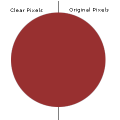
here's one with a mid-orange matte
and it looks terrible again. So the conclusion is, the matte doesn;'t have to be perfect, anything close will work a treat.
| Description: |
|
| Filesize: |
2.33 KB |
| Viewed: |
940 Time(s) |

|
_________________
brush your hair and comb your teeth |
|
|
|
|
 |
flash gordon
Joined: 14 Jun 2005
Posts: 32
|
 Posted: Fri Jan 06, 2006 2:34 am Post subject: Posted: Fri Jan 06, 2006 2:34 am Post subject: |
 |
|
Thanks friend!
I'll give that a try and post back!
_________________
I love Photshop! |
|
|
|
|
 |
flash gordon
Joined: 14 Jun 2005
Posts: 32
|
 Posted: Fri Jan 06, 2006 2:40 am Post subject: Posted: Fri Jan 06, 2006 2:40 am Post subject: |
 |
|
This this what you mean to change:
I went to File-->Save As-->change it to GIF
| Description: |
|
| Filesize: |
47.54 KB |
| Viewed: |
929 Time(s) |

|
_________________
I love Photshop! |
|
|
|
|
 |
flash gordon
Joined: 14 Jun 2005
Posts: 32
|
 Posted: Fri Jan 06, 2006 2:44 am Post subject: Posted: Fri Jan 06, 2006 2:44 am Post subject: |
 |
|
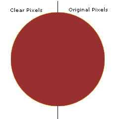
Testing:
EDIT: Could have been a little better. I guess the MATTE was off slightly.
Thanks for all the help!
| Description: |
|
| Filesize: |
2.33 KB |
| Viewed: |
926 Time(s) |

|
_________________
I love Photshop! |
|
|
|
|
 |
Gallo_Pinto

Joined: 15 Jul 2005
Posts: 785
Location: BC, Canada
|
 Posted: Fri Jan 06, 2006 1:09 pm Post subject: Posted: Fri Jan 06, 2006 1:09 pm Post subject: |
 |
|
that looks almost as if you've used a bright red matte. Make sure you've actually got the right colour as your foreground. The foreground colour is the one with the complete square visible in the tolbar, so you should put a grey there, then select foreground from the matte dropdown.
if you want the colour to be perfect, you can cheat like me and get the colour from a screenshot.
_________________
brush your hair and comb your teeth |
|
|
|
|
 |
|


