|
|
| Author |
Message |
AgfaD2
Joined: 03 Nov 2005
Posts: 267
Location: California
PS Version: Photoshop 9.0 CS2
OS: Windows XP Pro SP2/VISTA ULTIMATE
|
 Posted: Fri Nov 04, 2005 11:24 am Post subject: Posted: Fri Nov 04, 2005 11:24 am Post subject: |
 |
|
Well this is what I got...Still having trouble here.
|
|
|
|
|
 |
AgfaD2
Joined: 03 Nov 2005
Posts: 267
Location: California
PS Version: Photoshop 9.0 CS2
OS: Windows XP Pro SP2/VISTA ULTIMATE
|
 Posted: Fri Nov 04, 2005 1:00 pm Post subject: Posted: Fri Nov 04, 2005 1:00 pm Post subject: |
 |
|
Heres what I finally came up with....still unhappy with my results. Any opinions on what I should do next?
p.s. dont mind the white borders on the image. I had to do that for printing purposes.
-chris
|
|
|
|
|
 |
lasa

Joined: 08 Aug 2005
Posts: 1090
Location: Florida
PS Version: CS
OS: MS XP
|
 Posted: Fri Nov 04, 2005 2:33 pm Post subject: Posted: Fri Nov 04, 2005 2:33 pm Post subject: |
 |
|
Would it be safe to say you're not a Masking person...so..
Turn off all layers, nothing on screen, turn on only the graphic layer.
You can erase your way around the inner square leaving the hollies and leave alone...use which ever selection tool you like. (magic wand in combination with Alt + rectangular tool worked for me)
Then forget everything we've done to date.
Nowy the order should be:
Text top
Graphic frame second
added Picture below
White below as a background ( not really needed if the picture is big enough)
Good luck,
Lasa
|
|
|
|
|
 |
lasa

Joined: 08 Aug 2005
Posts: 1090
Location: Florida
PS Version: CS
OS: MS XP
|
 Posted: Fri Nov 04, 2005 2:48 pm Post subject: Posted: Fri Nov 04, 2005 2:48 pm Post subject: |
 |
|
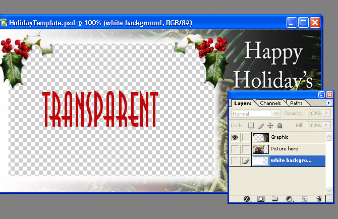
Erase it to look something like this...
then layer it accordingly
Lasa
| Description: |
|
| Filesize: |
116.18 KB |
| Viewed: |
457 Time(s) |

|
|
|
|
|
|
 |
AgfaD2
Joined: 03 Nov 2005
Posts: 267
Location: California
PS Version: Photoshop 9.0 CS2
OS: Windows XP Pro SP2/VISTA ULTIMATE
|
 Posted: Fri Nov 04, 2005 9:08 pm Post subject: Posted: Fri Nov 04, 2005 9:08 pm Post subject: |
 |
|
Funny thing is your explinations are very detailed to me, BUT still I cannot figure it out with the 'layers' part. Basically what I did was set the 'original' picture on top of the graphic layer & then used the erasor tool at a low opacity, THEN with the clone stamp went in and cleaned up the bad looking areas.
Still didnt look as nearly as your examples but it defiantly got me through today. I'd love to learn more.
But what I also was playing around with was the "feather" and couldnt really figure that out as well. Cause I didnt want the "hard" edges around the original picture..
Thank you sooo much for all your time and help with me!
Chris
|
|
|
|
|
 |
AgfaD2
Joined: 03 Nov 2005
Posts: 267
Location: California
PS Version: Photoshop 9.0 CS2
OS: Windows XP Pro SP2/VISTA ULTIMATE
|
 Posted: Fri Nov 04, 2005 9:31 pm Post subject: Posted: Fri Nov 04, 2005 9:31 pm Post subject: |
 |
|
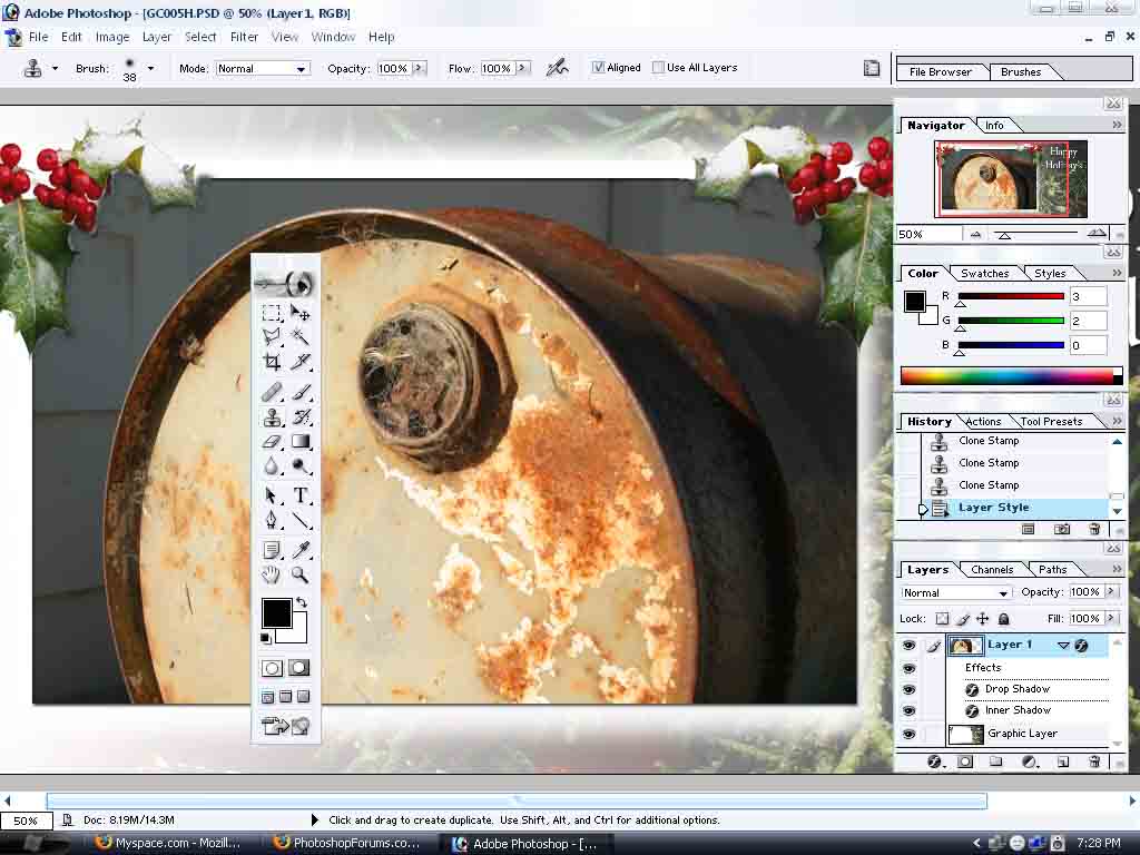
heres something i just completed...
again not nearly as good as yours but getting there...
Still cannot figure out to get the hard edges smoother..
Chris
| Description: |
|
| Filesize: |
93.79 KB |
| Viewed: |
434 Time(s) |

|
|
|
|
|
|
 |
lasa

Joined: 08 Aug 2005
Posts: 1090
Location: Florida
PS Version: CS
OS: MS XP
|
 Posted: Fri Nov 04, 2005 10:16 pm Post subject: Posted: Fri Nov 04, 2005 10:16 pm Post subject: |
 |
|
Good job!! This is not a easy program to learn, for some reason it's anti-intuitive in the beginning... later it's just confusing....kidding kinda.
Congratulations
Lasa
_________________
Lasa
My hobbie: www.angulo-webdesign-templates.threefooter.com
Treat people the way you want to be treated... |
|
|
|
|
 |
|


