|
|
| Author |
Message |
ronmatt

Joined: 30 Jun 2005
Posts: 94
Location: paradise, Ca
|
 Posted: Fri Sep 16, 2005 4:33 pm Post subject: winamp shell Posted: Fri Sep 16, 2005 4:33 pm Post subject: winamp shell |
 |
|
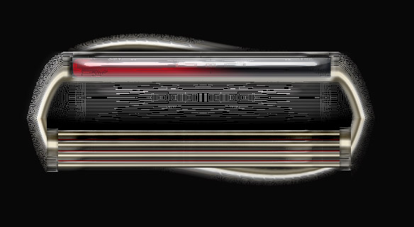
thought I'd try a shell. I'll be taking it slow and would appreciate some critiques. This is a gothic-tek look.
| Description: |
|
| Filesize: |
55.6 KB |
| Viewed: |
1022 Time(s) |
|
_________________
there is no finish line |
|
|
|
|
 |
Jersey Hacker
Joined: 08 Jun 2005
Posts: 864
Location: Jersey, Channel Islands, UK
|
| Posted: Fri Sep 16, 2005 4:36 pm Post subject: |
|
|
I think the shape is very good, but i think that the textures could be worked on, cos at the moment, it makes teh textures, as in the insides of the parts, look like its just a fuzz of a bad quality image, so that should be workd on, ptherwise, good start
_________________
www.jerseyhacker.co.uk
Free File Uploader for Everyone to use |
|
|
|
|
|
ronmatt
Joined: 30 Jun 2005
Posts: 94
Location: paradise, Ca
|
| Posted: Fri Sep 16, 2005 4:57 pm Post subject: |
|
|
too soft ya think? I sort of wanted an antiquey[?] look to it. I think my mistake is that I habitually started it at 600dpi, then reduced the size. But at this very early stage, it's the concept I'm concerned with.
_________________
there is no finish line |
|
|
|
|
|
Jersey Hacker
Joined: 08 Jun 2005
Posts: 864
Location: Jersey, Channel Islands, UK
|
| Posted: Sat Sep 17, 2005 2:23 am Post subject: |
|
|
No, all im saying is, i think the lines in the middle of the black bit, are very messy, and rather than looking as if those lines are there on purpose, it looks as if its a very bad quality image, and the lines are just a fuzzy mess
_________________
www.jerseyhacker.co.uk
Free File Uploader for Everyone to use |
|
|
|
|
|
ronmatt
Joined: 30 Jun 2005
Posts: 94
Location: paradise, Ca
|
| Posted: Sat Sep 17, 2005 4:37 am Post subject: |
|
|
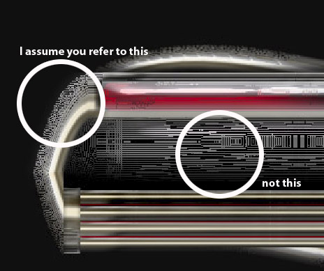
The center section I like as is. as for the 'outside' edges, you're right. They did fall apart. It's fixable I think. Although this wouldn't be the final art. This is a conceptual only. I also have the next step
| Description: |
|
| Filesize: |
197.62 KB |
| Viewed: |
1007 Time(s) |
|
| Description: |
|
| Filesize: |
72.77 KB |
| Viewed: |
1007 Time(s) |
|
_________________
there is no finish line |
|
|
|
|
|
Jersey Hacker
Joined: 08 Jun 2005
Posts: 864
Location: Jersey, Channel Islands, UK
|
| Posted: Sat Sep 17, 2005 5:30 am Post subject: |
|
|
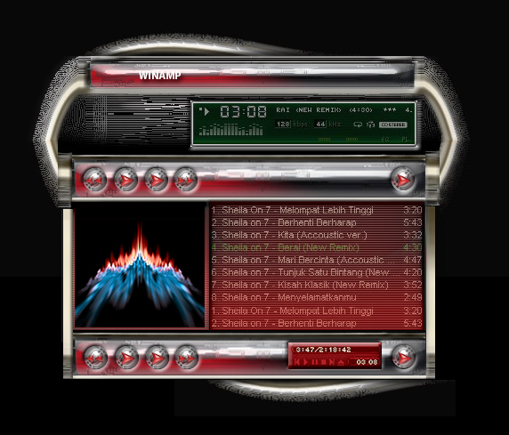
Actually, i was referring to the middle selection (the thing you labelled "not this", lol) i think its abit weird, i also dont like the outside edges, but thats just me, oh and also, i think it looks much better now that most of the middle is occuped with information and a bar, looks very nice, keep it up
_________________
www.jerseyhacker.co.uk
Free File Uploader for Everyone to use |
|
|
|
|
|
Gallo_Pinto

Joined: 15 Jul 2005
Posts: 785
Location: BC, Canada
|
| Posted: Mon Oct 17, 2005 8:27 pm Post subject: |
|
|
Your desing is excellent, I like the patterning and the colours. however, as a religious winamp user, I find skins that are big to be annoying. Your skin is a little wider than it needs to be. it would be cool if tat area to the left of the main window could dissapear, and maybe slide out for the EQ or options?
_________________
brush your hair and comb your teeth |
|
|
|
|
|
|


