Posted: Tue Sep 13, 2005 1:01 am Post subject: Wooop, new sigs
hey guys can you please tell me what you think of these
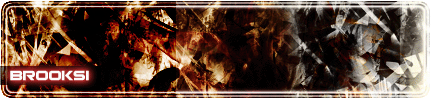
Brooksi.gif
Description:
Filesize:
35.58 KB
Viewed:
738 Time(s)
_________________ Dialog box's are trouble,
Cliking yes will shut everything down,
Clicking no will freeze everything your doing,
Clicking cancel will just get you another one.
Posted: Tue Sep 13, 2005 1:02 am Post subject: The 2nd one
.2nd
fire2.gif
Description:
Filesize:
30.12 KB
Viewed:
736 Time(s)
_________________ Dialog box's are trouble,
Cliking yes will shut everything down,
Clicking no will freeze everything your doing,
Clicking cancel will just get you another one.
Joined: 08 Jun 2005
Posts: 864
Location: Jersey, Channel Islands, UK
Posted: Tue Sep 13, 2005 6:33 am Post subject:
I like the first one alot, i think that the contrast between colour to greyscale is great, but i think the edges are abit boxy, and the second one i think the background is quite well brushed, but abit on the repetitive side, and i dont like the text, because i think the stoke is too large,maybe change is too a 2 or 1 px stroke, or even better, no stroke at all _________________ www.jerseyhacker.co.uk
The first one shows good crap(you know contrast, repetition, alignment, and proximary) and the text goes good with it. The second one is a bit to dark in some spots and pluse the outer glow on the text really doesn't make it stand out. But its good to see that you put in good effort into both of them, especially with using the brushes.
You cannot post new topics in this forum You cannot reply to topics in this forum You cannot edit your posts in this forum You cannot delete your posts in this forum You cannot vote in polls in this forum You cannot attach files in this forum You can download files in this forum