|
|
| Author |
Message |
AFRANCIS
Joined: 09 May 2005
Posts: 12
|
 Posted: Thu Aug 25, 2005 6:11 pm Post subject: 3d halloween text Posted: Thu Aug 25, 2005 6:11 pm Post subject: 3d halloween text |
 |
|
hi does any body have any ideas for spooky 3d halloween text for a nightclub flyer? or actions or text effects
i want a nice eyecatching 3d style thats suits the theme halloween havoc
_________________
AFRANCS |
|
|
|
|
 |
stevealmighty

Joined: 14 Jul 2005
Posts: 335
Location: upstate NY (WAY UPSTATE!)
|
 Posted: Fri Aug 26, 2005 5:40 am Post subject: Posted: Fri Aug 26, 2005 5:40 am Post subject: |
 |
|
Best bet is to do a google search for it. Download it and then go to town making your flyers!
_________________
All gave some, some gave all.....Lest we forget that war produces veterans, wounded both mentally and physically, and it is our job to help them now, as they have already helped us all in ways we will never know, and in ways that we take for granted every day. |
|
|
|
|
 |
lasa

Joined: 08 Aug 2005
Posts: 1090
Location: Florida
PS Version: CS
OS: MS XP
|
 Posted: Fri Aug 26, 2005 4:56 pm Post subject: Posted: Fri Aug 26, 2005 4:56 pm Post subject: |
 |
|
|
|
|
|
|
 |
Gallo_Pinto

Joined: 15 Jul 2005
Posts: 785
Location: BC, Canada
|
 Posted: Sat Aug 27, 2005 1:17 am Post subject: Posted: Sat Aug 27, 2005 1:17 am Post subject: |
 |
|
if it were me I'd use a big fat font, a bit rough maybe, and try to make it looke like a pump[kin cut-out with a lot of inner bevel, a texture overlay, and a bit of glow.
_________________
brush your hair and comb your teeth |
|
|
|
|
 |
AFRANCIS
Joined: 09 May 2005
Posts: 12
|
 Posted: Sat Aug 27, 2005 11:30 am Post subject: Posted: Sat Aug 27, 2005 11:30 am Post subject: |
 |
|
Wanna have a try and upload what u came out with
_________________
AFRANCS |
|
|
|
|
 |
Gallo_Pinto

Joined: 15 Jul 2005
Posts: 785
Location: BC, Canada
|
 Posted: Sat Aug 27, 2005 12:00 pm Post subject: Posted: Sat Aug 27, 2005 12:00 pm Post subject: |
 |
|
okay, so here the problem is that I really don't want a shadow. However, if I try to change the shadow colour to work like a highlight, it looks terrible because the texture does not show through.
I've cut through the letters in such a way that it would be feasible to actually carve them in a pumpkin. Anyway the result is terrible and I'm ashamed to actually post it, but here you go...
| Description: |
|
| Filesize: |
182.61 KB |
| Viewed: |
798 Time(s) |

|
_________________
brush your hair and comb your teeth |
|
|
|
|
 |
Gallo_Pinto

Joined: 15 Jul 2005
Posts: 785
Location: BC, Canada
|
 Posted: Sat Aug 27, 2005 12:01 pm Post subject: Posted: Sat Aug 27, 2005 12:01 pm Post subject: |
 |
|
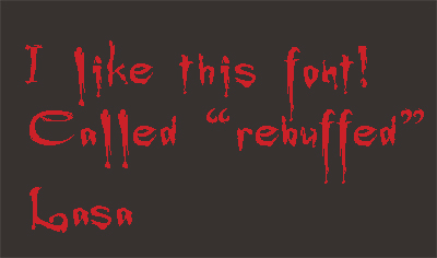
| lasa wrote: | I've always enjoyed this font "rebuffed".. a take off of Buffy the vampire slayer.
Lasa |
There's also a good and fairly similar one called "chiller"
_________________
brush your hair and comb your teeth |
|
|
|
|
 |
SCync
Joined: 28 Jan 2005
Posts: 98
Location: Montreal
|
 Posted: Sun Aug 28, 2005 9:29 am Post subject: Posted: Sun Aug 28, 2005 9:29 am Post subject: |
 |
|
You're best off to choose a font that suits your graphic content, than going the other way around. Halloween is one of those themes that gives you a lot of liberty to use those shlocky fonts available at the freebie font sites, like daFont.
As for the 3D aspect, any search for tutorials will get you 3 trillion one hundred million an two results. 
|
|
|
|
|
 |
|


