|
|
| Author |
Message |
mhalweg
Joined: 08 Aug 2005
Posts: 67
Location: waunakee wisconsin
|
 Posted: Mon Aug 08, 2005 12:42 pm Post subject: help with effect Posted: Mon Aug 08, 2005 12:42 pm Post subject: help with effect |
 |
|
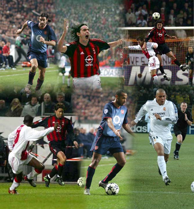
afternoon. i can't figure out how to fade pics like the ones in collage that i've attached. i've looked and looked for tutorials but i can't do it. all i can get is using a gradient that goes from a color to transparent. would like to b able to make my collage have the same effect as the attachment. thx
matt[/img]
| Description: |
|
| Filesize: |
87.37 KB |
| Viewed: |
699 Time(s) |

|
|
|
|
|
|
 |
swanseamale47
Joined: 23 Nov 2004
Posts: 1478
Location: Swansea UK
|
 Posted: Mon Aug 08, 2005 3:20 pm Post subject: Posted: Mon Aug 08, 2005 3:20 pm Post subject: |
 |
|
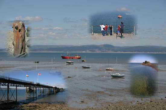
I would just add the other pics on as layers and with a soft opacity erasier rub out the edges. I just did this to show what I mean. Wayne
| Description: |
|
| Filesize: |
53.14 KB |
| Viewed: |
691 Time(s) |

|
|
|
|
|
|
 |
mhalweg
Joined: 08 Aug 2005
Posts: 67
Location: waunakee wisconsin
|
 Posted: Mon Aug 08, 2005 7:42 pm Post subject: Posted: Mon Aug 08, 2005 7:42 pm Post subject: |
 |
|
k thx much.
matt
|
|
|
|
|
 |
Tristan Gray
Joined: 05 Aug 2005
Posts: 47
Location: Halifax, Nova Scotia, Canada
|
 Posted: Tue Aug 09, 2005 7:17 am Post subject: Posted: Tue Aug 09, 2005 7:17 am Post subject: |
 |
|
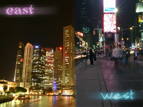
There is also another way. Although using the brush can often do the same sort of thing with more control. Simply get the two images you want on their own layers and line them up as you want. Make a selection where you want them to blend. Select > Feather enter 20 and then simply highlight the topmost layer and hit 'delete' to clear the selection. Now the images will fade together.
Here is a quick example.
| Description: |
|
| Filesize: |
144.38 KB |
| Viewed: |
664 Time(s) |

|
|
|
|
|
|
 |
Jersey Hacker
Joined: 08 Jun 2005
Posts: 864
Location: Jersey, Channel Islands, UK
|
 Posted: Tue Aug 09, 2005 7:19 am Post subject: Posted: Tue Aug 09, 2005 7:19 am Post subject: |
 |
|
Yes teh way tristan suggested is the way id do it, but id also edit the bit you feahered, place it on its own layer and play with the blend mode of the layer
_________________
www.jerseyhacker.co.uk
Free File Uploader for Everyone to use |
|
|
|
|
 |
Tristan Gray
Joined: 05 Aug 2005
Posts: 47
Location: Halifax, Nova Scotia, Canada
|
 Posted: Tue Aug 09, 2005 7:22 am Post subject: Posted: Tue Aug 09, 2005 7:22 am Post subject: |
 |
|
Yeah best result is doing it like I did and then cleaning it up afterwards with blending modes and then maybe using a certain opacity eraser to widen the fade if needed. It is pretty easy and in my opinion becoming an over-used effect. That image of the soccer players is really ugly, it is best to keep it simple with an effect like this because if you just start adding blended images with no coherency the image becomes really unbalanced.
|
|
|
|
|
 |
mhalweg
Joined: 08 Aug 2005
Posts: 67
Location: waunakee wisconsin
|
 Posted: Tue Aug 09, 2005 7:51 am Post subject: Posted: Tue Aug 09, 2005 7:51 am Post subject: |
 |
|
|
|
|
|
|
 |
Tristan Gray
Joined: 05 Aug 2005
Posts: 47
Location: Halifax, Nova Scotia, Canada
|
 Posted: Tue Aug 09, 2005 9:33 am Post subject: Posted: Tue Aug 09, 2005 9:33 am Post subject: |
 |
|
Use a larger brush with less opacity. That transition is still a little too sharp in my opinion.
|
|
|
|
|
 |
mhalweg
Joined: 08 Aug 2005
Posts: 67
Location: waunakee wisconsin
|
 Posted: Tue Aug 09, 2005 10:33 am Post subject: Posted: Tue Aug 09, 2005 10:33 am Post subject: |
 |
|
ok i'll try it most likely 2nite. when u say less opacity do u mean a higher percentage or lower? and what about brush hardness? i used 31 hardness and 50% opacity. thx
matt
|
|
|
|
|
 |
Tristan Gray
Joined: 05 Aug 2005
Posts: 47
Location: Halifax, Nova Scotia, Canada
|
 Posted: Tue Aug 09, 2005 10:51 am Post subject: Posted: Tue Aug 09, 2005 10:51 am Post subject: |
 |
|
I mean lesser percentage and hardness just play with but you don't want the borders to be too stark. Also, try using the other method I suggested to make the image seem a little more structured instead of just random images floating about in abstract space.
|
|
|
|
|
 |
|


