|
|
| Author |
Message |
WhoMikeJones
Joined: 28 Apr 2005
Posts: 22
|
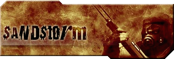
 Posted: Wed Jun 08, 2005 8:51 am Post subject: my new sandstorm sig Posted: Wed Jun 08, 2005 8:51 am Post subject: my new sandstorm sig |
 |
|
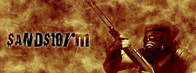
what do u think
| Description: |
|
| Filesize: |
55.56 KB |
| Viewed: |
733 Time(s) |
|
|
|
|
|
|
 |
ekosh

Joined: 01 Jun 2005
Posts: 216
Location: US of A
|
| Posted: Wed Jun 08, 2005 10:58 pm Post subject: |
|
|
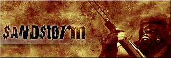
it needs some sort of border there is too much dead space maybe something like this even just adding a simple bevel edge I think makes them pop out better it just needs some finishing touches
| Description: |
|
| Filesize: |
43.97 KB |
| Viewed: |
715 Time(s) |
|
|
|
|
|
|
|
FadedinPS23

Joined: 27 Dec 2004
Posts: 183
|
| Posted: Thu Jun 09, 2005 12:28 am Post subject: |
|
|
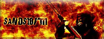
What about this?
| Description: |
|
| Filesize: |
57.92 KB |
| Viewed: |
708 Time(s) |
|
|
|
|
|
|
|
Xopods

Joined: 19 Apr 2005
Posts: 96
Location: Montreal, Quebec
|
| Posted: Thu Jun 09, 2005 7:39 am Post subject: |
|
|
I'm not sure I like either of the "improvements." Adding a border is never a good thing. Borders = bad. Open design = good. If anything, I'd suggest letting the edge bleed a bit. As for FadedinPS23's idea, it looks okay, but now looks more like a firestorm than a sandstorm. It jumps out more, sure, but maybe Mike is after a something more subtle.
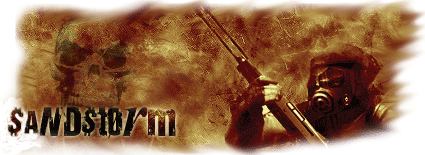
So, yeah, overall, I like the original best. I agree it needs a little something, though. I don't like where the text is. How about moving it into the bottom right and adding some very faint watermark-style image to the left side? Here's a quick job, just to give you the idea. Pardon the crappy clonebrushing because I don't have a layered image to work with.
| Description: |
|
| Filesize: |
41.25 KB |
| Viewed: |
696 Time(s) |
|
|
|
|
|
|
|
Xopods
Joined: 19 Apr 2005
Posts: 96
Location: Montreal, Quebec
|
| Posted: Thu Jun 09, 2005 7:42 am Post subject: |
|
|
Damn. Forgot the background in the forums is light blue, instead of white. Obviously, it isn't meant to have this halo. You get the idea, though. Make the edge irregular, have the "sandstorm" bleed off the background and place it somewhere more interesting and maybe add a faint image to the background, though it may even be fine just to leave the space empty.
|
|
|
|
|
|
ekosh
Joined: 01 Jun 2005
Posts: 216
Location: US of A
|
| Posted: Thu Jun 09, 2005 8:01 am Post subject: |
|
|
technically doing the irregular edge gives the same type of bordr I used itjust gives it a more finished look to do something, his image doesnt look complete, I do agree however that an irregular edge can add a lot to it
| Description: |
|
| Filesize: |
35.13 KB |
| Viewed: |
689 Time(s) |
|
|
|
|
|
|
|
Proprius
Joined: 28 Feb 2005
Posts: 137
|
| Posted: Thu Jun 09, 2005 12:02 pm Post subject: |
|
|
I really like the irregular edge. It makes it appear that the sand in the image is literally blowing off (kinda). I would take that even further, and enhance the bleeding with individual grains of sand.
|
|
|
|
|
|
Xopods
Joined: 19 Apr 2005
Posts: 96
Location: Montreal, Quebec
|
| Posted: Fri Jun 10, 2005 6:57 am Post subject: |
|
|
You could also bleed more than just the name. You could, for instance, have the guy's gun extend out of the edge on both sides.
|
|
|
|
|
|
|


