|
|
| Author |
Message |
explosion242

Joined: 05 Apr 2005
Posts: 31
|
 Posted: Mon Jun 06, 2005 10:29 pm Post subject: please let me know what you think..... Posted: Mon Jun 06, 2005 10:29 pm Post subject: please let me know what you think..... |
 |
|
By the way I really like this board! I have been playing with PS lately and wanted to get some advice on a graphic I have created. Let me know what you like and what you dont like.
Let me have it.
| Description: |
|
| Filesize: |
32.28 KB |
| Viewed: |
1044 Time(s) |

|
_________________
::::explosion242:::: |
|
|
|
|
 |
def1
Joined: 30 Apr 2005
Posts: 223
|
| Posted: Mon Jun 06, 2005 10:39 pm Post subject: |
|
|
kinda boring but good for a first start
|
|
|
|
|
|
Aldog

Joined: 27 May 2005
Posts: 51
Location: Taylorsville
|
| Posted: Tue Jun 07, 2005 11:13 am Post subject: |
|
|
I like the look of the text, but it seems to get lost in the background...somehow...although that may not make sense, but my opinion none the less.
maybe give it a drop shadow or something, or take off the bevel/inner shadow...
the background is a little bland as well.
_________________
A.D. |
|
|
|
|
|
Xopods

Joined: 19 Apr 2005
Posts: 96
Location: Montreal, Quebec
|
| Posted: Tue Jun 07, 2005 11:54 am Post subject: |
|
|
I like the way the background looks abstract at first, then when you look again, you see the glasses and the face. However, the colour scheme is awful, and ruins the whole design.
|
|
|
|
|
|
explosion242
Joined: 05 Apr 2005
Posts: 31
|
| Posted: Wed Jun 08, 2005 1:13 pm Post subject: |
|
|
Thanks for the advice. I will attempt to redo the design. I thought the background shouln't be that distracting, but i do think the text is boring and missing something. Any other ideas, suggestions?
_________________
::::explosion242:::: |
|
|
|
|
|
DaWizz
Joined: 02 Jun 2005
Posts: 12
|
| Posted: Wed Jun 08, 2005 1:44 pm Post subject: |
|
|
I think the text doesn't quite fit the backround but it doen't really stand out either so it just looks like text dropped onto a backround instead of one whole image
|
|
|
|
|
|
explosion242
Joined: 05 Apr 2005
Posts: 31
|
| Posted: Mon Jun 13, 2005 9:51 pm Post subject: |
|
|
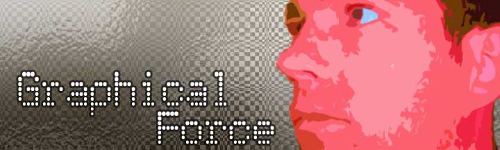
Well here is a whole new design. What do you think?
| Description: |
|
| Filesize: |
21 KB |
| Viewed: |
961 Time(s) |
|
_________________
::::explosion242:::: |
|
|
|
|
|
def1
Joined: 30 Apr 2005
Posts: 223
|
| Posted: Mon Jun 13, 2005 10:09 pm Post subject: |
|
|
i like the text, the bg is cool(by the way is that a pattern overlay of the checkers and some ocean ripples?) the fave could be better
|
|
|
|
|
|
Xopods
Joined: 19 Apr 2005
Posts: 96
Location: Montreal, Quebec
|
| Posted: Tue Jun 14, 2005 6:54 am Post subject: |
|
|
The face is brightly coloured but without much texture, so it looks kind of weird on a patterned grey background. Obviously, you don't want it to be on another bright colour, but maybe a subdued complimentary colour, like a grey-cyan. Alternately, you could leave the background B&W but colour the text green or cyan and have some balance in the design that way.
I kind of like how the text is placed, except the letters in Force should probably be aligned with the ones in "Graphical", since it's a fixed width font. I don't mean that you have to put the "F" under the "G", but align it with, say, the "c", so the "o" aligns with the "a" and the "r" aligns with the "l".
The little bit of trapped space behind your neck bothers me, too. I'd move the head a bit to the right to get rid of that.
/Alex
|
|
|
|
|
|
explosion242
Joined: 05 Apr 2005
Posts: 31
|
| Posted: Tue Jun 14, 2005 7:13 am Post subject: |
|
|
Yeah, the colors were the thing that were bothering me also. So maybe change the colors of the background and mybe no pattern background? I will try some other placement of the image and the text. Thanks.
_________________
::::explosion242:::: |
|
|
|
|
|
|


