|
|
| Author |
Message |
zorg222

Joined: 25 May 2005
Posts: 59
|
 Posted: Fri May 27, 2005 2:55 pm Post subject: Yoda Sig Posted: Fri May 27, 2005 2:55 pm Post subject: Yoda Sig |
 |
|
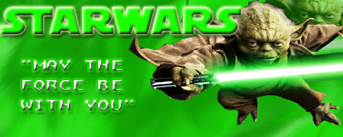
Thougts???
| Description: |
|
| Filesize: |
37.87 KB |
| Viewed: |
555 Time(s) |
|
_________________
Alienation Skins
If you want top quality GFX, skins, and resources for your forum, Alienation Skins is the place to go. |
|
|
|
|
 |
theyapps
Joined: 25 May 2005
Posts: 44
|
| Posted: Fri May 27, 2005 3:04 pm Post subject: |
|
|
The first think that pops out at me is Yoda looks kinda tossed in maybe you could blend him in a little bit more and maybe put a border on the whole thing. Also maybe try some more colors theres alot of green there.
_________________
Don't Panic |
|
|
|
|
|
def1
Joined: 30 Apr 2005
Posts: 223
|
| Posted: Fri May 27, 2005 3:47 pm Post subject: |
|
|
its cool but too much green
|
|
|
|
|
|
zorg222
Joined: 25 May 2005
Posts: 59
|
| Posted: Fri May 27, 2005 4:35 pm Post subject: |
|
|
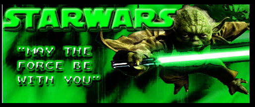
How's this?
| Description: |
|
| Filesize: |
46.78 KB |
| Viewed: |
534 Time(s) |
|
_________________
Alienation Skins
If you want top quality GFX, skins, and resources for your forum, Alienation Skins is the place to go. |
|
|
|
|
|
Haunus

Joined: 24 Nov 2004
Posts: 740
|
| Posted: Fri May 27, 2005 4:56 pm Post subject: |
|
|
Much better, but I dont like the style you used for the may the force be with you text, but thats just prefrence.
|
|
|
|
|
|
Shadow

Joined: 18 Mar 2005
Posts: 201
Location: N.B., Canada
|
| Posted: Fri May 27, 2005 8:40 pm Post subject: |
|
|
hmm, personally I liked the first one better, but keep it up, grab some brushes, and learn some good blending techniques, and work on your text, Text and font desicions can either make ur sig look really good or really bad.
A good font size would be 14-20, for the dominant name or word, and the quote should be 10 pixels or less.
Looks good though keep tryin 
|
|
|
|
|
|
zorg222
Joined: 25 May 2005
Posts: 59
|
| Posted: Fri May 27, 2005 8:48 pm Post subject: |
|
|
thanks guys
_________________
Alienation Skins
If you want top quality GFX, skins, and resources for your forum, Alienation Skins is the place to go. |
|
|
|
|
|
|


