|
|
| Author |
Message |
Xopods

Joined: 19 Apr 2005
Posts: 96
Location: Montreal, Quebec
|
 Posted: Mon May 23, 2005 10:50 am Post subject: Wallpaper experiment Posted: Mon May 23, 2005 10:50 am Post subject: Wallpaper experiment |
 |
|
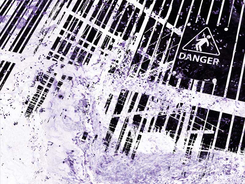
Here's a quick Photoshop job I did using two of my photos. I took a photo of water splashing over rocks, converted it to B&W, pumped the contrast and darkened it down. Next, I applied a Threshold to an image of a power substation with a warning sign, used that as a selection on the water image and inverted it. Lastly, I colorised the whole thing purple.
I think it would make good wallpaper, so I saved it at 800x600, but I worry that because it's so dark, some icons may not stand out very well. You could always take the rectangular marquee and change the colour it whatever region of the desktop you keep your icons.
Critiques?
| Description: |
|
| Filesize: |
174.55 KB |
| Viewed: |
542 Time(s) |
|
|
|
|
|
|
 |
Haunus

Joined: 24 Nov 2004
Posts: 740
|
| Posted: Tue May 24, 2005 3:14 am Post subject: |
|
|
its very strange, but I dont like the water, I think it would have been awsome if you'd left that out or made it smaller...but thats just my opinion.
|
|
|
|
|
|
Xopods
Joined: 19 Apr 2005
Posts: 96
Location: Montreal, Quebec
|
| Posted: Tue May 24, 2005 10:35 am Post subject: |
|
|
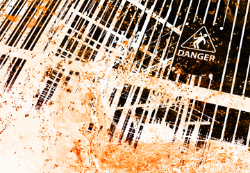
How about if it's in a different colour, to make it look fiery, like this? If I took out the water texture entirely, it would just be black and white line art.
| Description: |
|
| Filesize: |
181.18 KB |
| Viewed: |
525 Time(s) |
|
|
|
|
|
|
|
Haunus
Joined: 24 Nov 2004
Posts: 740
|
| Posted: Tue May 24, 2005 1:58 pm Post subject: |
|
|
Thats much better, but black and white line art is cool lol 
|
|
|
|
|
|
Xopods
Joined: 19 Apr 2005
Posts: 96
Location: Montreal, Quebec
|
| Posted: Tue May 24, 2005 5:55 pm Post subject: |
|
|
It is and it isn't. B&W line art done by hand with brush and ink will always be cool, but Photoshop has cheapened it, like it has most everything else. Not that what I have here isn't cheap, but at least it's a cheap digital effect that would be hard to achieve by hand, rather than cheap digital fakery of a high-quality handmade style.
|
|
|
|
|
|
Haunus
Joined: 24 Nov 2004
Posts: 740
|
| Posted: Tue May 24, 2005 5:59 pm Post subject: |
|
|
indeed, either way I like the newer "fiery" version, its much livelier and appealing.
|
|
|
|
|
|
BryanDowning

Joined: 05 Jul 2004
Posts: 1554
Location: California, USA
|
| Posted: Sun May 29, 2005 5:15 pm Post subject: |
|
|
I like both versions very much. Great work.
_________________
Best Regards,
Bryan Downing
bryandowning.com |
|
|
|
|
|
|


