|
|
| Author |
Message |
Haunus

Joined: 24 Nov 2004
Posts: 740
|
 Posted: Thu Apr 28, 2005 3:15 am Post subject: Logo - refraction studios Posted: Thu Apr 28, 2005 3:15 am Post subject: Logo - refraction studios |
 |
|
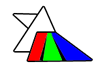
WEll i've been fooling around and heres what I came up with.
| Description: |
|
| Filesize: |
4.36 KB |
| Viewed: |
886 Time(s) |
|
|
|
|
|
|
 |
thehermit
Joined: 05 Mar 2003
Posts: 3987
Location: Cheltenham, UK
|
| Posted: Thu Apr 28, 2005 5:55 am Post subject: |
|
|
It's a little bit 'Clip Art' at the moment. I can see where you are going with the prism idea, but at the moment it looks a little basic.
_________________
If life serves you lemons, make lemonade! |
|
|
|
|
|
Xopods

Joined: 19 Apr 2005
Posts: 96
Location: Montreal, Quebec
|
| Posted: Thu Apr 28, 2005 7:44 am Post subject: |
|
|
The two white triangles next to each other don't look so good. Find a way to make one of them somehow different. A different colour or different texture or something.
The whole thing also needs more alignment and geometry. Right now everything looks placed at random. The three coloured beams of light should have a more consistent geometry and at least one of them should run parallel to the side of the prism. The incoming beam of light should either clearly be heading towards the middle of the prism, or align with the top of it, or something.
A general rule in design: if you're trying to decide where something goes and you find yourself moving it around the page until you say "yeah, that looks about right," then you're doing it wrong. Before placing anything, you should be able to articulate clearly why it goes precisely there, instead of anywhere else. Say you're placing a photo of a woman by the ocean. Something like "this photo goes here because it aligns with the text above it, the strong diagonal line created by the shoreline and the direction the woman is looking draws the reader's attention back towards the centre of the page, and the bright colours of the woman's shirt and the ocean balance the corresponding white space on the left side of the page."
I use that example because page layout is my thing more than logos, but it goes double for logos. A logo has to be simple, so every line counts. If everything works together in a precise, logical way, the logo looks tight, slick. If even one little element is there "just because," it looks sloppy.
I know this all sounds very critical, but don't be discouraged. This is a lot better than your previous attempts - you'll get there.
|
|
|
|
|
|
cyborg
Joined: 12 Oct 2004
Posts: 1102
Location: canada
|
| Posted: Thu Apr 28, 2005 9:50 am Post subject: |
|
|
it reminds me of dark side of the moon....you know Pink floyd
|
|
|
|
|
|
Haunus
Joined: 24 Nov 2004
Posts: 740
|
| Posted: Fri Apr 29, 2005 3:05 am Post subject: |
|
|
Xopods - No problem, thats why I posted it, i'll try some more, but I really have no idea how to make the other white shape any diffren't, it's supposed to be white light hitting the prism.
Cyborg - Tup I listen to pink floyd occasionally, The real diffrence is that the dark side of the moon is "darker in a sense"
|
|
|
|
|
|
cyborg
Joined: 12 Oct 2004
Posts: 1102
Location: canada
|
| Posted: Fri Apr 29, 2005 12:49 pm Post subject: |
|
|
hehe yeah good point
|
|
|
|
|
|
thehermit
Joined: 05 Mar 2003
Posts: 3987
Location: Cheltenham, UK
|
| Posted: Tue May 03, 2005 7:42 pm Post subject: |
|
|
It may not be the best choice of name, it may be a little 'expected' calling yourself a studio - it seems a fairly common name these days. I am trying to be polite, no offense intended.
As for the logo - how about a more lightning bolt of lightning? sounds obvious I know!
|
|
|
|
|
|
Haunus
Joined: 24 Nov 2004
Posts: 740
|
| Posted: Wed May 04, 2005 3:12 am Post subject: |
|
|
| thehermit wrote: | It may not be the best choice of name, it may be a little 'expected' calling yourself a studio - it seems a fairly common name these days. I am trying to be polite, no offense intended.
As for the logo - how about a more lightning bolt of lightning? sounds obvious I know! |
I understand about the name, but I have no clue what you mean about the lightning bolts...
|
|
|
|
|
|
Haunus
Joined: 24 Nov 2004
Posts: 740
|
| Posted: Wed May 04, 2005 3:55 am Post subject: |
|
|
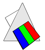
here we go, updated, and i'll call it Refraction Creations:
| Description: |
|
| Filesize: |
10.81 KB |
| Viewed: |
824 Time(s) |
|
|
|
|
|
|
|
Xopods
Joined: 19 Apr 2005
Posts: 96
Location: Montreal, Quebec
|
| Posted: Wed May 04, 2005 6:50 am Post subject: |
|
|
That's much better. Good work. You might want to make the triangle equilateral instead of isoceles, though.
Have you tried making the light vertical instead of diagonal, with the light coming in on the point of the triangle and coming out the bottom? That might create a nice symmetry.
|
|
|
|
|
|
|


