|
|
| Author |
Message |
zenyora
Joined: 29 Apr 2005
Posts: 2
|
 Posted: Fri Apr 29, 2005 4:44 pm Post subject: need help Posted: Fri Apr 29, 2005 4:44 pm Post subject: need help |
 |
|
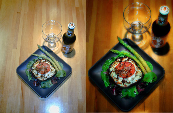
hey dudes..i kind need this for one of my classes but for some resone i cant get right..can help me getting the first picture look like the second one
thanks
| Description: |
|
| Filesize: |
66.59 KB |
| Viewed: |
348 Time(s) |

|
|
|
|
|
|
 |
<aazumak>

Joined: 22 Mar 2005
Posts: 384
Location: rhode island
|
 Posted: Sat Apr 30, 2005 11:02 am Post subject: Posted: Sat Apr 30, 2005 11:02 am Post subject: |
 |
|
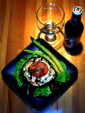
well here is what i turned the orgiional into.
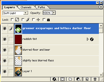
i also attacked a pic of the layers i have.
i have the orgiional on the bottom.
i then duplicated the layer, cut out everything excwpt the wine glass and gausian blured it just a tiny bit.
After that i added a red layer on soft light with very little opacity to make it, just a reddish tinge
I then added a black layer with green on the plate to make the whole picture darker and make the greens on the plate look better.
When i scaled the pic up it was a bit grainy so i duplicated the layer and blurred it(just erased the wine glass, the name on the beer and the beer cap so you could still kinda make those out) there i had blurred the floor.
i probably could have doine more but only spent bout 15 minutes on this one(most was trying oput stuff and deleting it)
| Description: |
|
| Filesize: |
34.05 KB |
| Viewed: |
331 Time(s) |

|
| Description: |
|
| Filesize: |
51.24 KB |
| Viewed: |
331 Time(s) |

|
|
|
|
|
|
 |
zenyora
Joined: 29 Apr 2005
Posts: 2
|
 Posted: Sat Apr 30, 2005 1:50 pm Post subject: Posted: Sat Apr 30, 2005 1:50 pm Post subject: |
 |
|
thanks man..
hey for the food did you brush over it..and how did you change the color of the floor ..did you also brush it..
thanks again
|
|
|
|
|
 |
<aazumak>

Joined: 22 Mar 2005
Posts: 384
Location: rhode island
|
 Posted: Sun May 01, 2005 7:30 am Post subject: Posted: Sun May 01, 2005 7:30 am Post subject: |
 |
|
if you look in my pic i tryied to leve the food alone, who wants black and red food?? i only added green to the green food.
though i did add a reddish tint to the whole scene. the red was at a low opacity though. basicly what i was trying to do was
A: zoom in(free transform, hold the shift key while ur doing it and it will stay in the same shape)
B: make the floor a little darker(by adding red and black)
C: make the exsparigus look better, i added some green.
D: i then blurred the floor and beer. anything i didnt want i just erased, i didnt bluur the brand and the brand on the cap.
E: blurred the cup just a little so it didnt look so hard
This whole time i was often duplicating the orgiional.
|
|
|
|
|
 |
|


