|
|
| Author |
Message |
scorpion_666
Joined: 19 Oct 2004
Posts: 75
Location: Lakewood, CO
|
 Posted: Wed Apr 13, 2005 10:53 pm Post subject: Color Balance Posted: Wed Apr 13, 2005 10:53 pm Post subject: Color Balance |
 |
|
For those who know, I'm 4 sigs away from completing my project. I can make all but one of them to which I'm going to have to hire and pay someone to do, cuz it's extremely difficult and definitely beyond my skills.
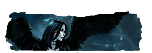
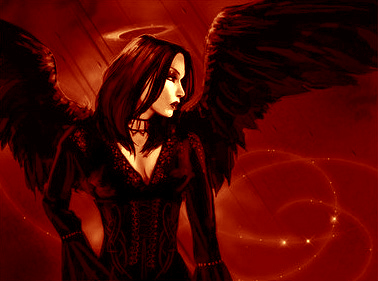
Anyway this one I can do by myself, the only problem is I need an effect done to it. I had someone whom I don't know color balance this image the other night(Bloodlust6), and at first I thought I could use it in it's present form after I tweak a few things. Then I realized I could use it as is, but I needed the actual jpeg of the image window so I don't have to repaint/reclone stamp the wings/bg and also so that when I Flip > Horizontal the image is the exact opposite of the beginning form, which is what I'm going for here.
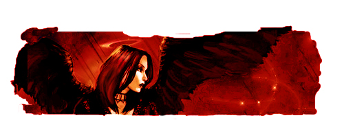
So to not babble further, if anyone can match the color balance on the odd shaped painted JPEG for my image window of a new sig, that'd be great. In other words, I need the (blood) jpeg to be red like the (bloodlust6) attachment.
Thats all I need, then I can take it from there and add all the effects after that.
Thank you
Scorpion
| Description: |
|
| Filesize: |
43.91 KB |
| Viewed: |
663 Time(s) |

|
| Description: |
|
| Filesize: |
96.28 KB |
| Viewed: |
663 Time(s) |

|
|
|
|
|
|
 |
witam

Joined: 27 Oct 2004
Posts: 812
Location: Belgium
|
 Posted: Wed Apr 13, 2005 11:31 pm Post subject: This? Posted: Wed Apr 13, 2005 11:31 pm Post subject: This? |
 |
|
|
|
|
|
|
 |
scorpion_666

Joined: 19 Oct 2004
Posts: 75
Location: Lakewood, CO
|
 Posted: Thu Apr 14, 2005 1:08 am Post subject: Posted: Thu Apr 14, 2005 1:08 am Post subject: |
 |
|
It's closer than I ever got.
Only one thing I can foresee as a problem when I add the raining blood. The wings show too much red highlight. A faint or subtle amount is fine, but that is alot of red in the wings. Only reason why is because the red raining blood will blend in with the color of the wings.
The hair shows alot more red then black, but I can live with that.
If the wings could be toned down, it would be perfect.
Thanx mate,
Scorpion
|
|
|
|
|
 |
witam

Joined: 27 Oct 2004
Posts: 812
Location: Belgium
|
 Posted: Thu Apr 14, 2005 1:17 am Post subject: Posted: Thu Apr 14, 2005 1:17 am Post subject: |
 |
|
|
|
|
|
|
 |
scorpion_666

Joined: 19 Oct 2004
Posts: 75
Location: Lakewood, CO
|
 Posted: Thu Apr 14, 2005 1:23 am Post subject: Posted: Thu Apr 14, 2005 1:23 am Post subject: |
 |
|
Thanx man, it's kinda frustrating when you get this far and then the last few sigs entail things that I am not good at. I've been choosing them randomly to do all along.
Nonetheless I appreciate the effort.
Peace
Scorpion
|
|
|
|
|
 |
witam

Joined: 27 Oct 2004
Posts: 812
Location: Belgium
|
 Posted: Thu Apr 14, 2005 1:46 pm Post subject: Hey Posted: Thu Apr 14, 2005 1:46 pm Post subject: Hey |
 |
|
|
|
|
|
|
 |
scorpion_666

Joined: 19 Oct 2004
Posts: 75
Location: Lakewood, CO
|
 Posted: Fri Apr 15, 2005 12:02 am Post subject: Posted: Fri Apr 15, 2005 12:02 am Post subject: |
 |
|

Here is the final product. I'm not overly happy because I had to Optimize to file size and all I have is hosting at a max of 250 KB before it resizes, so its only using like 50 colors. I have a copy at 128 or 64 colors, but I don't have the hosting amount for the file sizes, and I cannot resize the sig or it will look odd/different amidst the other 30.
Thanx again Witam. I got you helping with Viletouch and another dude Proprius helping with Red Vex and that leaves me with one other which another guy is helping me with.
Thanx to everyone who has helped through the process and...I'm so close. * is excited *
|
|
|
|
|
 |
teddc

Joined: 04 Oct 2004
Posts: 389
Location: Belmont North Australia
|
 Posted: Fri Apr 15, 2005 1:42 am Post subject: Posted: Fri Apr 15, 2005 1:42 am Post subject: |
 |
|
That looks heaps better
ted
_________________
WHAT WOULD VAN GOUGH HAVE DONE WITH PHOTOSHOP |
|
|
|
|
 |
<aazumak>

Joined: 22 Mar 2005
Posts: 384
Location: rhode island
|
 Posted: Fri Apr 15, 2005 2:16 pm Post subject: Posted: Fri Apr 15, 2005 2:16 pm Post subject: |
 |
|
ah, thats a good look, the colors really fit. and i think the text fits.
|
|
|
|
|
 |
scorpion_666

Joined: 19 Oct 2004
Posts: 75
Location: Lakewood, CO
|
 Posted: Fri Apr 15, 2005 6:28 pm Post subject: Posted: Fri Apr 15, 2005 6:28 pm Post subject: |
 |
|
Thanx peeps.
My issue with this is the file size mainly as it makes it more grainy. But I'm finding someone that can host it at a higher file size to capture more color. So that issue is being dealt with.
This one was really hard and took a few hours to do. The real trouble was getting it, so that the rain...looked like blood. Instead of the typical animated tut spec's. I used a longer pixel stream for the droplets and I increased the noise 50%. To make it more thick or seem more tangible or strong.
After making all the rain layers and changing the hue/saturation of them all. I then had to erase all the excess off. You can't Group with previous layer unless you copy the chick once for each layer. Which thinking back would have helped since I had to do it anyway, and it would have saved the erasing time.
Nonetheless after erasing, and setting it up in animation. The last step was to add the text. Only problem was that in adding the text you can't group with previous layer regardless of layer order, because the text glow turns to red and that would look disproportionate against all the other sigs in the set.
So to fix this I had to make 10 copies of the chick. Then merge them each with a different rain layer. Then add the text after that, but it doesn't end there. See I have to move the text to the sig or from a different document, so in doing so there was the problem of displacement or getting them in the right spot. So I had to copy both the text layer and the text effects 10 times each. Then merge them all into one layer after the previous merge, and this gets it so that your text glow is not red like the blood/rain is.
Thank you for your comments, I'm glad you like it, it was very hard.
3 to go!!
|
|
|
|
|
 |
|


