|
|
| Author |
Message |
scorpion_666

Joined: 19 Oct 2004
Posts: 75
Location: Lakewood, CO
|
 Posted: Mon Apr 04, 2005 9:08 pm Post subject: Continuing/Expanding the BG Posted: Mon Apr 04, 2005 9:08 pm Post subject: Continuing/Expanding the BG |
 |
|
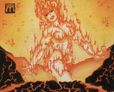
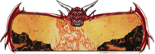
Ok here is what I have. I have a cropped image put into my template. What I need to know is how to expand the BG of the original image to fill in the whole templates window. Now it can't go over the template of course, and if I use cropping I need to fade together all the crop lines. I also need that crown symbol to the upper left to be removed. I think keeping that mantle look across the lower half of the sig would look great, while keeping the lava-sky on the top.
I need to know how to do these things, or have someone do them and explain to me how they did them. So I can learn for the future.
Attached is my current position(unable to attach the PSD for some reason) and the original jpeg if cutting out pieces helps anyone.
| Description: |
|
| Filesize: |
36.64 KB |
| Viewed: |
2475 Time(s) |

|
| Description: |
|
| Filesize: |
20.45 KB |
| Viewed: |
2475 Time(s) |

|
|
|
|
|
|
 |
<aazumak>

Joined: 22 Mar 2005
Posts: 384
Location: rhode island
|
 Posted: Tue Apr 05, 2005 4:10 pm Post subject: Posted: Tue Apr 05, 2005 4:10 pm Post subject: |
 |
|
hmmm. mybe if you just enlarged it to fit the size and moved the crom farther in. in the devilish thing you could always just select the white or blank space around it and just make it white.
|
|
|
|
|
 |
scorpion_666

Joined: 19 Oct 2004
Posts: 75
Location: Lakewood, CO
|
 Posted: Tue Apr 05, 2005 5:11 pm Post subject: Posted: Tue Apr 05, 2005 5:11 pm Post subject: |
 |
|
I honestly don't quite understand what you mean by that. Are you referring to the bg, behind the fire woman?
I'm a lil confused based upon how you worded that.
|
|
|
|
|
 |
<aazumak>

Joined: 22 Mar 2005
Posts: 384
Location: rhode island
|
 Posted: Tue Apr 05, 2005 5:38 pm Post subject: Posted: Tue Apr 05, 2005 5:38 pm Post subject: |
 |
|
well the picture you sowed cant fit under the big devil. its to tall and you cant really stretch it without making the women messed up.
i guess you could add a gradiant around the women. what i mean by that is to make the orange yellow backround to fit inside the devilsh frame. and just add some of the bubble things which is some kind of filet, texture i think. i dont think you can make the women, the design and the rock thing on the bottom fit the border(which is really nice)
sry for talking soo much
yes right now i am referring to the bk behind the women.
|
|
|
|
|
 |
scorpion_666

Joined: 19 Oct 2004
Posts: 75
Location: Lakewood, CO
|
 Posted: Tue Apr 05, 2005 8:53 pm Post subject: Posted: Tue Apr 05, 2005 8:53 pm Post subject: |
 |
|
I know the image is definitely too big to fit into the demon window. But I resized it down in the first place to capture it in there.
I then was on the right track with what I had to do but I didn't know how I had to do it. I called a photoshopper on the phone and she told me to crop or use the clone tool and mimic all the areas of the bg. So what I did was recreate the BG over and over by using the Clone Stamp Tool, and then used the Healing Brush Tool to fade and fix it all in together.
I then noticed that the mantle on the bottom had a fuzz line and needed to be fine or defined clearly. So I talked to a different graphics peep I know and he suggested using different layers and adding a layer line. However I couldn't fine the "layer line" he meant, and if he meant Stroke, I don't know how to make the line thinner, cuz even at 1 pixel it's still too wide. So I basically redrew another layer with the Clone Stamp Tool for the mantle, and then I used the eraser to clear up the haze surrounding it. Then just adjusted it to put it on top of the other layer.
This is what I have so far as a JPEG, please anyone tell me if there is something I missed, or if there is anything you suggest to improve this.
Thank you,
Patrick
| Description: |
|
| Filesize: |
67 KB |
| Viewed: |
2444 Time(s) |

|
|
|
|
|
|
 |
<aazumak>

Joined: 22 Mar 2005
Posts: 384
Location: rhode island
|
 Posted: Wed Apr 06, 2005 3:39 pm Post subject: Posted: Wed Apr 06, 2005 3:39 pm Post subject: |
 |
|
wow great job, i like the way you moved the rock stuff. umm i can see that toy used a round erasor around the rocks. mybe lower them a little bit and make a thin piece going all the way to the top and wrapping arounf a bit.
edit: axtually that looks kinda weird forget what i just said with the rocks
good job 
|
|
|
|
|
 |
scorpion_666

Joined: 19 Oct 2004
Posts: 75
Location: Lakewood, CO
|
|
|
|
|
 |
FadedinPS23

Joined: 27 Dec 2004
Posts: 183
|
 Posted: Wed Apr 06, 2005 11:35 pm Post subject: Posted: Wed Apr 06, 2005 11:35 pm Post subject: |
 |
|
It looks good, but the text should stand out and blend in at the same time. At least thats my opinion...maybe changing the color of the glow would look better. Maybe a red or orange or yellow.
It looks extremely out of place.
p.s. the rest of the image looks good!!!  
|
|
|
|
|
 |
scorpion_666

Joined: 19 Oct 2004
Posts: 75
Location: Lakewood, CO
|
 Posted: Wed Apr 06, 2005 11:55 pm Post subject: Posted: Wed Apr 06, 2005 11:55 pm Post subject: |
 |
|
Excellent suggestions, and I appreciate that.
Unfortunately the text is the immovable. I cannot change it for any of the sigs, they are all preset colors. I mean...yes I could change it, and I think you have a valid point, because with that chick being in flames, it makes a weird red or pink glow around the edges of the white distortion around the name. Unfortunately as I stated though, they are all preset and differentiated based upon ranking in a tribe/clan I'm making for someone.
All the low level people are in black text and white "smoke".
The subcommanders are dark blue/black text and dark blue "smoke".
The leaders are purple/black for one and dark red/black for the other, both with smoke of the appropriate non black color they are mixed with.
So that is kind of set in stone, even though on some it would be nice if it was changed, or could be. But if it was, I'd have to change them all, and that would take a very long time.
|
|
|
|
|
 |
FadedinPS23

Joined: 27 Dec 2004
Posts: 183
|
 Posted: Thu Apr 07, 2005 12:17 pm Post subject: Posted: Thu Apr 07, 2005 12:17 pm Post subject: |
 |
|
I understand.
it really is an excellent sig though.....
Faded
|
|
|
|
|
 |
|


