|
|
| Author |
Message |
Russ
Joined: 12 Oct 2004
Posts: 24
Location: CA
|
 Posted: Mon Mar 07, 2005 11:25 pm Post subject: A banner I whipped up out of boredom Posted: Mon Mar 07, 2005 11:25 pm Post subject: A banner I whipped up out of boredom |
 |
|
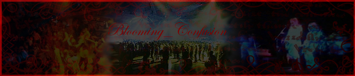
I just used some old rock concert pics and messe around with the smudge, burn, and brush tools for the background, and airbrushed the border and swirl deals.
| Description: |
|
| Filesize: |
113.45 KB |
| Viewed: |
861 Time(s) |
|
_________________
BOO! |
|
|
|
|
 |
cyborg
Joined: 12 Oct 2004
Posts: 1102
Location: canada
|
| Posted: Tue Mar 08, 2005 7:03 am Post subject: |
|
|
its pretty cool but its a bit dark
|
|
|
|
|
|
Russ
Joined: 12 Oct 2004
Posts: 24
Location: CA
|
| Posted: Tue Mar 08, 2005 7:57 pm Post subject: |
|
|
So umm.. thoughts?
_________________
BOO! |
|
|
|
|
|
cyborg
Joined: 12 Oct 2004
Posts: 1102
Location: canada
|
| Posted: Wed Mar 09, 2005 7:16 am Post subject: |
|
|
lol...maybe brighten it up abit more and make the musicians stand out more
|
|
|
|
|
|
Death By Jell-O

Joined: 19 Nov 2004
Posts: 56
Location: Oregon, USA
|
| Posted: Thu Mar 10, 2005 11:35 am Post subject: |
|
|
Too Dark.......Gives me a headache trying to see anything in it........
_________________
There's ALWAYS Room For JELL-O! |
|
|
|
|
|
Russ
Joined: 12 Oct 2004
Posts: 24
Location: CA
|
| Posted: Fri Mar 11, 2005 1:32 pm Post subject: |
|
|
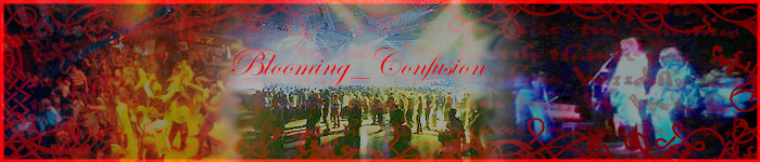
Whoa... it totally didn't look that dark on my home computer monitor. That's really really weird. Let me brighten it up a bit and reattach it....
| Description: |
|
| Filesize: |
173.63 KB |
| Viewed: |
803 Time(s) |
|
_________________
BOO! |
|
|
|
|
|
Goog

Joined: 02 Mar 2005
Posts: 84
|
| Posted: Fri Mar 11, 2005 5:48 pm Post subject: |
|
|
text is a little hard to define...
|
|
|
|
|
|
knights
Joined: 28 Feb 2005
Posts: 36
|
| Posted: Fri Mar 11, 2005 6:51 pm Post subject: |
|
|
looks much better but yea the text is abit hard to read. maybe set it to bold?
|
|
|
|
|
|
Proprius
Joined: 28 Feb 2005
Posts: 137
|
| Posted: Fri Mar 11, 2005 8:49 pm Post subject: |
|
|
You could do a very slight stroke and/or drop shadow and/or Bevel & Emboss to brighten up the text a bit.
|
|
|
|
|
|
|


