|
|
| Author |
Message |
Alzeric
Joined: 10 Apr 2003
Posts: 36
|
 Posted: Tue Apr 22, 2003 12:57 am Post subject: Masking Posted: Tue Apr 22, 2003 12:57 am Post subject: Masking |
 |
|
Well, I've not been a member here very long, but I love these forums. I've been having a lot of fun watching various tennis matches and participating in one. And I've decided that I'll contribute a bit of knowledge to those of you that don't already know this.
I'm sure all of you have seen magazine ads or web graphics with text filled with images. And probably tried using this effect yourselves. And if you were anything like I was, you basically created your text layer and then created a selection of it and then highlighted your image layer and then inverted the selection and then deleted the unwanted areas. I used this technique for the longest time and basically I never got it exactly the way I wanted it to look without countless undoes. Because this method is destructive to the original image, what I'm going to show you is a method to keep the original image intact while achieving the same result.
First, get your image on a layer of it's own. Like so... (Lambos and girls - ah, what a beautiful combination!)

Next, add your text and move the text layer below your image layer and then hold down ALT and click in between the layer like so. (This groups the image layer with the text layer and uses the text as a mask).

And your result is this (below). Now you have the luxury of editing your text as well as moving the position of it to get just the right look! Have fun and I hope this simplifies some of your photoshoping time.

As a side note for a bit more advanced application of this technique, if you're familiar with the layer blending options, then you should note that the top image will take on any blending option that you apply to the bottom layer. This is the default behavior of group blending. You can turn this off by double clicking on the bottom layer of the group - in this case the text and unchecking blending as a group option. Then each layer will only be effected by it's own blending.
This way of masking basically makes the top layer take on the shape of the bottom layer and can be used with other applications other then text. For example:
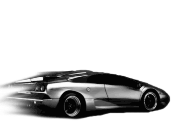
In place of the text I drew this glob of black (doesn't matter what color) and applied a motion blur to the tail end and tweaked a bit with the smudge tool. Group the layers as above with ALT, clicking between the top layer (image) and the bottom layer:

And as you can see the car was clipped to the shape I drew, producing a nice little fade effect, which like in the first post I can tweak to get just right by moving the image around or editing the shape I drew!

_________________
Interested in a Online Vampire Game |
|
|
|
|
 |
Influence
Joined: 22 Jun 2003
Posts: 4
|
 Posted: Sun Jun 22, 2003 10:12 pm Post subject: Posted: Sun Jun 22, 2003 10:12 pm Post subject: |
 |
|
How do u do the affects forf ading...is there a diff way? |
|
|
|
|
 |
Patrick
Administrator

Joined: 14 Feb 2003
Posts: 11945
Location: Harbinger, NC, U.S.A.
|
 Posted: Mon Jun 23, 2003 10:30 am Post subject: Posted: Mon Jun 23, 2003 10:30 am Post subject: |
 |
|
|
|
|
|
|
 |
Gallo_Pinto

Joined: 15 Jul 2005
Posts: 785
Location: BC, Canada
|
 Posted: Sat Jul 23, 2005 10:04 pm Post subject: Posted: Sat Jul 23, 2005 10:04 pm Post subject: |
 |
|
Layer masks are the greatest thing since sliced bread. Oh, and let's not forget "blend if:"
anyway, here's an image I made a while ao (before reading this tutorial). it's done the same way though. In order to get the shadows inside I put the text layer fill to zero, then apply styles.
_________________
brush your hair and comb your teeth |
|
|
|
|
 |
Jersey Hacker
Joined: 08 Jun 2005
Posts: 864
Location: Jersey, Channel Islands, UK
|
 Posted: Sun Jul 24, 2005 10:28 am Post subject: Posted: Sun Jul 24, 2005 10:28 am Post subject: |
 |
|
Thanks for the great tutorial, and that text "costa rica" is really good gallo pinto
_________________
www.jerseyhacker.co.uk
Free File Uploader for Everyone to use |
|
|
|
|
 |
Devchenka
Joined: 11 Aug 2005
Posts: 58
|
 Posted: Fri Jun 23, 2006 8:29 pm Post subject: Posted: Fri Jun 23, 2006 8:29 pm Post subject: |
 |
|
Alzeric
I like your tutorial, im learning photoshop, can you expalin more specific, what you do with the original image? Where is that black layer on the bottom came from? |
|
|
|
|
 |
Gallo_Pinto

Joined: 15 Jul 2005
Posts: 785
Location: BC, Canada
|
 Posted: Sat Jun 24, 2006 12:00 pm Post subject: Posted: Sat Jun 24, 2006 12:00 pm Post subject: |
 |
|
if by "black layer" you men this:

this isn't really a layer. This is a view of the layer's "layer mask". IN other words, what is black in this mask is visible, what is white is invisible, and greys in ebtween are, well, in between.
this image:

is the result of apllying that mask to a layer with an image of a lamborghini. you can see that the outlinen is the same shape, withthe same blurry effect on the back.
_________________
brush your hair and comb your teeth |
|
|
|
|
 |
julievive

Joined: 06 Mar 2007
Posts: 64
|
 Posted: Wed Mar 07, 2007 7:32 pm Post subject: Posted: Wed Mar 07, 2007 7:32 pm Post subject: |
 |
|
|
|
|
|
|
 |
|


