yodachoda87
Joined: 22 Oct 2010
Posts: 4
|
 Posted: Thu Oct 28, 2010 3:28 pm Post subject: Opinion on this Ferrari Logo Posted: Thu Oct 28, 2010 3:28 pm Post subject: Opinion on this Ferrari Logo |
 |
|
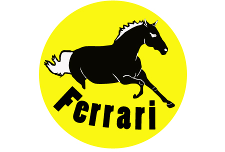
This is a VERY rough design, however I don't plan on making any drastic changes. I will touch up the horse a bit, maybe adding more detail. I will also add some green color and play with the text alot more. I plan to make the letter F kinda fuse with the back of the horse. Opinions please.
Also, whats a good text to use for Ferrari? Take a look at the ferrari logo by doing a google search. That style fits PERFECTLY with the company, however because of project requirements, I can't use that exact same text (I did find a place online to download that text). But I'd like to use a text that gives the same "feel". Thanks.
| Description: |
|
| Filesize: |
77.45 KB |
| Viewed: |
685 Time(s) |
|
|
|


