|
|
| Author |
Message |
Jesse_Gao

Joined: 05 Feb 2007
Posts: 6
Location: Wisconsin
|
 Posted: Tue Feb 06, 2007 5:52 pm Post subject: My First Sig Posted: Tue Feb 06, 2007 5:52 pm Post subject: My First Sig |
 |
|
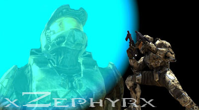
It is a little large, but it is the design I came up with yesterday. I would love to get some feedback, positive or negative.
| Description: |
|
| Filesize: |
38.56 KB |
| Viewed: |
506 Time(s) |
|
|
|
|
|
|
 |
malcon
Joined: 23 Feb 2005
Posts: 391
Location: miami florida
|
| Posted: Tue Feb 06, 2007 7:16 pm Post subject: |
|
|
Hey whats up! welcome to the forum. i like your sig. its simple wich is nice and it is well balanced using asymmety. (i hope i spelled that right) anyway the onlything that is really weak in the picture is the text. i ignore the text. it doesnt stand out or look very intresting. i think placement is key with text. i think it would almost look great along the right side on a vertical angle..its usually not good to have vertical type but in this case it would help. if you could make the font go down the right side, maybe behind the character it would create more flow. But if you done need the text then i would just take it out.
anyway you have a well balanced peice with good clarity.
keep it up
-malcon
_________________
http://malconpierce.deviantart.com/
http://malcon.cgsociety.org/gallery/
FOR HIRE! malconpierce@gmail.com |
|
|
|
|
|
Luke_Ftm
Joined: 29 Mar 2007
Posts: 2
|
| Posted: Thu Mar 29, 2007 7:02 am Post subject: |
|
|
| Quote: | |
Not Bad for 1st attempt
|
|
|
|
|
|
|


