|
|
| Author |
Message |
Kyoji24
Joined: 03 Jun 2005
Posts: 74
|
 Posted: Fri Jun 10, 2005 12:35 am Post subject: My first sig Posted: Fri Jun 10, 2005 12:35 am Post subject: My first sig |
 |
|
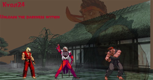
Now I'm new to photoshop so don't chew me out to bad guys. This is the first one that I've done. I'm starting to get the hang of photoshop so I hope my future ones are better.
| Description: |
|
| Filesize: |
119.43 KB |
| Viewed: |
943 Time(s) |
|
|
|
|
|
|
 |
ekosh

Joined: 01 Jun 2005
Posts: 216
Location: US of A
|
| Posted: Fri Jun 10, 2005 9:30 am Post subject: |
|
|
not bad for a firt timer its a little big for sig i usually make mine like 350 x 120 or 500 x 85 if that gives you a size idea, the text is a little small. also to make your text pop a little more you could use the drop shadow effect on it and set the distance to like 1 and it would help your text stand out better, but like I said for a first timer it looks pretty good
|
|
|
|
|
|
Moi

Joined: 21 Mar 2005
Posts: 308
|
| Posted: Fri Jun 10, 2005 4:23 pm Post subject: |
|
|
it looks oke for a first timer, but i think the caracter contrast a little to much with the background and also behind the houses where it's brownish meaby you could try some brush and/or blending effects on that??
but a good start nontheless
|
|
|
|
|
|
Jersey Hacker
Joined: 08 Jun 2005
Posts: 864
Location: Jersey, Channel Islands, UK
|
| Posted: Sat Jun 11, 2005 11:17 pm Post subject: |
|
|
Probably much better than my first sig, you need to improve on the nsize of the text and maybe change the font, as ekosh rightly said, it well to big for a signature, if u reduce ti to one of ekoshes sizez of like 500 x 100 (squash it abit) then it will be better, but very good start
_________________
www.jerseyhacker.co.uk
Free File Uploader for Everyone to use |
|
|
|
|
|
Kyoji24
Joined: 03 Jun 2005
Posts: 74
|
| Posted: Wed Jun 15, 2005 1:06 am Post subject: |
|
|
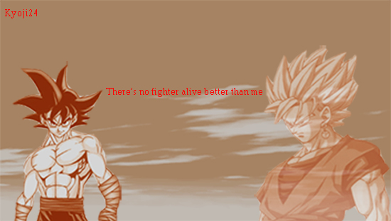
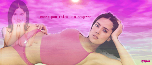
Well I did a bit more experimenting. I know these aren't sig sizes but I"m trying to get the hang of using photoshop more. Gonna post these then I gotta go finish up my project for my photoshop class. I'll work on the sizing of my future ones along with the texts. One more question though, how do the guys get their backgrounds the way they do on their sigs. I mean with all the different mixtures and blending you know.
|
|
|
|
|
|
Kyoji24
Joined: 03 Jun 2005
Posts: 74
|
| Posted: Wed Jun 15, 2005 1:09 am Post subject: |
|
|
try this
| Description: |
|
| Filesize: |
104.87 KB |
| Viewed: |
889 Time(s) |
|
| Description: |
|
| Filesize: |
67.39 KB |
| Viewed: |
888 Time(s) |
|
|
|
|
|
|
|
Jersey Hacker
Joined: 08 Jun 2005
Posts: 864
Location: Jersey, Channel Islands, UK
|
| Posted: Wed Jun 15, 2005 4:43 am Post subject: |
|
|
Very nice work kyoji, getting better, not a fan of dragonball Z my self, although i wouldnt say i minded the second sig!
Keep up the good work!
_________________
www.jerseyhacker.co.uk
Free File Uploader for Everyone to use |
|
|
|
|
|
Pixelist

Joined: 15 Jun 2005
Posts: 19
Location: USA
|
| Posted: Wed Jun 15, 2005 5:26 am Post subject: |
|
|
Position of the secondary image seems a bit peculiar to me in the Hayek one.
Combonation shoulders/leg makes it look like her thigh has been amputated.
_________________
Mac Pro - 7GB - 10.6.8 - PS & AI CS 5 |
|
|
|
|
|
Kyoji24
Joined: 03 Jun 2005
Posts: 74
|
| Posted: Thu Jun 16, 2005 12:22 am Post subject: |
|
|
| Pixelist wrote: | | Combonation shoulders/leg makes it look like her thigh has been amputated. |
Yeah I noticed that when I got finished. I thought that in photoshop that they had this command like in illustrator(send to front, send to back) but it wasn't. I'm gonna try alot harder in my future ideals. I got something in my head with maybe some videogame characters, maybe with the character moving a bit(you know animation). Thanks Jersey hacker,and the rest of you guys for your feedback.
|
|
|
|
|
|
ekosh
Joined: 01 Jun 2005
Posts: 216
Location: US of A
|
| Posted: Thu Jun 16, 2005 7:15 am Post subject: |
|
|
well you can kinda send forward and backward, if you put your elements on different layers you can change the orders of the layers essentially the same thing as send forward and backward it is just done with different layers, if that makes sense
|
|
|
|
|
|
|


