|
|
| Author |
Message |
styzack
Joined: 23 Feb 2012
Posts: 2
|
 Posted: Thu Feb 23, 2012 4:57 am Post subject: My Designs Posted: Thu Feb 23, 2012 4:57 am Post subject: My Designs |
 |
|
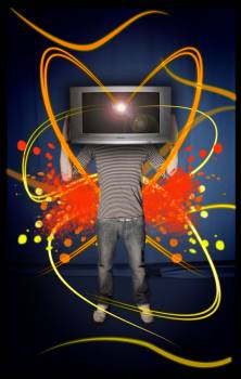
Would appreciate some feedback on this piece of work I did my for Digital Illustration module at University. Any form of feedback is welcome!
| Description: |
|
| Filesize: |
13.68 KB |
| Viewed: |
1227 Time(s) |
|
|
|
|
|
|
 |
thehermit
Joined: 05 Mar 2003
Posts: 3987
Location: Cheltenham, UK
|
| Posted: Thu Feb 23, 2012 6:49 am Post subject: |
|
|
Welcome to the forum  What was your motivation behind the piece? It's difficult to critique something that I can't rationalise. What was your motivation behind the piece? It's difficult to critique something that I can't rationalise.
Also it's a little small, you can post images that are 200k on the forum, any larger and you will have to link to it.
_________________
If life serves you lemons, make lemonade! |
|
|
|
|
|
styzack
Joined: 23 Feb 2012
Posts: 2
|
| Posted: Thu Feb 23, 2012 9:18 am Post subject: |
|
|
Hi, thanks for the welcome! There was a poster I saw for my University's Multimedia Convention which used the same sort of idea. The brief for my assignment was to create a piece with two contrasting opposites. I guess this was sort of Natural vs Man Made with a sort of technical twist, although i guess you could argue that people are man made too.
You can see it larger here on my blog http://scotttyzack.wordpress.com/
|
|
|
|
|
|
jerryb4417
Joined: 20 Dec 2008
Posts: 710
Location: Oklahoma
PS Version: photoshop cs5
OS: win7 pro 64 bit, i7-3.2g, GTS 450,
|
| Posted: Thu Feb 23, 2012 3:55 pm Post subject: |
|
|
hi,
at first didn't understand the purpose untill your 2nd post ...
and remember that old phrase "art is in the eye of the beholder"
not quite sure if you have acheved your goal of opposites...
when i first saqe that is saw a human who brain was replace by a mindless tv set... in it self that would a opposite... but I was thinking... to make it more striking... instead of a gray screen with a spot of light (which generally say enlightement) how about a white screen with a black hole!!! bottomless pit of nothing... just my view...
|
|
|
|
|
|
iloveprint
Joined: 12 Jan 2012
Posts: 34
|
| Posted: Tue Mar 27, 2012 3:59 am Post subject: |
|
|
The concept is great, but the color choice could be better since the orange and reds don't really add to the opposites thing you are looking for. You can take opposites one step further by using highly contrasting colors and making the difference between man and technology more pronounced. Also, the TV looks a bit squashed and lengthened so you can try fiddling with the size until it looks right.
|
|
|
|
|
|
jir4yu
Joined: 27 Mar 2012
Posts: 3
|
| Posted: Tue Mar 27, 2012 6:46 am Post subject: |
|
|
|
|
|
|
|
|
K-touch
Joined: 17 Jan 2010
Posts: 166
Location: Sydney, Australia.
PS Version: CS, CS2, CS3, CS4
OS: Mac OS X, Win Xp
|
| Posted: Mon Apr 09, 2012 3:46 am Post subject: Re: My Designs |
|
|
| styzack wrote: | | Would appreciate some feedback on this piece of work I did my for Digital Illustration module at University. Any form of feedback is welcome! |
I like it but, I'm not happy with the TV screen, I you needed to work something towards that.. Some sort of FX, right now it looks to plane...
_________________
Add your Business and be part of a new Business Video Directory revolution : )
http://www.kantabiz.com/videos.php |
|
|
|
|
|
gohan2091

Joined: 20 Apr 2012
Posts: 56
Location: England
|
| Posted: Fri Apr 20, 2012 6:52 am Post subject: |
|
|
I'd lose the drop shadows around the TV, it subtracts from the image and makes the whole image flat compared to the "pop" of the TV.
|
|
|
|
|
|
Frank1263

Joined: 09 May 2012
Posts: 221
Location: Spain
PS Version: CS6
OS: Windows 7
|
| Posted: Fri Jun 01, 2012 7:26 am Post subject: |
|
|
I agree with the comments about the tv. I would make it a little larger as well because now to me it looks like his hands aren't holding it properly.
And maybe you should clean it because it's dirty, as are the shoes. 
|
|
|
|
|
|
|


