Posted: Thu Jun 23, 2005 1:42 pm Post subject: cloud(9) - taking it seriously this time
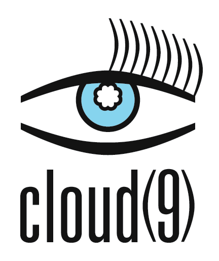
Alright, here's another logo. The last couple were just random ideas that I had, and threw together in Photoshop without much forethought. As thehermit pointed out, the lack of planning shows. I decided to take my own advice this time around and go through the design process the right way, from thumbnails to roughs on paper to computer. I suppose you could call this a digital rough, since there are still some things I want to tweak. Want to get feedback on the concept first, though, before I spend hours fussing over details.
Rather than starting with an idea for a logo/logotype and inventing a fictitious company to go with it, I decided to go for a more realistic approach and dream up a company first, then imagine that they'd hired me to create an identity for them, consisting of a (non-typographic) logo and a simple logotype, which could be used together or either on its own.
The company I came up with is called "Cloud Nine" (I allowed myself the flexibility of choosing between "nine" and "9"). It is an interior design company, catering to young, wealthy women who like to see themselves as sophisticated, but still a little girly or feminine - lots of silky draperies, overstuffed pillows and bright or pastel solid colours.
I'll say a bit about the thinking that went into this after I hear some of your thoughts; I don't want my own opinions to affect your reactions.
(Note: there is a b&w version as well, which is identical, except there is no fill in the iris. Also, if the black does not appear really black, that's not a mistake. In one of my design mags, there's a guy who expresses the opinion that very dark greys usually look better than true blacks, especially for typography, so I'm trying it out to see)
Joined: 05 Mar 2003
Posts: 3987
Location: Cheltenham, UK
Posted: Thu Jun 23, 2005 6:20 pm Post subject:
It doesn't say interior design but it is clear, concise and loud and proud.
Not sure about the numeral in brackets, or about the 1/2 eyelashes, but I do like the clear and defintate presence of the typeface. I also love the fluffy cloud, especially against the sky blue.
I would like to know your thoughts on this design and why you went the way you did, but I would also like to hear other's opinion on it first, so by all means hang back and tell me later if you want.
hmmm, I have just thought about the referencing of the eye now and it makes more sense to me, it could however be distilled further, but it grows on me
I would also be interested to hear what you discounted in your design ideas as they can be just as telling as the final product. _________________ If life serves you lemons, make lemonade!
for some reason I am disturbed with the eye but I cant put a finger on it. I am how ever very drawn to the type. I wish that the logo could have a 9 integrated into it somewhere to help match it a little better to the name. The cloud looks like a photoshop shape and I am not sure that i like it dead center maybe in the top left corner and only partially creaping out of the eye would be cool. I dont know those are just my first impressions of it
You cannot post new topics in this forum You cannot reply to topics in this forum You cannot edit your posts in this forum You cannot delete your posts in this forum You cannot vote in polls in this forum You cannot attach files in this forum You can download files in this forum