|
|
| Author |
Message |
canaan77
Joined: 09 Mar 2012
Posts: 10
|
 Posted: Sat Mar 10, 2012 5:30 am Post subject: Black&white to Color Posted: Sat Mar 10, 2012 5:30 am Post subject: Black&white to Color |
 |
|
Hey guys!
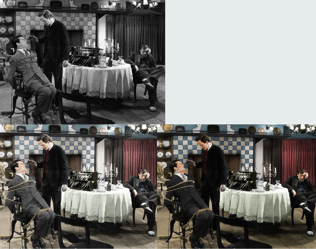
I would really appreciate some critique on my black&white to color project. I have done two versions of it and before I'm starting with my final tweaking I really would like to know which one you think is the most proper one at the moment. And why?
What do I have to improve?
Thanks in advance.
/canaan77
| Description: |
|
| Filesize: |
186.08 KB |
| Viewed: |
632 Time(s) |

|
|
|
|
|
|
 |
hawkeye
Joined: 14 May 2009
Posts: 2377
Location: Mesa, Az
OS: Windows 7 Pro 64 bit
|
 Posted: Sat Mar 10, 2012 9:49 am Post subject: Posted: Sat Mar 10, 2012 9:49 am Post subject: |
 |
|
Looks good, I like the second best. But these things are highly subjective, someone else might pefer #1.
|
|
|
|
|
 |
thehermit
Joined: 05 Mar 2003
Posts: 3987
Location: Cheltenham, UK
|
 Posted: Sat Mar 10, 2012 10:08 am Post subject: Posted: Sat Mar 10, 2012 10:08 am Post subject: |
 |
|
Like hawkeye, I think both look good. My decision would be made after a thought about what I want to achieve. Am I going for a modern colourisation of the b&w? or am I trying to emulate the hand painted effects of yesteryear?
IMO at the moment you are steering more towards a late 19th early 20th century colouring rather than what is I am guessing is a contemporary 50's stock film and grading.
For me there needs to be a larger amount of time spent on some details. The tiles, instead of being blue, should also contain other colours and maybe more white to offset the uniformity (sometimes the death of colouring). The floorboards are too uniform as is a lot the colouring, don't rely on the shadows already present in the image to provide the variance, it doesn't.
I would also say that the shadow/blacks are slightly overdone in the second image, you have lost areas in the photo.
To sum up, even if it is meant to be a 1920's scene, it still looks to me like it was done in the 50's therefore I would concentrate my colouring efforts on processing from that era.
Perhaps more variation overall, but certainly your skin tones are kosher.
_________________
If life serves you lemons, make lemonade! |
|
|
|
|
 |
canaan77
Joined: 09 Mar 2012
Posts: 10
|
 Posted: Sat Mar 10, 2012 11:12 am Post subject: Posted: Sat Mar 10, 2012 11:12 am Post subject: |
 |
|
Thank you guys!
I really appreciate your comments. I agree that I have to work a lot more on the details and variation. I'll try to upload an updated version in a near future.
|
|
|
|
|
 |
Matt
VIP

Joined: 24 Sep 2007
Posts: 3515
Location: Haverhill, UK
PS Version: Lightroom 5, CS4 & Elements 11
OS: Windows 8.1
|
 Posted: Sat Mar 10, 2012 5:04 pm Post subject: Posted: Sat Mar 10, 2012 5:04 pm Post subject: |
 |
|
Look good to me. Time consuming and laborious work, so well done.
Like already said, the answer to your question is subjective and personal to the viewer. For me I prefer the second image. The colour looks a little understated on the first one.
Greta job though.
_________________
Matt
3photoshop.com
http://www.3photoshop.com |
|
|
|
|
 |
darklite
Joined: 19 Dec 2009
Posts: 277
Location: Oregon, U.S.
PS Version: cs
OS: windows 7
|
 Posted: Mon Mar 12, 2012 5:03 pm Post subject: Posted: Mon Mar 12, 2012 5:03 pm Post subject: |
 |
|
I like the second one better too. The first one looks flat, like the color overlay transparencies have been scaled back.
_________________
Jeff
http://www.autumnwindstudios.com |
|
|
|
|
 |
|


