|
|
| Author |
Message |
hytham
Joined: 17 Nov 2011
Posts: 37
Location: 64
|
 Posted: Tue Nov 22, 2011 12:05 am Post subject: 2 Logos, need feedback :) Posted: Tue Nov 22, 2011 12:05 am Post subject: 2 Logos, need feedback :) |
 |
|
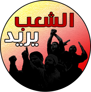
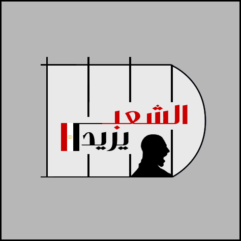
Hello guys,
I hope that the Arabic language that i used in the logos won't make feedback hard 
I made those logos for a Facebook page which talking about new T.V channel called "The people want"..this idea started after the Egyptian revolution.
| Description: |
|
| Filesize: |
166.19 KB |
| Viewed: |
770 Time(s) |
|
| Description: |
|
| Filesize: |
66.7 KB |
| Viewed: |
770 Time(s) |
|
|
|
|
|
|
 |
thehermit
Joined: 05 Mar 2003
Posts: 3987
Location: Cheltenham, UK
|
| Posted: Tue Nov 22, 2011 4:41 am Post subject: |
|
|
The top one has more impact, although I am not so keen on the textured background.
_________________
If life serves you lemons, make lemonade! |
|
|
|
|
|
jerryb4417
Joined: 20 Dec 2008
Posts: 710
Location: Oklahoma
PS Version: photoshop cs5
OS: win7 pro 64 bit, i7-3.2g, GTS 450,
|
| Posted: Tue Nov 22, 2011 9:28 am Post subject: |
|
|
hi,
just a opinion... plus there is a culture difference on how westerners and arabic people view art.... little factors like that can the design of log and how people view them.. smiling..
I agree with thehermit the top one has more impact...
normally if people are in a logo, it a complete sillouette ... not where you can see details in the faces ... this generally facilitate a person imagining himself in the log...
the texture I am not comfortable with... i would stay with smooth texture...
do the colors have a meaning?????
I be almost tempted to make the writing on one line follow the curve of the top part of the logo ....
the bottom logo with all the straight lines.... doesn't have much impact or meaning to me... be nice to know what the words means... many time a one or 2 word can make clear what the logo is about or give the viewer a meaning, it helps re enforce meanigs..... in this case all the straight lines sort of remind me of bars.. if that is your purpose i would think broken lines to represent a breakout.. if the words support that...
|
|
|
|
|
|
Auieos
Joined: 29 Jan 2010
Posts: 2019
|
| Posted: Tue Nov 22, 2011 10:14 pm Post subject: |
|
|
I like the first one as well. Makes me want to revolt. 
|
|
|
|
|
|
thehermit
Joined: 05 Mar 2003
Posts: 3987
Location: Cheltenham, UK
|
| Posted: Wed Nov 23, 2011 2:18 am Post subject: |
|
|
| Quote: | | Makes me want to revolt |
Insert joke here 
_________________
If life serves you lemons, make lemonade! |
|
|
|
|
|
hytham
Joined: 17 Nov 2011
Posts: 37
Location: 64
|
|
|
|
|
|
jerryb4417
Joined: 20 Dec 2008
Posts: 710
Location: Oklahoma
PS Version: photoshop cs5
OS: win7 pro 64 bit, i7-3.2g, GTS 450,
|
| Posted: Thu Nov 24, 2011 8:11 am Post subject: |
|
|
h,
putting in that smooth color background.. I think helped out alot...
the way you handle the text may have worked out better than my orginal suggestion of curve txt... it at angle which give it more flare and action and at the sametime it sort of filled the left side where otherwise be a big empty space .. over all i like your 2nd redention better than the first.
something to experiment with on that angle text give it a little perspective effect ..
|
|
|
|
|
|
|


