|
|
| Author |
Message |
ZiN
Joined: 19 Jan 2005
Posts: 66
|
 Posted: Thu Jan 27, 2005 10:45 pm Post subject: some of my work Posted: Thu Jan 27, 2005 10:45 pm Post subject: some of my work |
 |
|
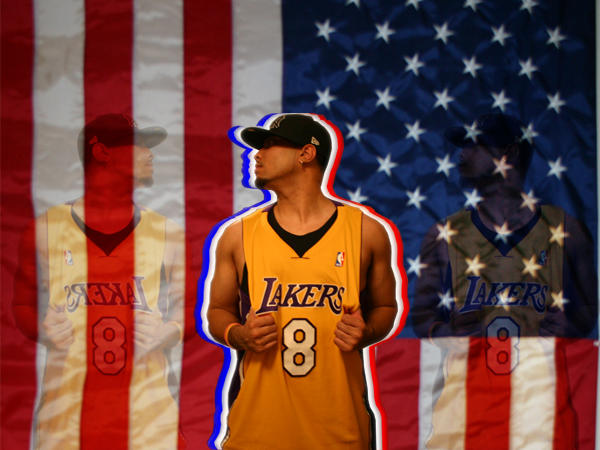
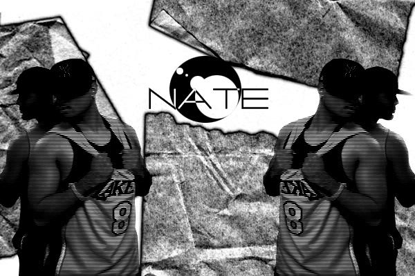
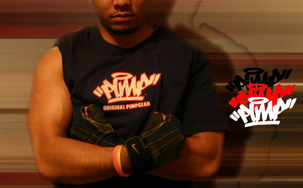
some of my work that i did, everything i did it on my own took loads of hours to do, the guy in these pics is my bro.
| Description: |
|
| Filesize: |
52.03 KB |
| Viewed: |
642 Time(s) |
|
| Description: |
|
| Filesize: |
54.89 KB |
| Viewed: |
642 Time(s) |
|
| Description: |
|
| Filesize: |
30.73 KB |
| Viewed: |
642 Time(s) |
|
_________________
>img resizemod="on" onload="rmw_img_loaded(this)" src="http://img.photobucket.com/albums/v25/mR_hA/banners/lpzin.jpg">
You may know everything on photoshop, but without ideas or creativty, theres no point in using it. - ZiN |
|
|
|
|
 |
Haunus

Joined: 24 Nov 2004
Posts: 740
|
| Posted: Fri Jan 28, 2005 5:13 am Post subject: |
|
|
I liked them, but the second one lacked emphasis and the last one was a little strange it didnt do much.
|
|
|
|
|
|
Arpax
Joined: 28 Jan 2005
Posts: 11
|
| Posted: Fri Jan 28, 2005 6:34 am Post subject: |
|
|
i must say very interesting style.. i like the idea tho
|
|
|
|
|
|
gecko

Joined: 29 Mar 2003
Posts: 293
|
| Posted: Fri Jan 28, 2005 1:20 pm Post subject: |
|
|
its compentant work and it has a lot of good points , but the repetition of his figure or the repition of the "pimp was probably the weakest element
_________________
*sketchkiddie*
http://thebluegecko.com |
|
|
|
|
|
cyborg
Joined: 12 Oct 2004
Posts: 1102
Location: canada
|
| Posted: Fri Jan 28, 2005 2:32 pm Post subject: |
|
|
they look good..but variation in the images would work better
|
|
|
|
|
|
|


