|
|
| Author |
Message |
marionreys
Joined: 06 Jun 2014
Posts: 7
|
 Posted: Fri Jun 06, 2014 8:54 am Post subject: Critique my work please... Posted: Fri Jun 06, 2014 8:54 am Post subject: Critique my work please... |
 |
|
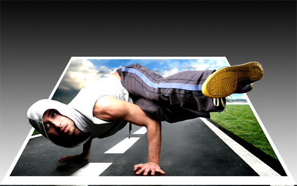
I am willing to be motivated and accepting constructive criticism...
Thanks
| Description: |
|
| Filesize: |
148.54 KB |
| Viewed: |
974 Time(s) |
|
|
|
|
|
|
 |
puncho
Joined: 23 Nov 2013
Posts: 4
Location: Gatineau, Quebec, Canada
PS Version: Elements 12
|
| Posted: Wed Jun 18, 2014 11:59 am Post subject: |
|
|
Except for some of the black border on the bottom of the image (as I see it here) it is quite impressive work I would say but I never attempted such an image yet myself maybe others will be able to give you more constructive feedback I hope.
|
|
|
|
|
|
thehermit
Joined: 05 Mar 2003
Posts: 3987
Location: Cheltenham, UK
|
| Posted: Thu Jun 19, 2014 6:19 am Post subject: |
|
|
It's neat, good pop out effect. I would say save it as a transparent png to preserve that pop out look.
_________________
If life serves you lemons, make lemonade! |
|
|
|
|
|
Hado
Joined: 22 Jun 2014
Posts: 2
Location: Australia
|
| Posted: Sun Jun 22, 2014 11:35 pm Post subject: |
|
|
This is a really well put together image. The only thing I've noticed is the bottom border of the image doesn't match up with the background. Apart from that you did a great job.
|
|
|
|
|
|
Glitch
Joined: 12 Mar 2014
Posts: 26
Location: Northeast New York State (no, not the city)
PS Version: CS4
OS: Windows 8.1
|
| Posted: Mon Jul 14, 2014 9:46 pm Post subject: |
|
|
I agree that it's a very good job. Making the background transparent sounds like a better idea to be instead of a gradient. Otherwise it will never match up on any website, paper, etc that you put it on, making it look like a box and possibly minimizing or destroying the 3D effect you have.
|
|
|
|
|
|
mastering-photoshop
Joined: 30 Jul 2014
Posts: 5
Location: India
|
| Posted: Wed Jul 30, 2014 10:59 pm Post subject: |
|
|
Awesome, except the perspective of the photograph, also as many other have already pointed out instead of gradient - that too white to black, you could use something else.
_________________
Abhijeet Sojwal
http://masteringphotoshop.com |
|
|
|
|
|
|


