|
|
| Author |
Message |
Captain42
Joined: 27 Oct 2009
Posts: 13
PS Version: CS3
OS: I'm a PC
|
 Posted: Tue Oct 27, 2009 6:16 pm Post subject: I have a question on mirroring in PS Posted: Tue Oct 27, 2009 6:16 pm Post subject: I have a question on mirroring in PS |
 |
|
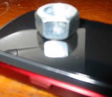
The chrome nut in my PS image that I mirrored below might look ok, but is it realistic? The picture below that I took with a camera and you can see the real nut image shoot straight down into the plane causing a different mirror effect. I can't figure out how to mirror the nut I have in PS to look like the picture. It seems like I need a 3D program. I'm new at this...any ideas?
Thank you.


|
|
|
|
|
 |
bdbolin

Joined: 01 Jul 2009
Posts: 134
PS Version: CS3
OS: Mac OS X
|
 Posted: Tue Oct 27, 2009 7:36 pm Post subject: Posted: Tue Oct 27, 2009 7:36 pm Post subject: |
 |
|
Just an idea:
-duplicate nut
-drag below top nut
-distort to make it more to size
-gaussian blur if you want.
-opacity change
_________________
FREE PHOTOSHOP TUTORIALS: http://www.redpixelmedia.com
(Looking for advertising trade-offs! We advertise you, you advertise us!) |
|
|
|
|
 |
artd
Joined: 06 Sep 2009
Posts: 51
|
 Posted: Wed Oct 28, 2009 12:53 am Post subject: Posted: Wed Oct 28, 2009 12:53 am Post subject: |
 |
|
Hi Captain,
I gave it a quick try after watching this video tutorial (link below).
http://www.youtube.com/watch?v=hEy7t4ayQ18
I wasn't sure what to do about the upper rounded part of the nut, so I just left it off of the reflection. Also, in watching the tutorial, I think he must have hit ctrl/cmd + T (free transform) before distorting his selection and just forgot to say so (at least I couldn't do it without that). In any case his tutorial should be helpful, check it out.
| Description: |
|
| Filesize: |
17.3 KB |
| Viewed: |
273 Time(s) |

|
|
|
|
|
|
 |
Captain42
Joined: 27 Oct 2009
Posts: 13
PS Version: CS3
OS: I'm a PC
|
 Posted: Wed Oct 28, 2009 9:33 am Post subject: Posted: Wed Oct 28, 2009 9:33 am Post subject: |
 |
|
Thanks everyone. I tried both your ideas and they worked better then what I came up with. The tutorial was great. My end result looks like the one in artd's image. It would be neat to figure out how to do the rounded top part of the nut as a reflection but I think the effect is accomplished as shown by artd.
Thanks!
|
|
|
|
|
 |
artd
Joined: 06 Sep 2009
Posts: 51
|
 Posted: Wed Oct 28, 2009 9:42 am Post subject: Posted: Wed Oct 28, 2009 9:42 am Post subject: |
 |
|
Thanks Captain,
For posting back to let us know we were helpful! Glad you posted the question in the first place, it turned out to be an interesting experiment :-)
|
|
|
|
|
 |
bdbolin

Joined: 01 Jul 2009
Posts: 134
PS Version: CS3
OS: Mac OS X
|
 Posted: Wed Oct 28, 2009 12:37 pm Post subject: Posted: Wed Oct 28, 2009 12:37 pm Post subject: |
 |
|
I don't think the entire piece will be reflected. I think only that very top of the nut will be reflected...
ok, that didn't make any sense. NVM.
_________________
FREE PHOTOSHOP TUTORIALS: http://www.redpixelmedia.com
(Looking for advertising trade-offs! We advertise you, you advertise us!) |
|
|
|
|
 |
Captain42
Joined: 27 Oct 2009
Posts: 13
PS Version: CS3
OS: I'm a PC
|
 Posted: Wed Oct 28, 2009 7:10 pm Post subject: Posted: Wed Oct 28, 2009 7:10 pm Post subject: |
 |
|
| bdbolin wrote: | I don't think the entire piece will be reflected. I think only that very top of the nut will be reflected...
ok, that didn't make any sense. NVM. |
I know what you meant 
You know, as I continued designing I was thinking about what you said and agreed with it. I think since the top of the nut tappers in you might not see it. Well.... curiosity got to me so I put a similar nut on a mirror. I was actually able to see the whole thing. Oh well, I still think the effect is accomplished pretty good how you guys showed it.
Here is the finished product in case you were all curious what I was doing. Please be critical if you have any comments. I'm new at this and I greatly appreciate input on what I could do differently or better:

|
|
|
|
|
 |
bdbolin

Joined: 01 Jul 2009
Posts: 134
PS Version: CS3
OS: Mac OS X
|
 Posted: Wed Oct 28, 2009 7:18 pm Post subject: Posted: Wed Oct 28, 2009 7:18 pm Post subject: |
 |
|
Very nice! I like the over all effect... however:
-You would have nice "layered" feeling if the title didn't go in front of the bolts. I think the bolts are closer to the front, however that effect is disintegrated with the title over it. My suggestion: Try masking the "C" where the bolt goes through.
-The noise on the top of "Chrome" isn't quite how I'd like it. Add maybe an inner shadow to try adding depth...?
Very nice job, just some critical comments. :-)
_________________
FREE PHOTOSHOP TUTORIALS: http://www.redpixelmedia.com
(Looking for advertising trade-offs! We advertise you, you advertise us!) |
|
|
|
|
 |
bdbolin

Joined: 01 Jul 2009
Posts: 134
PS Version: CS3
OS: Mac OS X
|
 Posted: Wed Oct 28, 2009 7:19 pm Post subject: Posted: Wed Oct 28, 2009 7:19 pm Post subject: |
 |
|
P.S. Interesting about the tapper on the bolt's reflection... thanks.
_________________
FREE PHOTOSHOP TUTORIALS: http://www.redpixelmedia.com
(Looking for advertising trade-offs! We advertise you, you advertise us!) |
|
|
|
|
 |
Captain42
Joined: 27 Oct 2009
Posts: 13
PS Version: CS3
OS: I'm a PC
|
 Posted: Wed Oct 28, 2009 8:14 pm Post subject: Posted: Wed Oct 28, 2009 8:14 pm Post subject: |
 |
|
| bdbolin wrote: | Very nice! I like the over all effect... however:
-You would have nice "layered" feeling if the title didn't go in front of the bolts. I think the bolts are closer to the front, however that effect is disintegrated with the title over it. My suggestion: Try masking the "C" where the bolt goes through.
-The noise on the top of "Chrome" isn't quite how I'd like it. Add maybe an inner shadow to try adding depth...?
Very nice job, just some critical comments. :-) |
Wow! that is some good advice bdbolin. I didn't even notice the title (chrome) being in front of the bolt when it should be behind it. I'm not crazy about the noise on the title either. I'll try some shadows instead.
I'm embarrassed to say that I don't know how to mask yet. I hear about layer mask all the time but never have played with it. Basically are you saying to put the bolt in front of the title so it overlaps it?
Please stayed tooooned... I'm going to fix it and see what you all think.
Thank you.
|
|
|
|
|
 |
|


