|
|
| Author |
Message |
GlitterRock
Joined: 28 Nov 2006
Posts: 7
|
 Posted: Tue Nov 28, 2006 4:15 am Post subject: Faded Family Photos Posted: Tue Nov 28, 2006 4:15 am Post subject: Faded Family Photos |
 |
|
I have a bunch of old family photos that are very faded and I am trying to restore. Anyone have any good tips or good tutorials on how to do this? I played around with the color/brightness. While is was better, I think it needs more work. I have some Photoshop skills, but not the level I need. Any help greatly appreciated.
|
|
|
|
|
 |
lasa

Joined: 08 Aug 2005
Posts: 1090
Location: Florida
PS Version: CS
OS: MS XP
|
| Posted: Tue Nov 28, 2006 11:22 am Post subject: |
|
|
All restoration are different. No one thing works on all images. Sometimes it simply a matter of duplicating the layer and setting layer mode to multiply... other times it take curves/levels etc.
If you post an example of what you got somebody here willbe able to guide you in the right direction.
Lasa
_________________
Lasa
My hobbie: www.angulo-webdesign-templates.threefooter.com
Treat people the way you want to be treated... |
|
|
|
|
|
Mr_Omen
Joined: 25 Nov 2006
Posts: 54
Location: Ohio
|
| Posted: Tue Nov 28, 2006 2:18 pm Post subject: |
|
|
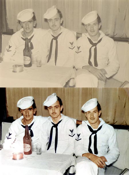
As stated, every picture is different and needs different adjustments. Brightness/Contrast definately play a part but are not a fix all. Restoring old photos has become my inspiration lately and I am sure I could give you some insight. If you could post an example we could give you more help though. If they are color photos using Brightness/Contrast and Hue/Saturation will be you two main tools. If they are black and white you may even want to add color to them, which is difficult and time consuming, but really pays off. For an example here is one that I did last night:
| Description: |
|
| Filesize: |
55.01 KB |
| Viewed: |
711 Time(s) |
|
|
|
|
|
|
|
GlitterRock
Joined: 28 Nov 2006
Posts: 7
|
| Posted: Tue Nov 28, 2006 11:27 pm Post subject: |
|
|
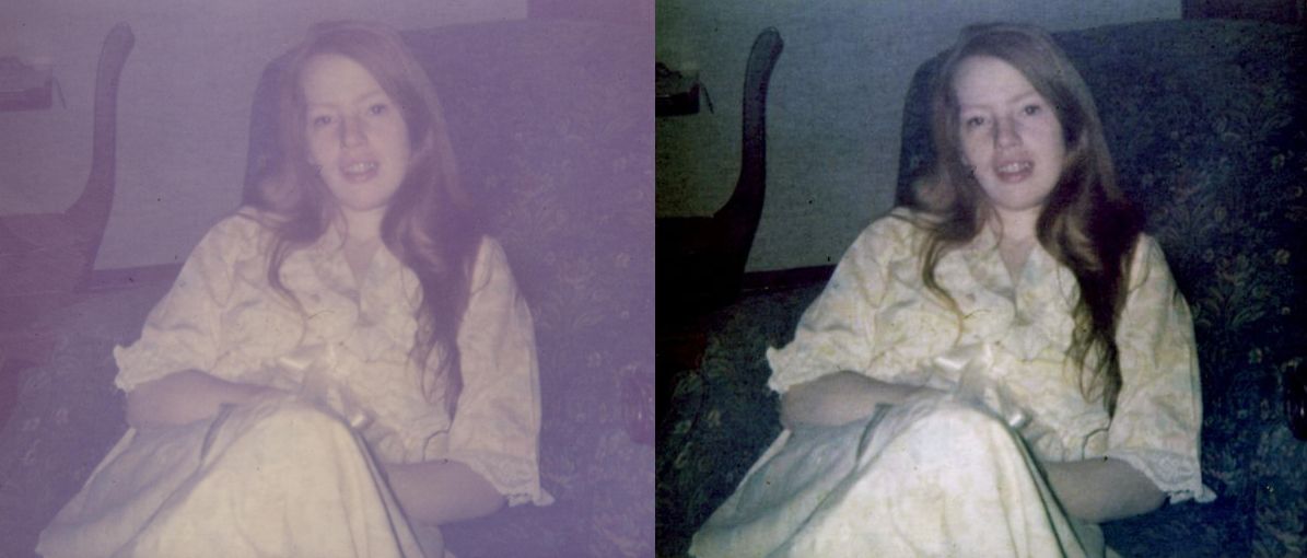
Thank you for the replies. I understand that every photo will be different, but since I have a lot of these I was hoping for a good guide or tutorial which covered a lot of the bases. Anyway, here is my scan. The one on the left is the scan, the right is the best I could do using the color controls, but it is still not where I would like it to be. Any help, greatly appreciated.
| Description: |
|
| Filesize: |
66.41 KB |
| Viewed: |
697 Time(s) |
|
|
|
|
|
|
|
GlitterRock
Joined: 28 Nov 2006
Posts: 7
|
| Posted: Wed Dec 06, 2006 6:56 am Post subject: |
|
|
A little help please.
|
|
|
|
|
|
lasa
Joined: 08 Aug 2005
Posts: 1090
Location: Florida
PS Version: CS
OS: MS XP
|
| Posted: Wed Dec 06, 2006 8:02 am Post subject: |
|
|
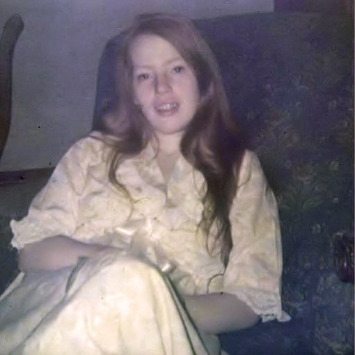
I worked on it and pretty much came out with what you got..
My bet results came from simply useing the AUTO COLOR then adding a warm filter adjustment.
Can you post one of the others to see if they are easier?
Lasa
| Description: |
|
| Filesize: |
72.1 KB |
| Viewed: |
613 Time(s) |
|
|
|
|
|
|
|
lasa
Joined: 08 Aug 2005
Posts: 1090
Location: Florida
PS Version: CS
OS: MS XP
|
| Posted: Wed Dec 06, 2006 9:11 am Post subject: |
|
|
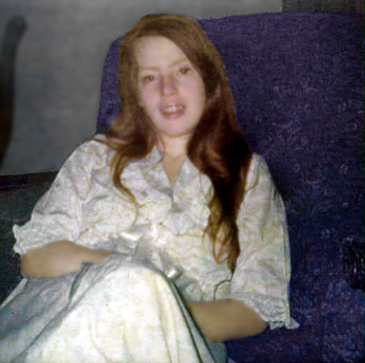
Blue channels is a little trashed..
Actually improved the image a little (didn't save) by using the channel mixer on the blue channel.
used something like 40% red 60% green 0% blue.
Give it a try..
Lasa
_________________
Lasa
My hobbie: www.angulo-webdesign-templates.threefooter.com
Treat people the way you want to be treated... |
|
|
|
|
|
Mr_Omen
Joined: 25 Nov 2006
Posts: 54
Location: Ohio
|
| Posted: Wed Dec 06, 2006 6:14 pm Post subject: |
|
|
The shown example can only be fixed so much. It was a bad picture to begin with, not containing enough information to work with (grainy). It would be very easy to spend a few hours on it fixing colors and such. I am assuming you have a bunch of these and spending time like this might not be your goal. Adjusting hue/saturation and brightness/contrast might be all you will need to do to get them clearer.
|
|
|
|
|
|
Mr_Omen
Joined: 25 Nov 2006
Posts: 54
Location: Ohio
|
| Posted: Wed Dec 06, 2006 8:55 pm Post subject: |
|
|
I messed around with it a bit. Not real happy with the results, but IMHO an improvement.
| Description: |
|
| Filesize: |
93.67 KB |
| Viewed: |
593 Time(s) |
|
|
|
|
|
|
|
GlitterRock
Joined: 28 Nov 2006
Posts: 7
|
| Posted: Mon Dec 25, 2006 5:13 pm Post subject: |
|
|
Sorry, I got distracted for a bit. Thank you for your help. It does look better. It is funny because I can see a decent picture under there, but there is a gray layer on top that if I could just peel off it would look decent. Perhaps you're right. I had some other photo which turned out better with the color adjustments. Thanks again.
|
|
|
|
|
|
|


