|
|
| Author |
Message |
malcon
Joined: 23 Feb 2005
Posts: 391
Location: miami florida
|
 Posted: Wed Oct 18, 2006 10:31 pm Post subject: "SILLY FISH" t-shirt company 1ST shirt design (upd Posted: Wed Oct 18, 2006 10:31 pm Post subject: "SILLY FISH" t-shirt company 1ST shirt design (upd |
 |
|
SEE HOW I DID THIS IN THE TECHNIQUES THREAD! hope you like it!
Hey whats up everybody, this is for a client that is making a tshirt company. his company name is "silly fish" and the concept is that the bait or whatever the prey of the fish is will get the fish instead of the fish getting the bait. so there are a few ideas floating around and this project is and will be alot of fun. i went ahead and made a full color picture of a shirt that we want to make. (its not going to look like this on the shirt, it would have to have some sortof fade or border.)
so this is a frog who is planning on clobbering the basas before it has a chance to eat the frog. i used a cool color scheme to keep a cool feeling to it. and because its fresh water i gave if more of a green tint rather than blue. its a simple asymetric compasition where the big object ballences with the small object bacause of simple placment. I tried to plan it so that the eye starts at the fish and moves around the water flow up the lilly pad stem up to the frog then the hammer. and then maybe to the logo. even thought itcould start at the logo and work the same way.
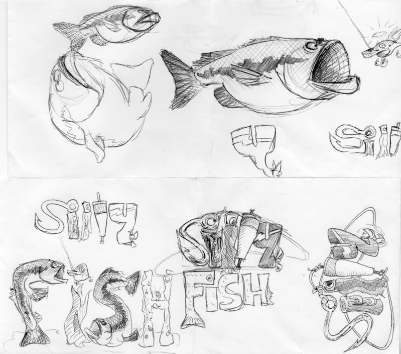
as for the logo i used simple things that you would use for fishing and this relationg to fishing, the s is a hook, the i is a piling (paired with the hook for the dot), then a fishing luar and bobber make up the two L s, then an outboard motor for the Y. i am pleased with the texturing of these letters, i tried to give it a more detailed texture without makeing it look to textured. i think i pulled it off.
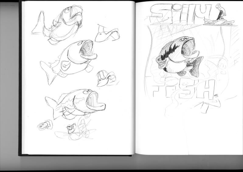
anyway here are some pics of the proces and the final image at the bottom along with the logo.
thanks guy and i would apreciate feedback!
-malcon

no background

logo
(just silly)

another

conceptual stuff
(yes they were drawn on envalops...its all i had at work haha)


Last edited by malcon on Sun Oct 22, 2006 1:02 pm; edited 1 time in total |
|
|
|
|
 |
malcon
Joined: 23 Feb 2005
Posts: 391
Location: miami florida
|
 Posted: Thu Oct 19, 2006 2:52 pm Post subject: Posted: Thu Oct 19, 2006 2:52 pm Post subject: |
 |
|
anybody? |
|
|
|
|
 |
lasa

Joined: 08 Aug 2005
Posts: 1090
Location: Florida
PS Version: CS
OS: MS XP
|
 Posted: Thu Oct 19, 2006 5:40 pm Post subject: Posted: Thu Oct 19, 2006 5:40 pm Post subject: |
 |
|
I love them...I really like hand draw images! and these are great. You obvoiusly have talent! if you could show some steps used to painted it... I know some people here would get a charge, I know I would. I can never get enough of people showing how things are made.
Lasa
_________________
Lasa
My hobbie: www.angulo-webdesign-templates.threefooter.com
Treat people the way you want to be treated... |
|
|
|
|
 |
malcon
Joined: 23 Feb 2005
Posts: 391
Location: miami florida
|
 Posted: Fri Oct 20, 2006 4:29 pm Post subject: Posted: Fri Oct 20, 2006 4:29 pm Post subject: |
 |
|
sure. when i get back to the house ill post some "progress pictures and explain how its done etc etc.
thanks for the comments.
anybody else? any advise? |
|
|
|
|
 |
malcon
Joined: 23 Feb 2005
Posts: 391
Location: miami florida
|
 Posted: Sun Oct 22, 2006 1:31 pm Post subject: Posted: Sun Oct 22, 2006 1:31 pm Post subject: |
 |
|
|
|
|
|
|
 |
malcon
Joined: 23 Feb 2005
Posts: 391
Location: miami florida
|
 Posted: Wed Oct 25, 2006 7:40 pm Post subject: Posted: Wed Oct 25, 2006 7:40 pm Post subject: |
 |
|
a black shirt...
 |
|
|
|
|
 |
SCync
Joined: 28 Jan 2005
Posts: 98
Location: Montreal
|
 Posted: Tue Nov 14, 2006 8:30 am Post subject: Posted: Tue Nov 14, 2006 8:30 am Post subject: |
 |
|
Just caught wind of this thread, really nice work. Great examples, and a wonderfully original character. |
|
|
|
|
 |
malcon
Joined: 23 Feb 2005
Posts: 391
Location: miami florida
|
 Posted: Tue Nov 14, 2006 11:05 am Post subject: Posted: Tue Nov 14, 2006 11:05 am Post subject: |
 |
|
|
|
|
|
|
 |
|


