|
|
| Author |
Message |
beebs
Joined: 26 Apr 2005
Posts: 13
|
|
|
|
|
 |
Kyoji24
Joined: 03 Jun 2005
Posts: 74
|
 Posted: Tue Jul 26, 2005 12:44 am Post subject: Posted: Tue Jul 26, 2005 12:44 am Post subject: |
 |
|
I like the concept that you used to do it. Keep at it.
|
|
|
|
|
|
Jersey Hacker
Joined: 08 Jun 2005
Posts: 864
Location: Jersey, Channel Islands, UK
|
| Posted: Tue Jul 26, 2005 1:47 am Post subject: |
|
|
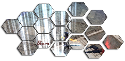
I really like the hexagons that you put the image in, very very good idea, and nice sig aswell, but i think it might look slightly better if the hexagons were an even space apart throughout, but thats just personal opinion
_________________
www.jerseyhacker.co.uk
Free File Uploader for Everyone to use |
|
|
|
|
|
Moi

Joined: 21 Mar 2005
Posts: 308
|
| Posted: Tue Jul 26, 2005 2:59 am Post subject: |
|
|
that's a very cool idea,
but i think jersey hacker is right about the even space between the hexagons!
good job!
|
|
|
|
|
|
Jersey Hacker
Joined: 08 Jun 2005
Posts: 864
Location: Jersey, Channel Islands, UK
|
| Posted: Tue Jul 26, 2005 5:16 am Post subject: |
|
|
Do you mind if i use that kind of idea, to make my own original sig, but using the hexagonal style, if you dont want me too, say, and i wont, but its a col idea and i just wanted to see if you minded first
_________________
www.jerseyhacker.co.uk
Free File Uploader for Everyone to use |
|
|
|
|
|
beebs
Joined: 26 Apr 2005
Posts: 13
|
| Posted: Tue Jul 26, 2005 1:58 pm Post subject: |
|
|
Thanks, everyone! 
Sure, go ahead! I had it as an even space at first, but then I thought it looked a little too plain, so I changed it up a bit. It looks better this way, I think.
|
|
|
|
|
|
Jersey Hacker
Joined: 08 Jun 2005
Posts: 864
Location: Jersey, Channel Islands, UK
|
| Posted: Wed Jul 27, 2005 12:52 am Post subject: |
|
|
Ok, well if youve tried it with even spacing, and you think it looks better uneven, then noone can argue, as you know what they both look like, and can judge which is better, rather than us guessing, thanks for letting me use the idea,
Nice work!
_________________
www.jerseyhacker.co.uk
Free File Uploader for Everyone to use |
|
|
|
|
|
beebs
Joined: 26 Apr 2005
Posts: 13
|
| Posted: Wed Jul 27, 2005 3:39 pm Post subject: |
|
|
If I have time, I'll post one that has (relatively) even spacing.
|
|
|
|
|
|
|