Still not a big fan. Using the full name of a company in the logo is usually not so great if the name is more than 4 letters or so. Better to design a logo that has just the initials or no letters at all, and put the name of the company underneath or to the right when needed.
I also feel the line is too reminiscent of the Nike swoosh, and would like it better if the transition from thin to thick was more consistent (right now it starts thin, gets fat in the middle, then thinner again at the bottom, then fat once more before the point).
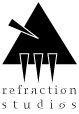
Most logos relate to the name of the company in some way, and what "Refraction" makes me think of is a prism. See below for what my first reaction would be if this company asked me to design a logo for them.
Mine is probably too evil looking - your designs for this logo seem light, airy and colourful - but there are lots of things to play with: making it colourful (not too colourful, though... a logo should always be recogniseable in b&w, since not all ads will be in colour), making it outlined instead of solid, making the corners round...
Disclaimer: This is just an idea to try to get you thinking; I'm not saying your final logo should look anything like this.
Still not a big fan. Using the full name of a company in the logo is usually not so great if the name is more than 4 letters or so. Better to design a logo that has just the initials or no letters at all, and put the name of the company underneath or to the right when needed.
I also feel the line is too reminiscent of the Nike swoosh, and would like it better if the transition from thin to thick was more consistent (right now it starts thin, gets fat in the middle, then thinner again at the bottom, then fat once more before the point).
Most logos relate to the name of the company in some way, and what "Refraction" makes me think of is a prism. See below for what my first reaction would be if this company asked me to design a logo for them.
Mine is probably too evil looking - your designs for this logo seem light, airy and colourful - but there are lots of things to play with: making it colourful (not too colourful, though... a logo should always be recogniseable in b&w, since not all ads will be in colour), making it outlined instead of solid, making the corners round...
Disclaimer: This is just an idea to try to get you thinking; I'm not saying your final logo should look anything like this.
yea I intially wanted to make a prism but I couldnt really visualize exactly how to do one, I think i'll take a shot later though.
yea I intially wanted to make a prism but I couldnt really visualize exactly how to do one, I think i'll take a shot later though.
Thing about logos is that you can't make them too complicated or put any small details in. The reason is that they have to look equally good really small (e.g. on the side of a pen or as the little icon in a browser address bar) and really big (e.g. on the side of a truck). This is also why you don't want to include more than 2-4 letters, if any - it becomes illegible if it's too small.
So, if you're going to go with the prism route (or anything else corresponding to a real-world object), you want to aim for the barest representation you can, rather than any sort of realism. For a prism, a triangle is enough. For light, something like a line (straight or wavy), a row of dots or a narrower triangle is fine.
If that sounds limiting, try this exercise, of the type that they often give in introductory design courses: draw (by hand, really rough-and-quick, no more than 10 seconds for each sketch) 100 (yes, one hundred) thumbnails, using just a triangle (can be filled or outline, sharp or round corners, etc., but still essentially a triangle) to represent a prism and either a line (or lines), a row (or rows) of dots (not necessarily circular - any simple geometric shape) or more triangles to represent light. Limit yourself to two colours (black counts as a colour) plus white (white is the paper/screen, so it doesn't count).
They needn't all be radically different; you can have 5 or 10 small variations on certain ideas. You'll be surprised how quickly and easily you get to 100, and often the best ideas don't come out until you're past 50. Once you're done, then start going through them and crossing out the ideas you like less than the others until you're only left with one (if you get down to two or three and can't decide, get someone else's opinion). Then you've got your idea. That's when you hit Illustrator or Photoshop to lay it out and start fine-tuning. A lot of the bad design you see out there comes from people opening up their art program without a clear idea in mind of what they're going to do, and just improvising as they go. You'll be surprised at how much easier it is when you already know what you want it to look like before you touch the mouse.
You cannot post new topics in this forum You cannot reply to topics in this forum You cannot edit your posts in this forum You cannot delete your posts in this forum You cannot vote in polls in this forum You cannot attach files in this forum You can download files in this forum