|
|
| Which text effect is better? |
Wind Alone |
|
33% |
[ 2 ] |
Distort Ripple |
|
66% |
[ 4 ] |
|
| Total Votes : 6 |
|
| Author |
Message |
scorpion_666
Joined: 19 Oct 2004
Posts: 75
Location: Lakewood, CO
|
 Posted: Sun Apr 10, 2005 12:06 pm Post subject: Which text effect is better? Posted: Sun Apr 10, 2005 12:06 pm Post subject: Which text effect is better? |
 |
|
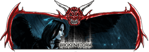
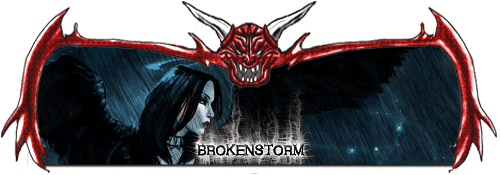
I'm just curious as to your opinions on this, because in the tut I have for this effect it says to Filter > Distort > Ripple at one point and I'm wondering if that looks better than without the ripple.
So look close at these two sigs and tell me what you like better:
Straight wind in the white glow
or ripple in the white glow
| Description: |
|
| Filesize: |
36.95 KB |
| Viewed: |
752 Time(s) |

|
| Description: |
|
| Filesize: |
30.94 KB |
| Viewed: |
752 Time(s) |

|
|
|
|
|
|
 |
scorpion_666

Joined: 19 Oct 2004
Posts: 75
Location: Lakewood, CO
|
 Posted: Sun Apr 10, 2005 3:33 pm Post subject: Posted: Sun Apr 10, 2005 3:33 pm Post subject: |
 |
|
If your going to look at the thread, vote please.
14 views and no replies, WTH?
|
|
|
|
|
 |
witam
Joined: 27 Oct 2004
Posts: 812
Location: Belgium
|
 Posted: Sun Apr 10, 2005 3:37 pm Post subject: Posted: Sun Apr 10, 2005 3:37 pm Post subject: |
 |
|
|
|
|
|
|
 |
scorpion_666

Joined: 19 Oct 2004
Posts: 75
Location: Lakewood, CO
|
 Posted: Sun Apr 10, 2005 5:10 pm Post subject: Posted: Sun Apr 10, 2005 5:10 pm Post subject: |
 |
|
| witam wrote: | | Honestly i don't think either fits.. it doesn't fit the image.. neither does.. |
Ok I hear what you are saying. However I'm actually more concerned with which text effect looks better with the template. Because like that image inside the template, it clashes with the template itself. Therefore in this case it might clash with the text as well. While on other sigs the image and template could match or the image and text effect could match but the third element might not.
Basically it has to be one or other, so if it had to be one of the two, based upon the template and text effect, but regardless of the image in the middle. Which do you suggest?
|
|
|
|
|
 |
teddc

Joined: 04 Oct 2004
Posts: 389
Location: Belmont North Australia
|
 Posted: Sun Apr 10, 2005 6:14 pm Post subject: Posted: Sun Apr 10, 2005 6:14 pm Post subject: |
 |
|
I agree with witham...
...but
It's a matter of your personal choice.
What you want. It's your sig
ted
_________________
WHAT WOULD VAN GOUGH HAVE DONE WITH PHOTOSHOP |
|
|
|
|
 |
scorpion_666

Joined: 19 Oct 2004
Posts: 75
Location: Lakewood, CO
|
 Posted: Sun Apr 10, 2005 9:11 pm Post subject: Posted: Sun Apr 10, 2005 9:11 pm Post subject: |
 |
|
Actually while they are my creation, I'm not going to keep them for myself. I think I'm going to let someone else use this sig set.
Nonetheless I'm basically asking if there was a choice between the two, which would it be.
|
|
|
|
|
 |
teddc

Joined: 04 Oct 2004
Posts: 389
Location: Belmont North Australia
|
 Posted: Sun Apr 10, 2005 9:33 pm Post subject: Posted: Sun Apr 10, 2005 9:33 pm Post subject: |
 |
|
ask the client which one
ted
_________________
WHAT WOULD VAN GOUGH HAVE DONE WITH PHOTOSHOP |
|
|
|
|
 |
scorpion_666

Joined: 19 Oct 2004
Posts: 75
Location: Lakewood, CO
|
 Posted: Sun Apr 10, 2005 10:06 pm Post subject: Posted: Sun Apr 10, 2005 10:06 pm Post subject: |
 |
|
There is no client, as I'm not making this for anyone specific. I might let someone else use the set, I might not.
Don't know and it's irrelevant.
Simple poll question, if there was a choice you had to make between the two, what would it be?
not too hard here...I think 
|
|
|
|
|
 |
witam

Joined: 27 Oct 2004
Posts: 812
Location: Belgium
|
 Posted: Sun Apr 10, 2005 11:08 pm Post subject: Posted: Sun Apr 10, 2005 11:08 pm Post subject: |
 |
|
|
|
|
|
|
 |
scorpion_666

Joined: 19 Oct 2004
Posts: 75
Location: Lakewood, CO
|
 Posted: Sun Apr 10, 2005 11:41 pm Post subject: Posted: Sun Apr 10, 2005 11:41 pm Post subject: |
 |
|
Thank you for your comment and a decision between the two.
What you pointed out is actually the oddest thing about this. I have very lil control over that. Aside from going Image > Adjustments > Brightness/Contrast and lowering them both to thin it. It's just on certain images the darker ones mainly, it appears more visible and you can see all the wind and distortion fibers, and on the light colored ones...you barely see them at all. It makes it rather inconsistent and it annoys me.
If anyone here has an alternative solution AFTER voting on one of the two previous options, I'd love to hear it.
|
|
|
|
|
 |
|


