|
|
| Author |
Message |
FadedinPS23

Joined: 27 Dec 2004
Posts: 183
|
 Posted: Tue Mar 15, 2005 3:34 am Post subject: ride the wave Posted: Tue Mar 15, 2005 3:34 am Post subject: ride the wave |
 |
|
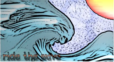
This image is ALL photoshop from the wave to the sun. This wasn't taken from any kind of image. What do you think?
| Description: |
|
| Filesize: |
102.02 KB |
| Viewed: |
576 Time(s) |
|
|
|
|
|
|
 |
cyborg
Joined: 12 Oct 2004
Posts: 1102
Location: canada
|
| Posted: Tue Mar 15, 2005 8:48 am Post subject: |
|
|
that looks pretty good... the poster edges looks great in the wave:D
|
|
|
|
|
|
teddc

Joined: 04 Oct 2004
Posts: 389
Location: Belmont North Australia
|
| Posted: Tue Mar 15, 2005 2:03 pm Post subject: |
|
|
Very good..
reminds me of Van Gough style with the swirls and colours
and I love the composition
ted
_________________
WHAT WOULD VAN GOUGH HAVE DONE WITH PHOTOSHOP |
|
|
|
|
|
thehermit
Joined: 05 Mar 2003
Posts: 3987
Location: Cheltenham, UK
|
| Posted: Tue Mar 15, 2005 9:35 pm Post subject: |
|
|
The blunt side of me says it looks like an accident in the filter factory, the nicer side of me says it reminds me of the famous Japanese piccie 'The Wave'.
_________________
If life serves you lemons, make lemonade! |
|
|
|
|
|
FadedinPS23
Joined: 27 Dec 2004
Posts: 183
|
| Posted: Wed Mar 16, 2005 12:06 am Post subject: |
|
|
well let me reassure you that it wasn't an accident. I meant for it to look like that. Thanks for the comments though.
|
|
|
|
|
|
Goog

Joined: 02 Mar 2005
Posts: 84
|
| Posted: Wed Mar 16, 2005 8:07 am Post subject: |
|
|
Put more black lines where you need em' and itll be perfect.
|
|
|
|
|
|
dojo.ro

Joined: 09 May 2004
Posts: 45
Location: Timisoara, Romania
|
| Posted: Wed Mar 16, 2005 9:13 am Post subject: |
|
|
It looks quite nice. So much you can do with talent and skills 
I love it. My only problem would be with the writing. make it stand more or just delete it. It's too dark and takes the beauty of the image.
_________________
My Photoshop tutorials
Dojo Design |
|
|
|
|
|
FadedinPS23
Joined: 27 Dec 2004
Posts: 183
|
| Posted: Wed Mar 16, 2005 3:09 pm Post subject: |
|
|
I agree ..... I don't like the writing either.
|
|
|
|
|
|
|


