|
|
| Author |
Message |
Haunus

Joined: 24 Nov 2004
Posts: 740
|
 Posted: Wed Mar 16, 2005 4:27 am Post subject: new design Posted: Wed Mar 16, 2005 4:27 am Post subject: new design |
 |
|
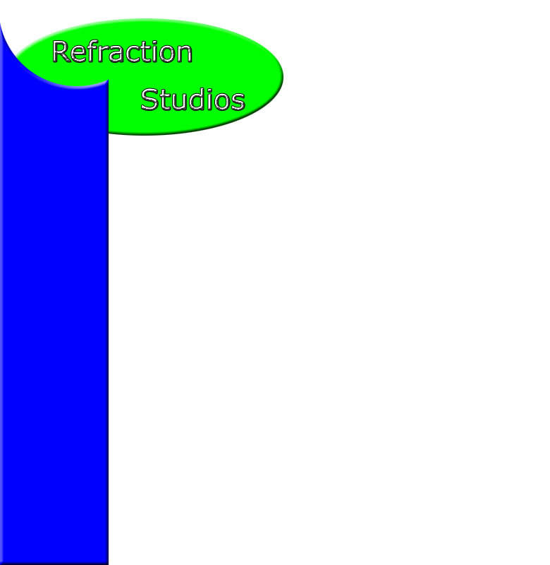
The other design was too constricted what do you think of this?
| Description: |
|
| Filesize: |
51.21 KB |
| Viewed: |
875 Time(s) |
|
|
|
|
|
|
 |
witam

Joined: 27 Oct 2004
Posts: 812
Location: Belgium
|
| Posted: Wed Mar 16, 2005 4:37 am Post subject: |
|
|
|
|
|
|
|
|
Haunus
Joined: 24 Nov 2004
Posts: 740
|
| Posted: Wed Mar 16, 2005 5:03 am Post subject: |
|
|
professionalism, but good vibes as well, kinda like a fun, professional effect.
|
|
|
|
|
|
Proprius
Joined: 28 Feb 2005
Posts: 137
|
| Posted: Wed Mar 16, 2005 7:12 am Post subject: |
|
|
I really like the shapes, but I think the bright green makes it seem too "bright" for a professional look... barely. I think darkening the green up just a little bit would help mitigate this. Great Work!
|
|
|
|
|
|
Goog

Joined: 02 Mar 2005
Posts: 84
|
| Posted: Wed Mar 16, 2005 8:10 am Post subject: |
|
|
Agree with what Prop (if I may call you that  )said. )said.
Bright colors make it look, kid-ish. I know it may be just an example, but you know  . .
And maybe give it them some texture....
|
|
|
|
|
|
dojo.ro

Joined: 09 May 2004
Posts: 45
Location: Timisoara, Romania
|
| Posted: Wed Mar 16, 2005 9:11 am Post subject: |
|
|
Try to have some more elements and graphics. So far it's too somple and unappealing. Try a logo and something for it. and the bevel is too high ... make it more discreet.
Good luck and keep us posted.
_________________
My Photoshop tutorials
Dojo Design |
|
|
|
|
|
teddc

Joined: 04 Oct 2004
Posts: 389
Location: Belmont North Australia
|
| Posted: Wed Mar 16, 2005 1:41 pm Post subject: |
|
|
The colours a bit sharp. Try toning them down a bit and you will start to get on the right track.
Ted
_________________
WHAT WOULD VAN GOUGH HAVE DONE WITH PHOTOSHOP |
|
|
|
|
|
Haunus
Joined: 24 Nov 2004
Posts: 740
|
| Posted: Wed Mar 16, 2005 2:01 pm Post subject: |
|
|
Any ideas for logos? I will darken it and decrease the bevel. heres a button by the way.
| Description: |
|
| Filesize: |
1.86 KB |
| Viewed: |
843 Time(s) |

|
|
|
|
|
|
|
witam
Joined: 27 Oct 2004
Posts: 812
Location: Belgium
|
| Posted: Wed Mar 16, 2005 2:05 pm Post subject: |
|
|
Logo should be something unique and yours in my opinion. It represents you and your art.
Like Dojo.ro already said try adding more graphical elements. show off your abilities. This is what people will base their idea about you and your studios on. If you add more complex elements, people will assume you can do more complicated stuff. If you use simple basic elements (as you do now) people will assume you don't know more. It will not invite them to come to you.
_________________
Witam
http://members.chello.be/wotsa
http://www.shadowness.com/witam |
|
|
|
|
|
Devil-Dan
Joined: 13 Mar 2005
Posts: 3
Location: Cornwall southwest u.k
|
| Posted: Wed Mar 16, 2005 4:40 pm Post subject: |
|
|
i think the shapes good. imo colours too bright but it should reflect u and ur skills. As the other peeps say think it needs more work and more detail. Try using different styles.
|
|
|
|
|
|
|


