|
|
| Author |
Message |
darklite
Joined: 19 Dec 2009
Posts: 277
Location: Oregon, U.S.
PS Version: cs
OS: windows 7
|
 Posted: Sun Dec 05, 2010 9:49 am Post subject: Portrait of Heath Ledger Posted: Sun Dec 05, 2010 9:49 am Post subject: Portrait of Heath Ledger |
 |
|
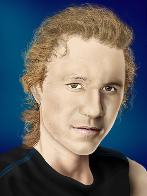
Here's my latest of Heath Ledger. I got stuck somewhere, but I don't know where. Something seems not quite right to me. Any thoughts?
| Description: |
|
| Filesize: |
93.74 KB |
| Viewed: |
665 Time(s) |

|
_________________
Jeff
http://www.autumnwindstudios.com |
|
|
|
|
 |
thehermit
Joined: 05 Mar 2003
Posts: 3987
Location: Cheltenham, UK
|
 Posted: Sun Dec 05, 2010 10:40 am Post subject: Posted: Sun Dec 05, 2010 10:40 am Post subject: |
 |
|
Hi darklite it may help us if you could provide the reference photo/s.
It looks good to me, perhaps a little 'smooth' or airbrushed, I can only add subjective points really, but I may add more texture to his face, stubble and the like.
More detail on his right eyebrow would add to the composition as would a bit more ear shadow/definition.
Nice hair work as always!
_________________
If life serves you lemons, make lemonade! |
|
|
|
|
 |
darklite
Joined: 19 Dec 2009
Posts: 277
Location: Oregon, U.S.
PS Version: cs
OS: windows 7
|
 Posted: Sun Dec 05, 2010 12:56 pm Post subject: Posted: Sun Dec 05, 2010 12:56 pm Post subject: |
 |
|
Thanks Hermit. I've stared at it for hours and I can find a million things wrong, but I always do with my stuff. I'd like to get someone else's opinion to narrow it down. I agree about the stubble. I don't do men that often and it was a challenge. I've attached a reference pic.
| Description: |
|
| Filesize: |
37.7 KB |
| Viewed: |
656 Time(s) |

|
_________________
Jeff
http://www.autumnwindstudios.com |
|
|
|
|
 |
thehermit
Joined: 05 Mar 2003
Posts: 3987
Location: Cheltenham, UK
|
 Posted: Sun Dec 05, 2010 2:13 pm Post subject: Posted: Sun Dec 05, 2010 2:13 pm Post subject: |
 |
|
| Quote: | | I've stared at it for hours and I can find a million things wrong |
Yikes! I can do that on any given job myself, we are always our own worse enemy/critic (apart from in the worse cases, when we're not!, but you did ask for it  ) )
Off the top of my head, widen his. More shading work and darken the hair. Lighting around our right side of his face, it's good until the lip level when it seem to stop on the source image, but carry on around on yours. Oh and ear ring smaller, but now I'm being churlish 
Gotta say though, you have got the source image pretty much nailed down, it's a great likeness and as I say it's only subjective. I certainly can't produce anything like this so...
_________________
If life serves you lemons, make lemonade! |
|
|
|
|
 |
darklite
Joined: 19 Dec 2009
Posts: 277
Location: Oregon, U.S.
PS Version: cs
OS: windows 7
|
 Posted: Sun Dec 05, 2010 2:22 pm Post subject: Posted: Sun Dec 05, 2010 2:22 pm Post subject: |
 |
|
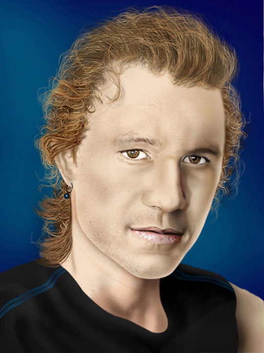
Thanks Hermit, every bit helps. Hmmm. widening the face. That's an interesting tip, and now that I look at it, I think you're right. I also noticed a bit more hollowing of the face on the source image, ie, thinner cheekbones. I should try to add a bit more depth.
_________________
Jeff
http://www.autumnwindstudios.com |
|
|
|
|
 |
thehermit
Joined: 05 Mar 2003
Posts: 3987
Location: Cheltenham, UK
|
 Posted: Sun Dec 05, 2010 4:21 pm Post subject: Posted: Sun Dec 05, 2010 4:21 pm Post subject: |
 |
|
It's your gig and I'm no Dali  Look forward to seeing the end result! Look forward to seeing the end result!
_________________
If life serves you lemons, make lemonade! |
|
|
|
|
 |
darklite
Joined: 19 Dec 2009
Posts: 277
Location: Oregon, U.S.
PS Version: cs
OS: windows 7
|
 Posted: Mon Dec 06, 2010 8:48 am Post subject: Posted: Mon Dec 06, 2010 8:48 am Post subject: |
 |
|
|
|
|
|
|
 |
thehermit
Joined: 05 Mar 2003
Posts: 3987
Location: Cheltenham, UK
|
 Posted: Tue Dec 07, 2010 2:32 am Post subject: Posted: Tue Dec 07, 2010 2:32 am Post subject: |
 |
|
Looks good to me darklite and although subtle I think the face being wider helps as does the added texture. GJ
_________________
If life serves you lemons, make lemonade! |
|
|
|
|
 |
darklite
Joined: 19 Dec 2009
Posts: 277
Location: Oregon, U.S.
PS Version: cs
OS: windows 7
|
 Posted: Tue Dec 07, 2010 5:49 am Post subject: Posted: Tue Dec 07, 2010 5:49 am Post subject: |
 |
|
|
|
|
|
|
 |
|


