|
|
| Author |
Message |
modula
Joined: 19 Apr 2010
Posts: 7
|
 Posted: Thu Apr 22, 2010 1:43 am Post subject: Blending superimposed object Posted: Thu Apr 22, 2010 1:43 am Post subject: Blending superimposed object |
 |
|
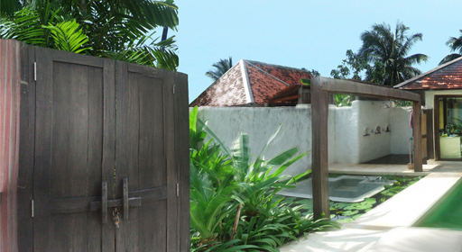
I'm working on piecing together a large panoramic image from terrible source material, so I am having to add certain elements after the individual photos have been merged. Attached is a jpeg of a segment of this work in progress. The door on the left is really bothering me, as it is so clearly superimposed. I have feathered the edges quite a lot using a soft eraser setting, and have tried playing with burning the edges too, and nothing seems to make it convincing. Does anyone please have any tips as to how to make this blend with the background?
Thanks
| Description: |
|
| Filesize: |
166.92 KB |
| Viewed: |
1290 Time(s) |
|
|
|
|
|
|
 |
jjochems78
Joined: 09 Nov 2009
Posts: 21
Location: Lansing, MI
|
| Posted: Thu Apr 22, 2010 2:41 pm Post subject: |
|
|
I'm thinking its not the edges that are making it look imposed. Its the way the light looks on the door compared to the background. Best thing I could suggest is to play with the door using curves. And adjust the highlights and shadows in a way to make it match more with the background. Still not an easy task. You have to be really subtle with curves otherwise you blow out the contrast too much.
|
|
|
|
|
|
thehermit
Joined: 05 Mar 2003
Posts: 3987
Location: Cheltenham, UK
|
| Posted: Thu Apr 22, 2010 4:41 pm Post subject: |
|
|
Good observation jj (if I may be so bold as to call you that). Lighting is a problem. I do think though, that a bit more blurring could take place (anti aliasing) on the gate edges. The only real problem that I can see is the slightly blurred palms in the foreground/middle ground. Don't let anything stand in your way, composite it, if you have to! 
_________________
If life serves you lemons, make lemonade! |
|
|
|
|
|
modula
Joined: 19 Apr 2010
Posts: 7
|
| Posted: Fri Apr 23, 2010 2:01 am Post subject: |
|
|
Cheers for the advice. Before you'd replied I'd blurred the edges a bit and created some fake lighting on it that had got it 90% right. But you're totally right - it is the blurred bush that made it look off, so I'm in the process of replacing this now - it's at about 99% right now!
Thanks - I may well be back on here soon if it doesn't come out 100%!
|
|
|
|
|
|
modula
Joined: 19 Apr 2010
Posts: 7
|
| Posted: Mon May 10, 2010 1:56 am Post subject: |
|
|
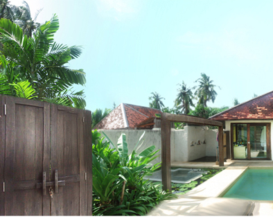
It's been a while but I need more help on this same problem! I've attached a new version of the image. I've corrected the bush to the right of the door on the left of the image, placed a gaussian blurred version of the door underneath and changed the contrast / brightness of the door, but it still does not sit properly with the rest of the image. Does anyone have any amazing tips to make it look less superimposed please? I'm getting desperate and I really need this done....
Thanks!
|
|
|
|
|
|
modula
Joined: 19 Apr 2010
Posts: 7
|
| Posted: Mon May 10, 2010 1:59 am Post subject: |
|
|
Ok it didn't attach! Attempt 2
| Description: |
|
| Filesize: |
152.07 KB |
| Viewed: |
1172 Time(s) |
|
|
|
|
|
|
|
seaco

Joined: 31 Dec 2009
Posts: 729
Location: UK
PS Version: CC
OS: Windows 10
|
| Posted: Tue May 11, 2010 8:13 am Post subject: |
|
|
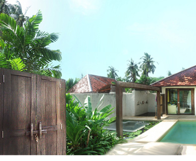
I added some contrast/brightness then burn and dodge etc. to get closer to the rest of the pic and give a more sunlit appearance...
Lee
| Description: |
|
| Filesize: |
78.19 KB |
| Viewed: |
1146 Time(s) |
|
_________________
Lee |
|
|
|
|
|
modula
Joined: 19 Apr 2010
Posts: 7
|
| Posted: Fri May 14, 2010 10:15 am Post subject: |
|
|
Cheers for that - sorted the lighting out and it solved it perfectly!
|
|
|
|
|
|
|


