|
|
| Author |
Message |
scorpion_666

Joined: 19 Oct 2004
Posts: 75
Location: Lakewood, CO
|
 Posted: Sat Apr 09, 2005 9:59 pm Post subject: 2nd Sig I've ever made by myself! Posted: Sat Apr 09, 2005 9:59 pm Post subject: 2nd Sig I've ever made by myself! |
 |
|
Please rate this and I'd love any HONEST criticism, critique, or comments.
ANIMATION, so please 56K peeps, just wait a sec.

|
|
|
|
|
 |
teddc

Joined: 04 Oct 2004
Posts: 389
Location: Belmont North Australia
|
 Posted: Sun Apr 10, 2005 1:36 am Post subject: Posted: Sun Apr 10, 2005 1:36 am Post subject: |
 |
|
I don't know...
you seem to have two conflicting styles.
One with the border and the other with the interior.
The border seems 'caroonty' and line drawing were as the model in the inner seems to have an airbrushed effect. It looks as though you have just copied and pasted the whole thing together.
You could do something with the horns, they seem a bit bland as with the teeth.
The concept is good. I like the animated rain. And you are getting an idea of design.
Keep going it's a hard road ahead.
ted
_________________
WHAT WOULD VAN GOUGH HAVE DONE WITH PHOTOSHOP |
|
|
|
|
 |
<aazumak>

Joined: 22 Mar 2005
Posts: 384
Location: rhode island
|
 Posted: Sun Apr 10, 2005 6:05 am Post subject: Posted: Sun Apr 10, 2005 6:05 am Post subject: |
 |
|
yes, the red and the black clash yet they kinda look good together.
|
|
|
|
|
 |
scorpion_666

Joined: 19 Oct 2004
Posts: 75
Location: Lakewood, CO
|
 Posted: Sun Apr 10, 2005 9:05 am Post subject: Posted: Sun Apr 10, 2005 9:05 am Post subject: |
 |
|
| teddc wrote: | I don't know...
you seem to have two conflicting styles. |
Yeah the "demon border" is a template for all the sigs I'm making. Like the text effects regardless of whether the image clashes with it or not. It is unchangeable and unmodifiable. I agree with you it does clash, but on some it will and some it won't.
| teddc wrote: | One with the border and the other with the interior.
The border seems 'caroonty' and line drawing were as the model in the inner seems to have an airbrushed effect. It looks as though you have just copied and pasted the whole thing together. |
I'm going to take this as a compliment. Because I actually clone stamped/healing brushed the far left of the sig, and nearly all of the sig on the right side, from the mid point of the demon template. So if you think it's copy/pasted, than I must have done really good blending it all and reforming/expanding the bg.
| teddc wrote: | You could do something with the horns, they seem a bit bland as with the teeth.
The concept is good. I like the animated rain. And you are getting an idea of design.
Keep going it's a hard road ahead.
ted |
Yeah those were my thoughts as well with the template to begin with. I thought the horns and teeth were a lil "blah". But I had an illustrator make that out of nothing, and he didn't charge me so I took it for what it was, instead of having him redo it a few more times.
I do agree with you, it is going to get tough with all the different designs and skills you can employ.
|
|
|
|
|
 |
BuzWeaver

Joined: 09 Apr 2005
Posts: 82
Location: Atlanta, GA - USA
|
 Posted: Sun Apr 10, 2005 1:05 pm Post subject: Posted: Sun Apr 10, 2005 1:05 pm Post subject: |
 |
|
Very nice.
|
|
|
|
|
 |
scorpion_666

Joined: 19 Oct 2004
Posts: 75
Location: Lakewood, CO
|
 Posted: Sun Apr 10, 2005 2:03 pm Post subject: Posted: Sun Apr 10, 2005 2:03 pm Post subject: |
 |
|
Tanks^^
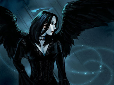
Another dude I know online on msn, said a similar response of clashing themes or mainly colors. But he said the editing work is great, you can't even tell that it's been done. That is great, and it's the idea, I don't want to show graphical errors, so I worked the brushes for along time to get it to look blended really well.
It isn't cropped, here is the original jpeg and based upon my placement you'll see how or where I extended the BG.
| Description: |
|
| Filesize: |
47.96 KB |
| Viewed: |
546 Time(s) |

|
|
|
|
|
|
 |
cyborg
Joined: 12 Oct 2004
Posts: 1102
Location: canada
|
 Posted: Mon Apr 11, 2005 9:08 am Post subject: Posted: Mon Apr 11, 2005 9:08 am Post subject: |
 |
|
something just with the interior would look better than with the demon border....like a metal border or something
|
|
|
|
|
 |
|


