|
|
| Which is the best picture? |
Picture #1 |
|
0% |
[ 0 ] |
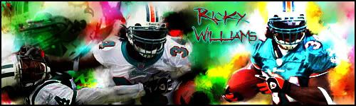
Picture #2 |
|
0% |
[ 0 ] |
Picture #3 |
|
0% |
[ 0 ] |
|
| Total Votes : 0 |
|
| Author |
Message |
pd8731
Joined: 30 Nov 2007
Posts: 1
|
 Posted: Fri Nov 30, 2007 4:29 pm Post subject: Which is The Best? (Poll) Posted: Fri Nov 30, 2007 4:29 pm Post subject: Which is The Best? (Poll) |
 |
|
Picture #1

Picture #2
Picture #3
 |
|
|
|
|
 |
Pathogen38
Joined: 21 Oct 2007
Posts: 14
|
| Posted: Sat Dec 01, 2007 10:16 pm Post subject: |
|
|
I like picture one because Picture two has too much rainbows and football and picture three means nothing to me. However I like the effects done to picture three the best, especially the translucent boxes/triangles on the left.
_________________
"This time around I know what I'm fighting for"
- Cinderella Man (great movie) |
|
|
|
|
|
CoosmoGirl123
Joined: 13 Dec 2007
Posts: 13
Location: Toronto
|
| Posted: Sat Dec 15, 2007 3:04 pm Post subject: |
|
|
I like 1
_________________
It is the medium that is the message |
|
|
|
|
|
yourfateunknown
Joined: 28 Dec 2007
Posts: 7
|
| Posted: Fri Dec 28, 2007 10:10 am Post subject: |
|
|
number 3 is the best, im not a fan of negative pictures
and the 2nd one, too much bright colours and the font colour and the font doesnt fit
but the third looks profiessinal 
_________________
www.yourfateunknown.com - free movies |
|
|
|
|
|
helcyon
Joined: 02 Oct 2005
Posts: 191
PS Version: CS3
OS: OSX 10
|
| Posted: Fri Jan 04, 2008 10:57 am Post subject: |
|
|
Number 3 is the best.
#1 looks like you just applied a filter to a picture and left it as is. Nothing special about it.
#2 is much too chaotic. There is way too much happening all at once with a ton of colors. It is not pleasing to the viewer's eyes. The font choice does not fit and the outer glow looks odd.
#3 Things can be changed to improve this, but out of the 3, it is the best. The "pd8731" is legible, and although there are many elements to the page the viewer is not distracted by chaos. You might want to lessen the opacity of the background text, while increasing the fill opacity of the main "pd8731"
_________________
www.kg-studios.com |
|
|
|
|
|
|


