|
|
| Author |
Message |
BamaFan2989
Joined: 21 Aug 2005
Posts: 7
|
 Posted: Wed Aug 24, 2005 8:42 pm Post subject: rating? Posted: Wed Aug 24, 2005 8:42 pm Post subject: rating? |
 |
|
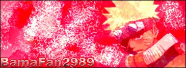
hey guys can you rate these out of 10? they were done a while back... and i am working on a big one that i am trying to make perfect ^_^
just tell me what you think


i know the fonts could have been better... but i didnt have any downloaded....
_________________
arigato ! ^_^ |
|
|
|
|
 |
BamaFan2989
Joined: 21 Aug 2005
Posts: 7
|
| Posted: Wed Aug 24, 2005 9:57 pm Post subject: |
|
|
also this guys
i just did it 5 mins ago and i kinda like it
like i said.. i havent been in this for long so any progress is good....
the white is bothering me because i think it is too white or something, plus the font isnt' dark enough to me.
i am posting the .psd file just in case any of you wanna do something to it and show me
thanks
_________________
arigato ! ^_^ |
|
|
|
|
|
Kyoji24
Joined: 03 Jun 2005
Posts: 74
|
| Posted: Thu Aug 25, 2005 5:48 am Post subject: |
|
|
You need to do something with the text to make it stand out more. Remember your text can express what the design means even it the design is crappy. As for the naruto one, you need to work on your brushing and blending. The text should tied in with it instead of an gradient on it, its 5/10 in attempting it. As for the top two you may want to design a more interesting background to match the pictures or renders. Try using no more than 2 pics or renders within the sig, that will help make things stand out. Another 5/10 for effort. |
|
|
|
|
|
eMiR
Joined: 04 Aug 2005
Posts: 92
|
| Posted: Fri Aug 26, 2005 4:07 am Post subject: |
|
|
Yea add more things to the text there currently plain and you need to do more Brushing an d maybe Rendering make the backround stand out a bit more and maybe blend a render into it.
I give it 5/10 also.
_________________
You Have Balls, I Like Balls |
|
|
|
|
|
|


