|
|
| Author |
Message |
Vindeta
Joined: 03 Sep 2010
Posts: 21
|
 Posted: Sun Feb 06, 2011 9:45 pm Post subject: Opinions for a picture Posted: Sun Feb 06, 2011 9:45 pm Post subject: Opinions for a picture |
 |
|
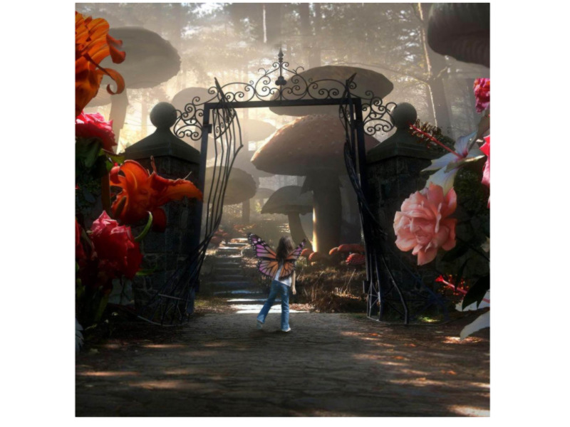
Wanted to do something for my niece and she really likes the movie Alice in Wonderland so i figured what a better idea than to put her in a scene from it.
I just finished touching this one up after working on it for a couple days now and wanted to know what everyone thought of it. The original is 40x30 and had to shrink this one down by quite a bit. If anyone has any ideas on how to make it look just that much better, please say whats on your mind.
| Description: |
|
| Filesize: |
130.37 KB |
| Viewed: |
742 Time(s) |
|
|
|
|
|
|
 |
ground_zero298
Joined: 06 Feb 2011
Posts: 7
|
| Posted: Mon Feb 07, 2011 1:20 am Post subject: |
|
|
Looks good, she should really like that.
IMO I would take the back ground, duplicate it, and overlay it. Back ground should be more colorfull. Try to get the background colors to harmonize with the flowers. Also her shadow should be on the other side.
Just my 2 cents, but I prefer heavy colors and I'm a stickler for shadowing.
|
|
|
|
|
|
Vindeta
Joined: 03 Sep 2010
Posts: 21
|
| Posted: Mon Feb 07, 2011 2:00 am Post subject: |
|
|
Thanks for the input ground_zero, its these things little things that i'm looking for. I did notice what you meant by the shadow which is a fairly easy change
The duplication and overlaying the background made the entire thing super dark which will need some playing around with.
Thanks
|
|
|
|
|
|
ground_zero298
Joined: 06 Feb 2011
Posts: 7
|
| Posted: Mon Feb 07, 2011 3:16 pm Post subject: |
|
|
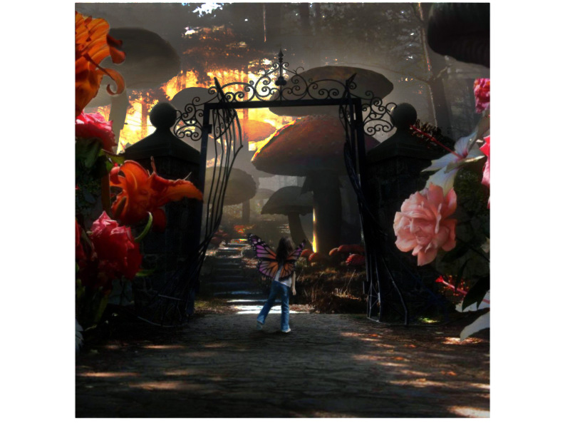
I spent a couple minutes with your pic, excuse the crudness of it.
went with a hard light overlay on the back ground, and couple tweaks in the color spectrum (image adjustments) and some burn and sponge brushes. With some time and effort it can help the color pop from the background.
Just some info if you feel like messing with the back ground colors.
I got a little excessive with some burn spots, but it was just to give you some ideas.
| Description: |
|
| Filesize: |
151.47 KB |
| Viewed: |
703 Time(s) |
|
|
|
|
|
|
|
thehermit
Joined: 05 Mar 2003
Posts: 3987
Location: Cheltenham, UK
|
| Posted: Mon Feb 07, 2011 3:28 pm Post subject: |
|
|
I like the tones in the original, there's a nice touch of the ethereal about the misty background and desaturated is exactly the look I would have pitched for.
For my tastes I would blur the roses in the foreground a little I think it may bring your daughter into focus even more and create a proper depth of field, I may be tempted to also create a little light dappling on the ground beneath her feet.
Overall though, you must be pleased with this Vindeta, you have done a rocking job! 
Just noticed - perhaps the flower in the top left is a little distracting (everyone loves a critic  ) )
_________________
If life serves you lemons, make lemonade! |
|
|
|
|
|
Vindeta
Joined: 03 Sep 2010
Posts: 21
|
| Posted: Tue Feb 08, 2011 12:17 am Post subject: |
|
|
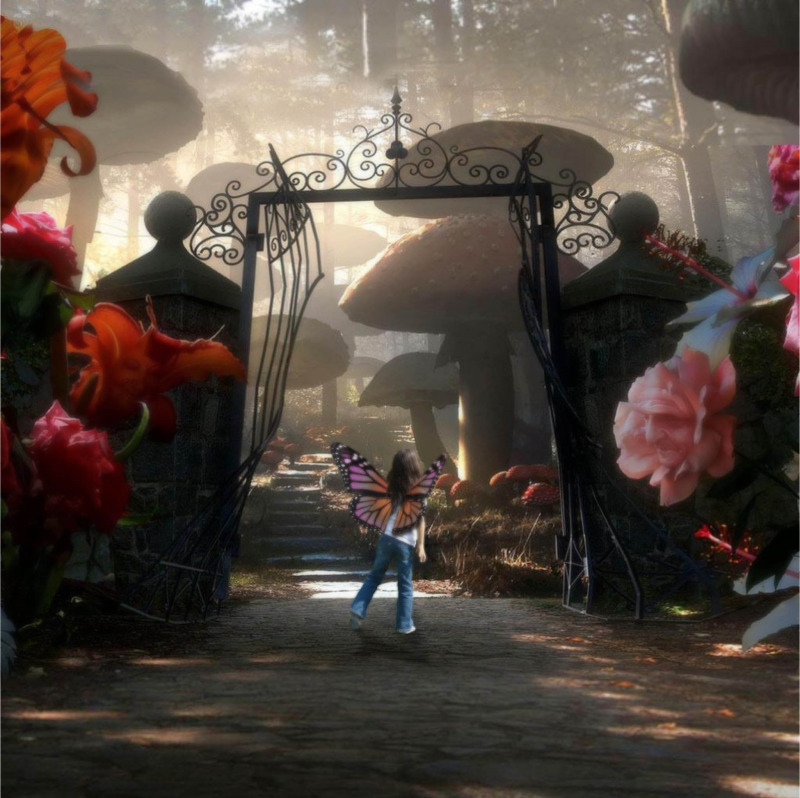
I went ahead and duplicated the outside flowers and put a Gaussian Blur on them along with adjusting the exposure and hue/saturation of them in order to make them blend in more with the environment instead of having them stand out so much.
Also changed up the shadow in order to have it angled in a more relevant direction.
I did attempt to change up the background with adjusting the blending modes. Also tried adjusting the different settings in the image > adjustments and in the end, i didn't get the feel that i wanted so I kept it as it is. What i wanted to keep was the feel of what was in the distance stays in the distance. None of which i wanted to push into the foreground with making colors stand out from the background. This way i can keep the focus on the foreground with keeping that misty look as thehermit pointed out.
This is what i ended up with
| Description: |
|
| Filesize: |
184.67 KB |
| Viewed: |
687 Time(s) |
|
|
|
|
|
|
|
Netaddict
Joined: 16 Feb 2011
Posts: 332
Location: Earth
PS Version: CS6
OS: Windows 7 Professional
|
| Posted: Thu Feb 17, 2011 6:15 am Post subject: |
|
|
I prefer Vindeta's first image over the others as the others are a bit too dark and crowded
|
|
|
|
|
|
|


