|
|
| Author |
Message |
jppv
Joined: 04 Jun 2011
Posts: 7
|
 Posted: Tue Aug 16, 2011 11:01 pm Post subject: Need some inspiration/advice please Posted: Tue Aug 16, 2011 11:01 pm Post subject: Need some inspiration/advice please |
 |
|
Hey all,
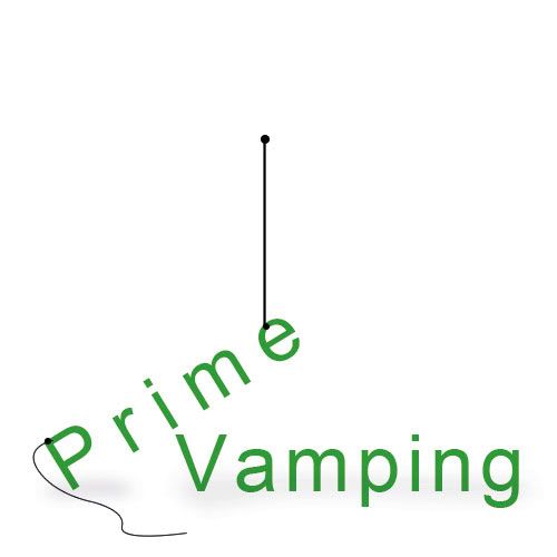
Creating a 3D poster type deal for a client of mine. And I need a little inspiration/advice/tips on a few things.
Take a look at what I got so far, as you can see the Prime is suppose to look like it's falling off of Vaping. What I need is help in creating something that will make Prime look like it's not going to fall anymore because it's attached to Vaping. Either something holding the P in Prime or something like a string attached to the p in vaping that is then attached to the e in Prime, or smoke looks like it's wrapped around a letter in Prime and in Vaping that's holding it in place. Not sure what to do I am at a stand still lol
Any creative advice would be appreciated.
Thanks
| Description: |
|
| Filesize: |
114.52 KB |
| Viewed: |
1139 Time(s) |

|
|
|
|
|
|
 |
Auieos
Joined: 29 Jan 2010
Posts: 2019
|
 Posted: Wed Aug 17, 2011 2:03 am Post subject: Posted: Wed Aug 17, 2011 2:03 am Post subject: |
 |
|
The Perspective of the two words look to be different to each other as far as vanishing points, horizon etc.
Especially where the points of the M and the V meet.
The overall look could be improved just by fixing this issue.
|
|
|
|
|
 |
jppv
Joined: 04 Jun 2011
Posts: 7
|
 Posted: Wed Aug 17, 2011 10:33 am Post subject: Posted: Wed Aug 17, 2011 10:33 am Post subject: |
 |
|
They are suppose to be off, and not perfectly aligned.
| Auieos wrote: | The Perspective of the two words look to be different to each other as far as vanishing points, horizon etc.
Especially where the points of the M and the V meet.
The overall look could be improved just by fixing this issue. |
|
|
|
|
|
 |
Photoshoprint
Joined: 15 Aug 2011
Posts: 10
Location: Romania
|
 Posted: Wed Aug 17, 2011 3:02 pm Post subject: Posted: Wed Aug 17, 2011 3:02 pm Post subject: |
 |
|
Here, maybe his helps. Try aligning the place where P is with V and you'll get the illusion that the words are standing on a floor and Prime is leaning on Vamping

_________________
Photoshoprint | Photoshop Tutorials for Print-Ready Designs |
|
|
|
|
 |
seaco

Joined: 31 Dec 2009
Posts: 729
Location: UK
PS Version: CC
OS: Windows 10
|
 Posted: Wed Aug 17, 2011 4:30 pm Post subject: Posted: Wed Aug 17, 2011 4:30 pm Post subject: |
 |
|
Maybe this?
| Description: |
|
| Filesize: |
127.23 KB |
| Viewed: |
1101 Time(s) |

|
_________________
Lee |
|
|
|
|
 |
jppv
Joined: 04 Jun 2011
Posts: 7
|
 Posted: Wed Aug 17, 2011 7:32 pm Post subject: Posted: Wed Aug 17, 2011 7:32 pm Post subject: |
 |
|
Thank you for the great ideas guys!
I am going to go with Photoshoprint's idea, it'll look good and it's easy 
Thanks again everyone!
|
|
|
|
|
 |
Cloudless_Creative

Joined: 23 Dec 2011
Posts: 113
PS Version: Adobe CS5
OS: Mac
|
 Posted: Tue Dec 27, 2011 7:26 pm Post subject: Posted: Tue Dec 27, 2011 7:26 pm Post subject: |
 |
|
An extremely late reply but Seaco, you did exactly what my mind painted after reading the post! 
_________________
Those who dare to waste one moment of time have not yet discovered the value of life. |
|
|
|
|
 |
Netaddict
Joined: 16 Feb 2011
Posts: 332
Location: Earth
PS Version: CS6
OS: Windows 7 Professional
|
 Posted: Sat Jan 07, 2012 2:09 pm Post subject: Posted: Sat Jan 07, 2012 2:09 pm Post subject: |
 |
|
One simple improvement: please remove the smoke, it's disratcting. The irst thing I noticed when I looked at your picture was the smoke, my eyes spent some time trying to figure out what the main subject is.
seaco; as usual you are right on
|
|
|
|
|
 |
iloveprint
Joined: 12 Jan 2012
Posts: 34
|
 Posted: Tue Mar 27, 2012 4:04 am Post subject: Posted: Tue Mar 27, 2012 4:04 am Post subject: |
 |
|
The last idea is pretty good and would work with the right touch. The glare/spark/shine on the letter P takes away from the whole vapor thing going on, though, so you might want to rethink that. Otherwise, it's all pretty good.
|
|
|
|
|
 |
jir4yu
Joined: 27 Mar 2012
Posts: 3
|
 Posted: Tue Mar 27, 2012 6:47 am Post subject: Posted: Tue Mar 27, 2012 6:47 am Post subject: |
 |
|
|
|
|
|
|
 |
|


