|
|
| Author |
Message |
NrG
Joined: 30 Jan 2007
Posts: 19
Location: newtownards, northern ireland
|
|
|
|
|
 |
AM²

Joined: 30 Jan 2007
Posts: 12
|
 Posted: Wed Jan 31, 2007 5:32 am Post subject: Posted: Wed Jan 31, 2007 5:32 am Post subject: |
 |
|
You created this by using photoshop only few hours ?
users with a month+ skills cant do such thing, wicked job ! keep it up with PS and you will find out what an exciting software it is!
|
|
|
|
|
|
NrG
Joined: 30 Jan 2007
Posts: 19
Location: newtownards, northern ireland
|
| Posted: Wed Jan 31, 2007 6:02 am Post subject: |
|
|
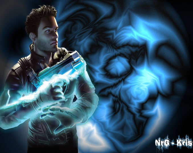
Hehe thanks dude, heres a new version. Just added text really, but it took a while to make the text, sure, I am using Tutorials and all, but learning pretty fast I think. That, and, Im only 16. Plenty of time to learn...
Please, could you give me tips on how to make it better? I like the comments saying its good for a noob, but I would appriciate it if I was told how to make it better.
Thanks!!
--Kris--
EDIT: Just came up with this sig aswell!! Not doing bad for a noob lol.
| Description: |
|
| Filesize: |
41.18 KB |
| Viewed: |
491 Time(s) |

|
| Description: |
|
| Filesize: |
111.59 KB |
| Viewed: |
497 Time(s) |
|
|
|
|
|
|
|
malcon
Joined: 23 Feb 2005
Posts: 391
Location: miami florida
|
| Posted: Wed Jan 31, 2007 11:58 am Post subject: |
|
|
hey whats up man. welcome to the site. you will love photoshop! anyway i like the peice. the only thing i have a problem with is the lighting. where is the orange light coming from? you have this blue glow around the gun with a blue and black background. in a way i like the contrast of the orange light on the figure but it doesnt read just right.
the picture is very clean.
on the other one, i think it is to symetrical. balance is key, but somtimes symetry can be very boring. also the signature its to close to the edge.
be carfull with text, the text you have chosen for the banner is quite mundane and does not reflect the figure's action very well. experiment with making up your own text!
anyway your deffinattly off to a great start!
keep it up
-malcon
_________________
http://malconpierce.deviantart.com/
http://malcon.cgsociety.org/gallery/
FOR HIRE! malconpierce@gmail.com |
|
|
|
|
|
|