|
|
| Author |
Message |
truetifoso
Joined: 20 Jun 2010
Posts: 16
Location: Southern California
|
 Posted: Sat Jul 30, 2011 9:27 pm Post subject: Masking Tennis Strings Posted: Sat Jul 30, 2011 9:27 pm Post subject: Masking Tennis Strings |
 |
|
Hello, everyone.
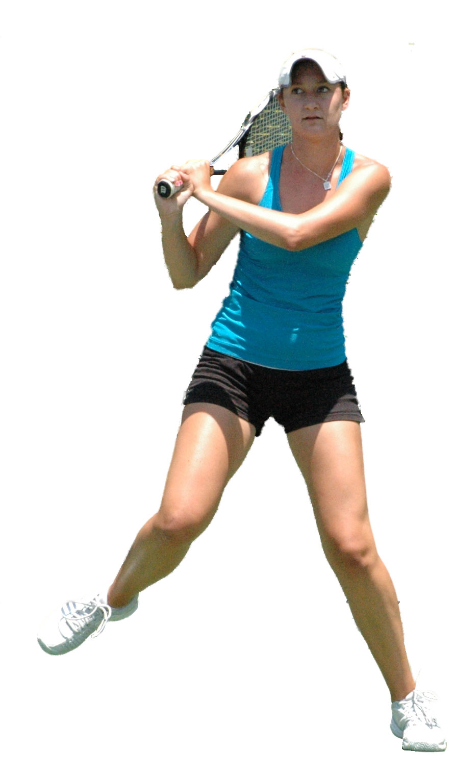
I'm working on creating cut-outs of some tennis players and am having trouble with masking (correct term?) the strings. More accurately, how do I make the spaces between the strings transparent?
Here are two examples of what I would like the end result to be:
http://www.princewhosnext.com/#/arconada
http://www.princewhosnext.com/#/silva
Note the way they kept the "P" stencil in the "Silva" picture.
Thanks in advance for your help.
|
|
|
|
|
 |
jerryb4417
Joined: 20 Dec 2008
Posts: 710
Location: Oklahoma
PS Version: photoshop cs5
OS: win7 pro 64 bit, i7-3.2g, GTS 450,
|
 Posted: Sun Jul 31, 2011 7:53 am Post subject: Posted: Sun Jul 31, 2011 7:53 am Post subject: |
 |
|
hi,
well first just a novice however just helped a person a few months ago on something similar ..
be nice to see the actually image that your going to work on instead of seeing a poor video resolultion.. remember how one does things maybe different on each image ...
first a couple of thought on videos...
did screen capture on the video and really zoomed in...
1. on the girl video not 100% positive but those do not looklike the orginal strings... too sharp looking, the ends of the strings they end at wrong places on some of them ... color too consistant .. etc... since the strings are drawn in that be maybe why you don't see any lettering on the strings the person just idn't put the extra time into it to do it although that part is simple and could have been done...
2. on boy video... they didn't cutout the space between strings, the strings very uneven, very blurry, etc they probably didn't want to take the time ..
now with that said..... there a couple of ways you can go about this...
1. if the images are good resolution... you can probably select the strings then do a inverse and delete the spaces or you can select inverse and creat a mask ...
note: selecting the strings .. a lot ofdifferent ways... but depends on the image.
2, or you can either
a. find a racket with the nice perspective and gooood resolution use that to replace the strings in your image.... of course since it a good resolution be much easiear to select the strings...
b. or did what i think they did in the girl video and that is they literally drew there own strings... smile... then you can transform it fit the perspective of the racket where it looks natural ....
note: if you need to add lettering... fairly simple.... have the strings selected and then put a text layer below that ...! and again transform the letter where it looks natura ..
well those are my thoughts.. just a novice so the other guys who are better mayve better ideas...
|
|
|
|
|
 |
thehermit
Joined: 05 Mar 2003
Posts: 3987
Location: Cheltenham, UK
|
 Posted: Sun Jul 31, 2011 10:32 am Post subject: Posted: Sun Jul 31, 2011 10:32 am Post subject: |
 |
|
I would say (depending upon the image) channel masking and or a calculations command.
_________________
If life serves you lemons, make lemonade! |
|
|
|
|
 |
truetifoso
Joined: 20 Jun 2010
Posts: 16
Location: Southern California
|
 Posted: Sun Jul 31, 2011 10:46 am Post subject: Posted: Sun Jul 31, 2011 10:46 am Post subject: |
 |
|
You guys are great! Thanks so much.
I'll try these out now.
BTW - Attached is a JPEG version of the specific picture I'm working on. Does this change the way you would approach this task?
| Description: |
|
| Filesize: |
131.8 KB |
| Viewed: |
1735 Time(s) |

|
|
|
|
|
|
 |
jerryb4417
Joined: 20 Dec 2008
Posts: 710
Location: Oklahoma
PS Version: photoshop cs5
OS: win7 pro 64 bit, i7-3.2g, GTS 450,
|
 Posted: Sun Jul 31, 2011 1:07 pm Post subject: Posted: Sun Jul 31, 2011 1:07 pm Post subject: |
 |
|
hi,
seeing the image at first i thought about that...
basically increase the contrast between the strings and it background and then make a selection maybe using color range or even the magic wand..
however those big horizontal lines inside the racket ... be a l ot of work for me to eliminate those.... so i go with the other ideas i state earlier...
just a thought once you get your new netting in there... make the color dull sometime if the strings are too sharp looking or brighter looking that bring too much attention to the eyes and not the over image.... youdon't want to give the eyes any excuses to stay any longer in the racket area than you need...
if you don't mind a little critque...lol ... the edges of the gal looks real rough.
that really caught my eye quite a bit.... may need to reselect or if you have "refine edge" avail may use that to clean up the edge ...
|
|
|
|
|
 |
thehermit
Joined: 05 Mar 2003
Posts: 3987
Location: Cheltenham, UK
|
 Posted: Sun Jul 31, 2011 2:04 pm Post subject: Posted: Sun Jul 31, 2011 2:04 pm Post subject: |
 |
|
Do you have a untouched original source image?
What you have now is tricky because of the varying background scenery, but as Jerryb intimates, could be accomplished through selection methods such as colour selection etc, in truth though an untouched image would give us full scope to advise.
_________________
If life serves you lemons, make lemonade! |
|
|
|
|
 |
|


